by Gene Crawford | Apr 4, 2012 | Gallery, Marketing
Very fun parallax website. Super great execution too. The best part is the way it’s used to view different sets of cloths over the model. But the bottom nav slides into place and you can then use the up and down arrows to load the clothes. I love clever usage of...
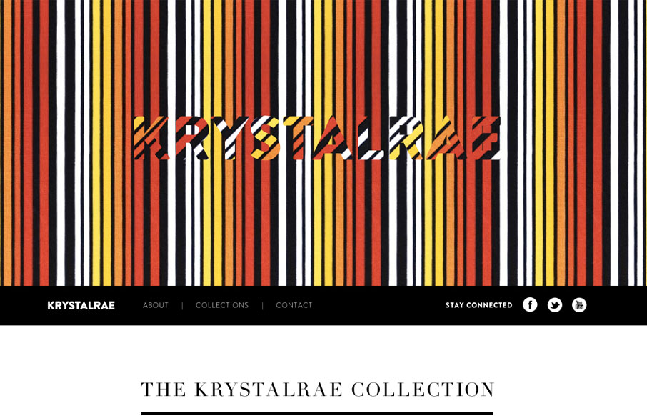
by Maria | Mar 26, 2012 | Gallery, Marketing
Soleil Noir’s 2012 wishes is just plain fun to play with. Vertical parallax meets bright happy colors, simple messaging, and some animations to add another slight layer of wow. The nav on the side is neat. Choosing a colored dot is like picking an easter egg not...
by Gene Crawford | Mar 5, 2012 | Gallery, Marketing
Beautifully executed vertical parallax website design for beetle.com. They’ve kind of become known for having a mind blowing web experience and again with this site they deliver. The vertical scrolling works so well here because there’s a narrative to be...
by Gene Crawford | Jan 20, 2012 | Food and Beverage, Gallery, Marketing
Really cool vertical parallax site design for McCafe®. I love the beans that float around as you scroll and the lower sections’ overlaying each other slightly are pretty well done. It’s nice to see a website for a mega-large organization, even if...
by Gene Crawford | Jan 19, 2012 | Gallery, Marketing
I like the big headshots used in the background on this site. I also really dig that left sidebar navigation design. I don’t think i’ve yet to come across a site that has subpages work as single page scrolling layouts either. Neat.
by Gene Crawford | Jan 4, 2012 | Gallery, Marketing
The interactions into the content on this site are really cleverly implemented/designed. I actually like the sliding around the screens do here. There’s actually a lot going on here with this website, some things are working really well to pull you into the...