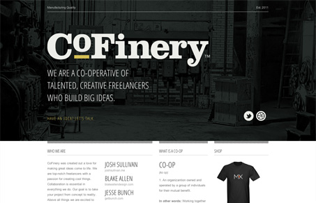
Admittedly, there’s not yet much on this site. I don’t know what the final intent will be, but in it’s current state, I like what’s going on. There’s this thing called CoFinery. The page briefly states what that is, what it means, who’s involved, and various ways to get in touch with the extended beings that make up CoFinery. That’s a lot of info packaged in a nicely laid out space. There’s a striking contrast between the top and bottom half of the page. The top half is bold, rich, engaging, and simplified. The bottom half, being primarily text, is structured, detailed, and houses all the “moving parts” cleanly. I’m definitely interested in following along as big ideas are built. This looks like it’s going to be something great.
Glassmorphism: The Transparent Design Trend That Refuses to Fade
Glassmorphism brings transparency, depth, and light back into modern UI. Learn how this “frosted glass” design trend enhances hierarchy, focus, and atmosphere, plus how to implement it in CSS responsibly.


0 Comments