
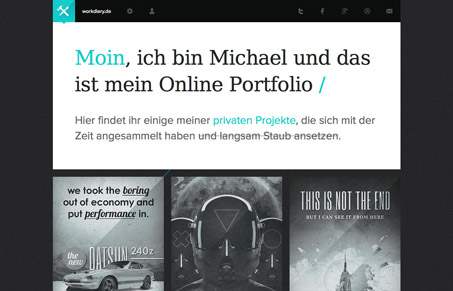
Workdiary.de is a pretty bold design with a very graphic sensibility. It’s a showcase for Michael’s work and it’s minimalistic color is severe and clean. I really like some of the small hits of cyan here and there. The economy of contrast is really clear. Also the hover state for each design is really nice. The quick zoom and flash of cyan are striking. Well done responsive layout too make for a great experience.


Fitts’s Law: Why the Easy Button Wins
Large, close targets are faster to hit than small, distant ones, that’s Fitts’s Law. A look at the 1954 rule behind buttons, prime and magic pixels, thumb zones, and dark patterns.


0 Comments