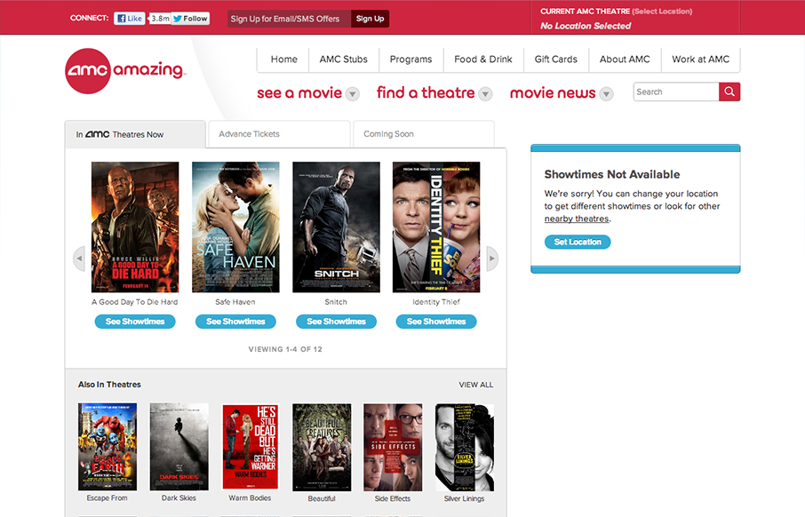
by Gene Crawford | Mar 5, 2013 | Entertainment, Gallery
Presenting Happy Cog’s redesign of @amctheatres for your responsive web design viewing oohing and aahing: amctheatres.com #RWD— Greg Hoy (@hoyboy) February 6, 2013 Really nice work. I love seeing a lot of the techniques and thought we all use on our...

by Gene Crawford | Feb 28, 2013 | Entertainment, Gallery
This is an interesting single page site. I can’t tell if it’s just the gateway into the app or a coming soon style page, but it’s well done nonetheless. I especially love the email signup form, the way the submit button looks placed within the field...
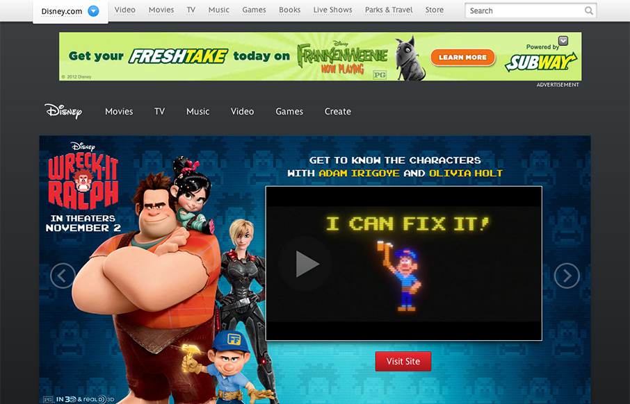
by Gene Crawford | Jan 14, 2013 | Entertainment, Gallery
Congratulations to @dromano, @fillup, and the whole team on the slick new design for disney.com that launched today! (finally!)— Jesse James Garrett (@jjg) October 1, 2012 The new Disney.com site rolled out late in 2012. There’s been a lot of linking and...
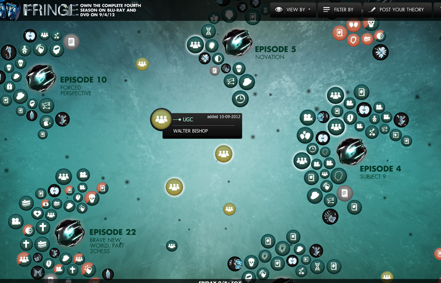
by Giovanni DiFeterici | Jan 2, 2013 | Entertainment, Gallery
This is a super cool experiment in interactive exploration. It’s not entirely practical but it’s stuff like this that keeps us pushing what we think of as a typical website interaction and we always need that. It seems a bit outdated technically –...
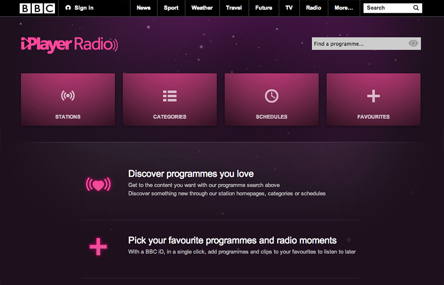
by Gene Crawford | Oct 12, 2012 | Entertainment, Gallery
Well, well, well: looks like the BBC Radio site’s just launched a fine-lookin’ responsive site. bbc.co.uk/radio/ /via @paulrobertlloyd— Responsive Design (@RWD) October 8, 2012 While this isn’t a typical “website” it’s still worthy of...
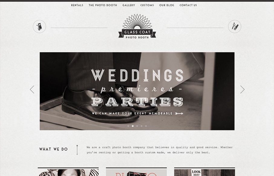
by Gene Crawford | Oct 11, 2012 | Entertainment, Gallery
Really digging the style of this site, combined with the fun animations and pics glasscoatphotobooth.com — Dan Denney (@dandenney) October 1, 2012 Nice clean design with a striking monochromatic “grey” color scheme. It’s nice when you check out the...