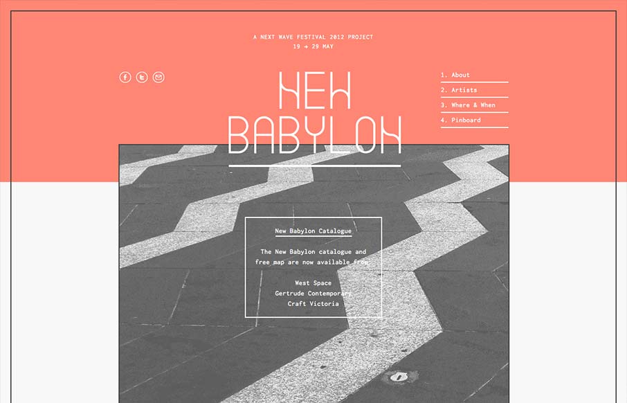
by Gene Crawford | Sep 24, 2012 | Entertainment, Gallery
I like the way the lines used in this design and the big blocks of color or no color work together. Even into the type it feels unified yet unbalanced. Rich yet minimal that’s how i’d describe this design. Lovely.
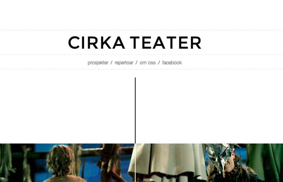
by Gene Crawford | Sep 24, 2012 | Entertainment, Gallery
Cool vibe to this scroller website. I really dig how there’s a slight parallax thing going on with the show sections/images, it really helps give it some depth interaction wise. The flip over effect on the lightbox windows for the show details is unexpected yet...
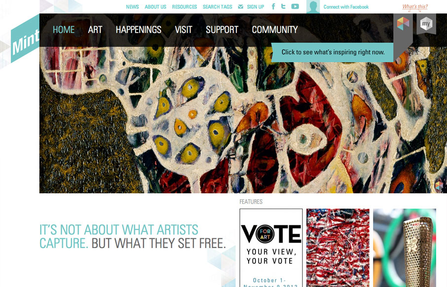
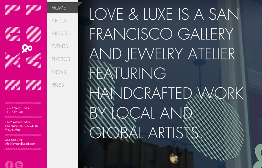
by Gene Crawford | Aug 9, 2012 | Education, Entertainment, Gallery
The way they’ve used the logo in the mint museum website is pretty clever it’s off the side and sort of slanted and it’s not the central element but yet it’s very noticeable. The large hero image slideshow is pretty standard but they’ve...
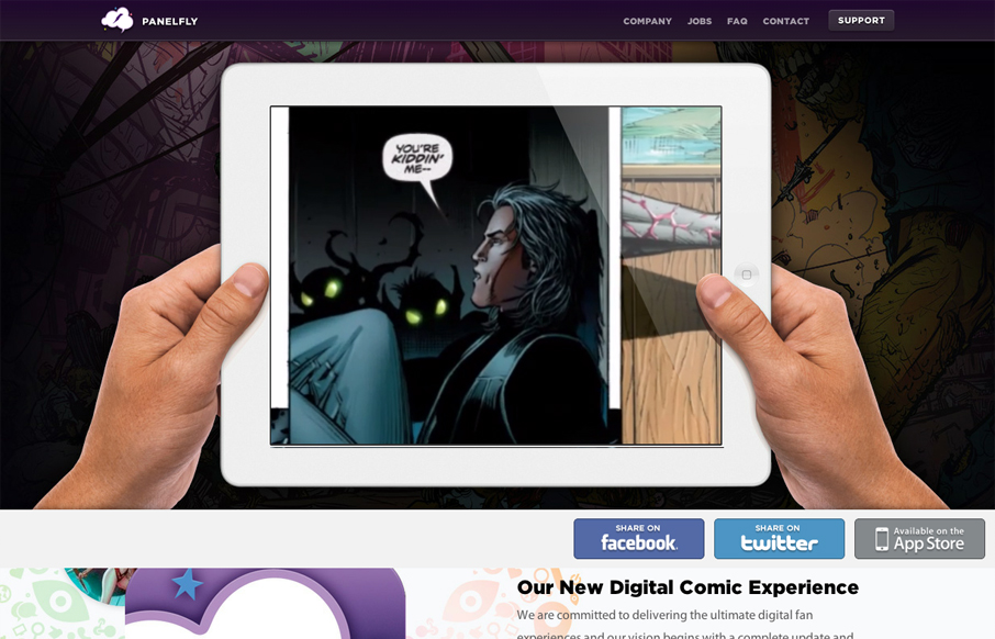
by Giovanni DiFeterici | Jun 21, 2012 | Entertainment, Gallery
Introducing the new Panelfly Website, this showcases the release of our new app! Submitted by: Clinton Halpin @clintonhalpin Role: Designer & Developer panelfly.com is a lushly colorful site, full of energy and movement. I love the panelfly’s palette;...
by Gene Crawford | Jun 18, 2012 | Entertainment, Gallery
What a great website to study the different screen size experiences with. I love the three major size designs here. The wider has the nice nav inline next to the logo area and then as you scale in it slides under the logo. With the final iPhone sized screen having the...
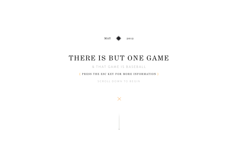
by Gene Crawford | May 22, 2012 | Entertainment, Gallery
Holy wow, Eephus League Magazine: eephusleague.com/magazine/(via this @dribbble drbl.in/ecEd)— Dan Cederholm (@simplebits) May 21, 2012 Re: the previous tweet, now that’s how you publish a magazine on the web. Embrace the vertical scroll (which is the...