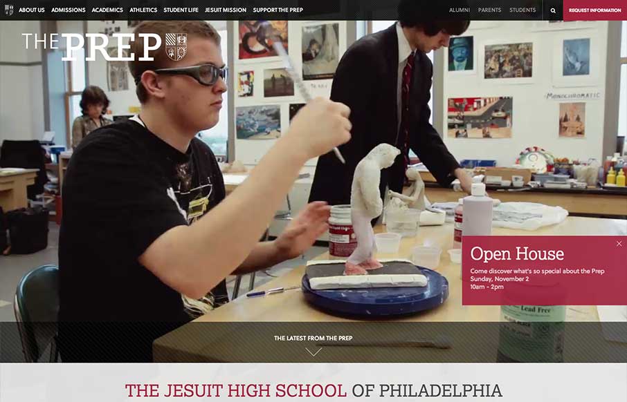
by Gene Crawford | Aug 12, 2014 | Education, Gallery
The St. Joseph’s Prep website is quite nice. I like the video background and how when the page scales down to smaller widths they swap out for a static image and then down to nothing for mobile devices. Nice strong easy to scan grid design too. Looks to be...

by Aaron Griswold | Jul 22, 2014 | Education, Gallery
College sites are hard, mainly because of all the content from all the different areas that content and data comes from. Nichols College does a good job unifying all of it into a modern, responsive design – that probably looks even better on a tablet view...
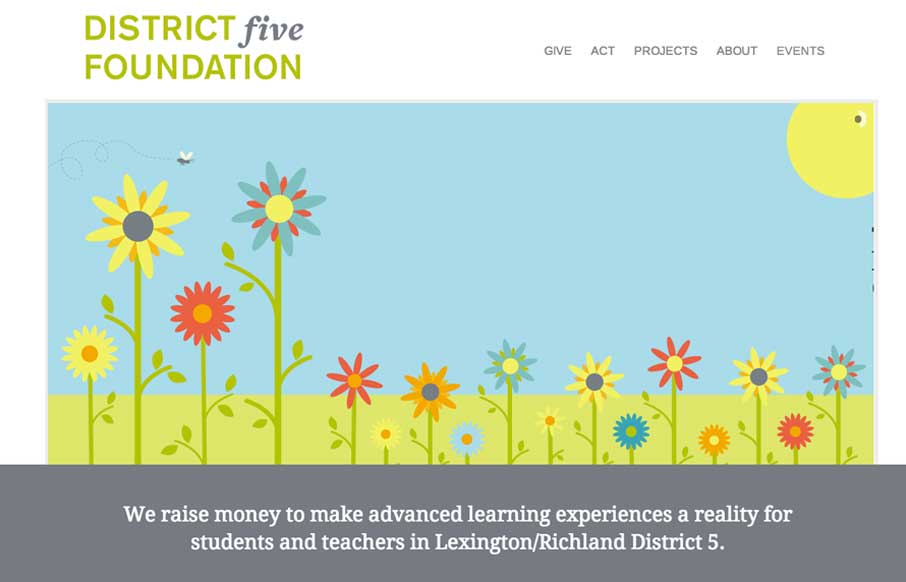
by Gene Crawford | Jun 3, 2014 | Education, Gallery, Nonprofit
I love simple design, it’s not as easy to pull off as you first think it is. This is why i’m always impressed when I find someone who has. This site for District 5 Foundation is one of those. Well thought out, well designed, deceptively simple websites. By...
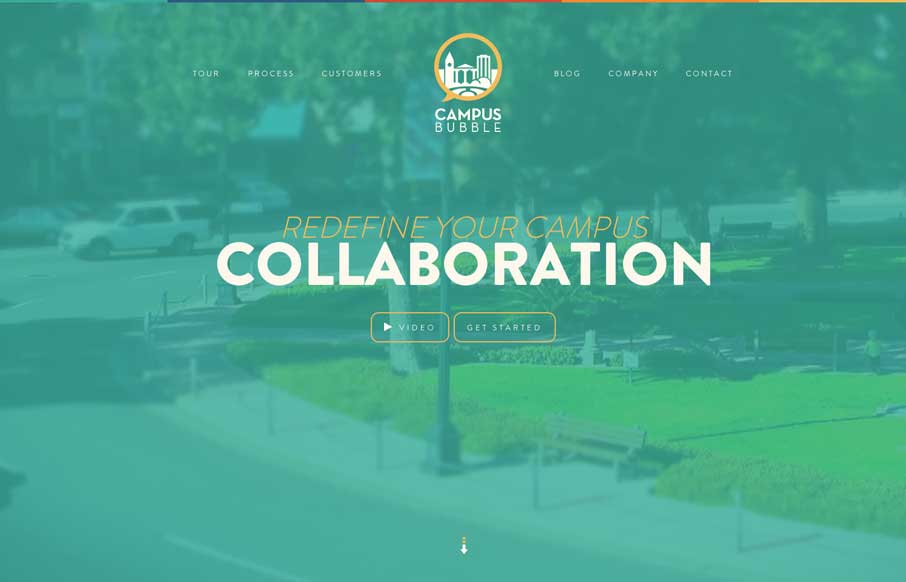
by Gene Crawford | May 1, 2014 | Education, Gallery
Pretty cool visual details built into this site. Like the sped up video in the hero area and all the loading animations as you scroll down. Really great visuals to boot. Winning combo design wise.

by Gene Crawford | Mar 28, 2014 | Education, Gallery
Nice, Harvard has a responsive site design now. Not sure how long it’s been relaunched but I like it. It’s one of the better collegiate designs as far as i’m concerned. I really dig the featured marquee area and how they change for focus based on the...

by Gene Crawford | Mar 4, 2014 | Education, Gallery
There is some really neat design stuff going on with this site. I love how the “Rijks Museum” overlays and play with the slider. Then the top nav is just fun to mess with. Nice responsive work here too.