by Aaron Griswold | Dec 22, 2014 | Education, Gallery
This February marks the 150th anniversary of General Sherman’s burning of Columbia, South Carolina. The City of Columbia is commemorating the rebirth and reconstruction of the Capital City through a series of events designed to appeal to history buffs from all...

by Gene Crawford | Oct 17, 2014 | Education, Gallery
Sweet responsive site for Haywood College. I like the downward angle used to anchor the page visually, that’s a nice touch. Marisa Falcigno @helloODDS Role: Designer & Developer The website project was integral in highlighting the new identity while...

by Gene Crawford | Oct 8, 2014 | Education, Gallery
What a fun looking visual brand. Nice to see it spill out onto the overall layout and design of the website too. Lovely stuff.

by Gene Crawford | Sep 22, 2014 | Education, Gallery
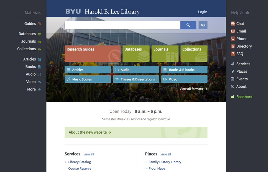
Very interesting user experience design going on. I really dig the fixed side menus a lot. Very smart interactions. Wow. Just wow. New website for @BYU Libraries: http://t.co/xxO000oA9E Soon to be the envy of all #libweb types. Nice work, @HBLL— Erin White...

by Gene Crawford | Aug 14, 2014 | Education, Gallery
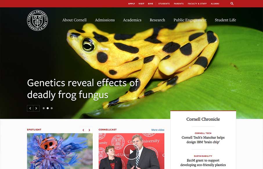
One of the better responsive higher ed site’s i’ve ever reviewed. There’s tons of nice design patterns in play here as well as other detail work. What’s most striking is that the responsive design isn’t just the home page, but seems to go...

by Gene Crawford | Aug 12, 2014 | Education, Gallery
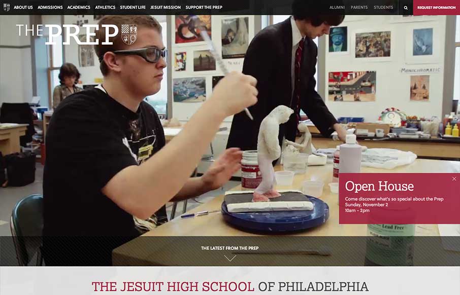
The St. Joseph’s Prep website is quite nice. I like the video background and how when the page scales down to smaller widths they swap out for a static image and then down to nothing for mobile devices. Nice strong easy to scan grid design too. Looks to be...
