by Giovanni DiFeterici | Sep 5, 2012 | Design Firm, Gallery
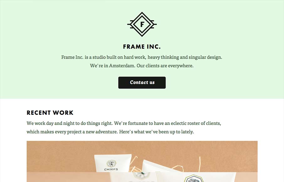
I can really get behind the minimal approach to content that frameinc presents. The site isn’t cluttered up with overblown copy or quirky language and I’m not forced to wade through a huge portfolio to get a sense of what this business does. The design and...
by Giovanni DiFeterici | Sep 4, 2012 | Design Firm, Gallery
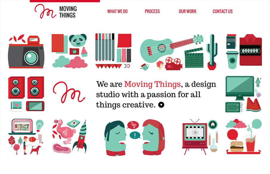
The illustrations are really great on this site and the animations completely sell The humor. Love it?
by Gene Crawford | Aug 21, 2012 | Design Firm, Gallery, Marketing Company
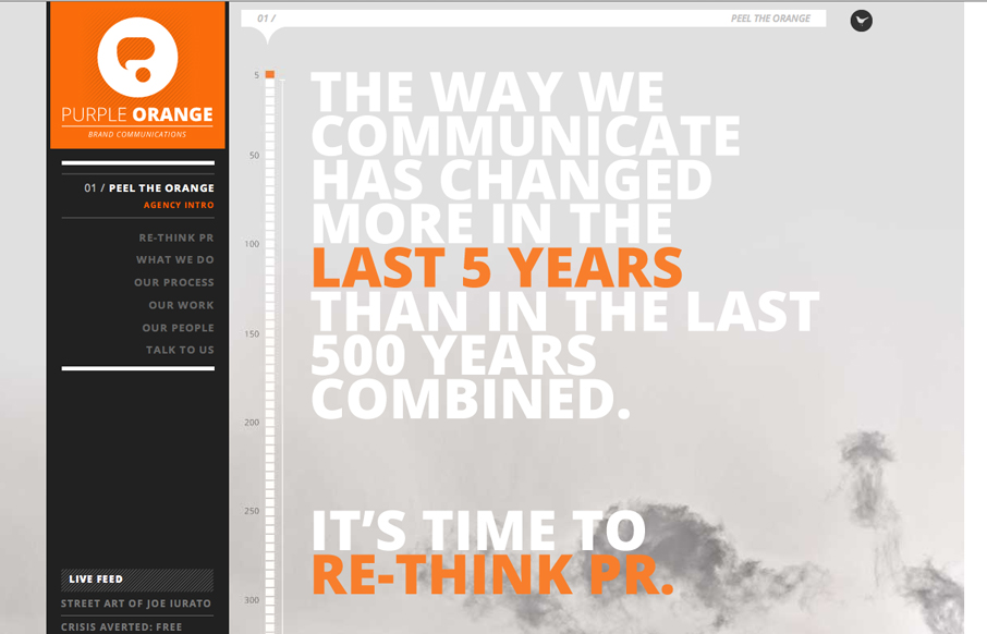
Submitted by: Emily Hopcian We set out to make a new and distinctive brand identity for ourselves (Purple Orange is a brand communications agency) and settled on this one-page design utilizing parallax to create a more dynamic look and feel. We tapped two agencies to...
by Giovanni DiFeterici | Aug 20, 2012 | Design Firm, Gallery, Marketing Company
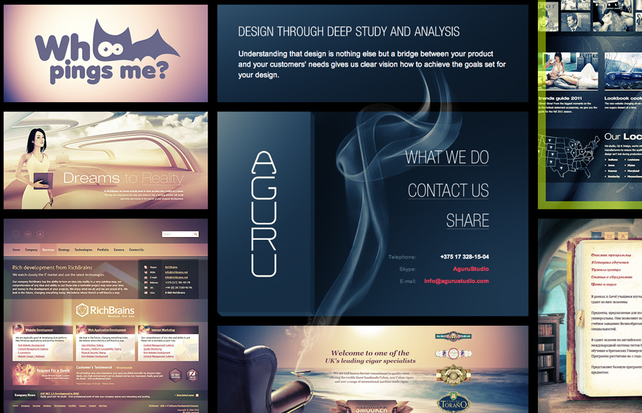
Submitted by: Steve Craw @AguruStudio Role: Designer I’m often against splash screens, but the one presented by agurustudio is really helpful and definitely improves the experience. The simple animation is easy to understand and introduces visitors to a behavior...
by Gene Crawford | Aug 8, 2012 | Design Firm, Gallery
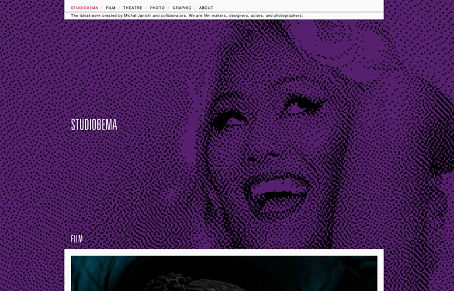
Relatively simple website when you get down to it, the interactions aren’t mindblowing but what’s really nice is the simplicity mixed with the large illustrated background image/photos. For some reason they’re just engaging to me and I love...
by Gene Crawford | Aug 7, 2012 | Design Firm, Gallery
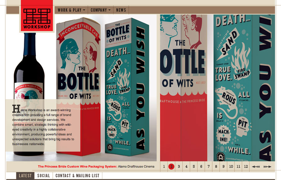
I think the Helms Workshop website has been around for a while and I’m just now seeing it. I still think it holds up really well and I love the tight typography and the minimal pallet with the browns and then the Red for highlight & focus is just nice.
