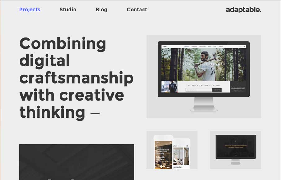
by Gene Crawford | Jan 12, 2015 | Design Firm, Gallery
I love this layout. It’s simple and to the point as well as a nice example of responsive design. The scaling of the main images is nicely done and in contrast the larger bolder type in the layout works our really well.
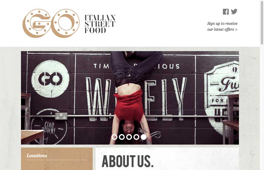
by Gene Crawford | Jan 8, 2015 | Food and Beverage, Gallery
Cool adaptive site design for GO Food. I dig all the illustration work and how it’s been worked into the layout to feel really hand made like it does.
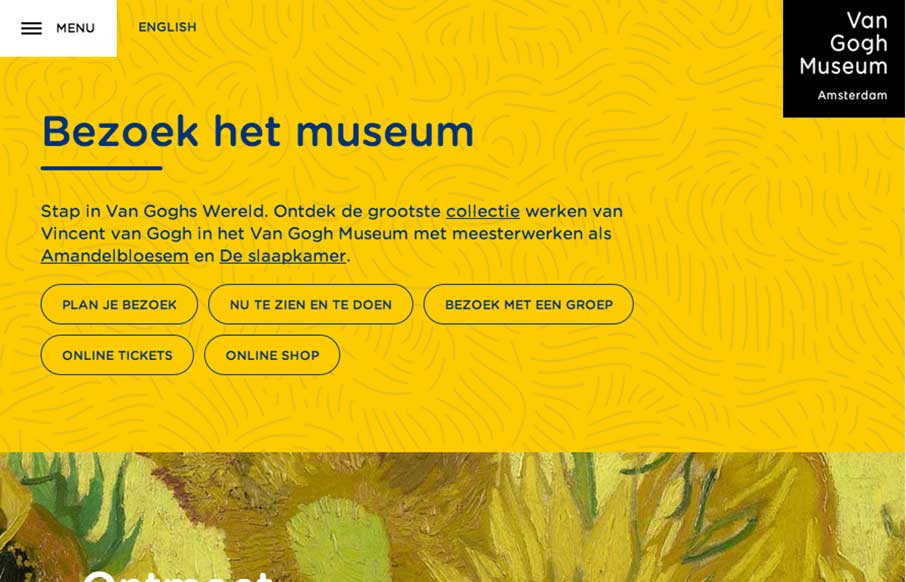
by Gene Crawford | Jan 7, 2015 | Gallery, Nonprofit
There is really a lot going on here with the Van Gogh Museum website. From the different design decisions made across the different screen widths to the navigation details. You really need to go spend some time clicking through this one guys.
by Gene Crawford | Jan 7, 2015 | Gallery, Portfolio
Nice Masonry/Isotope type responsive effect here. Actually, digging into the code looks like it is Isotope… I like the usage of it here because it just feels a little different. Especially with the way the logo overlays on top of the images like that too as you...
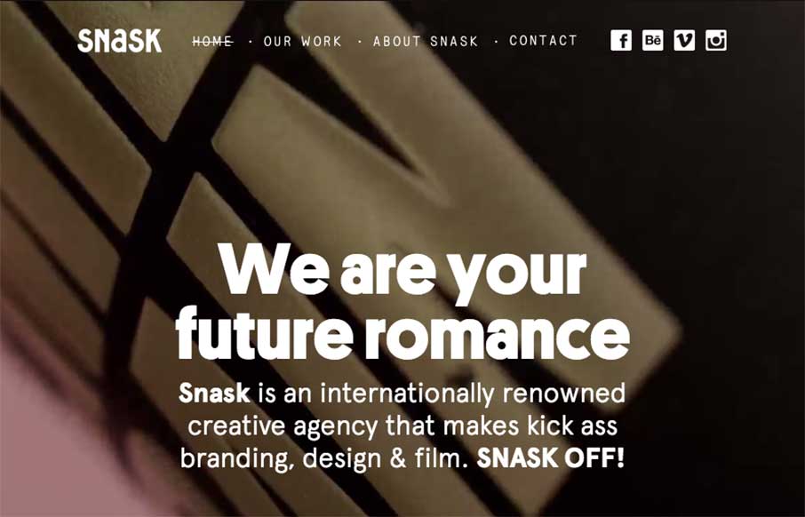
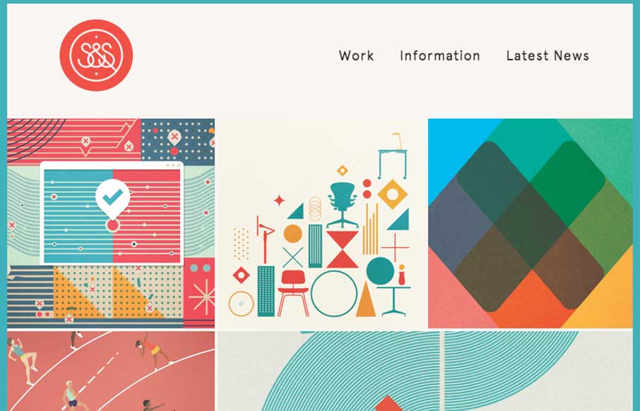
by Gene Crawford | Jan 7, 2015 | Gallery, Marketing Company
Some fairly straightforward design queues here on the Snask site. But I really really love the way the images are placed on the page. They just feel like they’re embedded in the page somehow to me. Kinda like a nice offset printed page feels. Know what I mean?...