by Gene Crawford | Jan 14, 2015 | Gallery
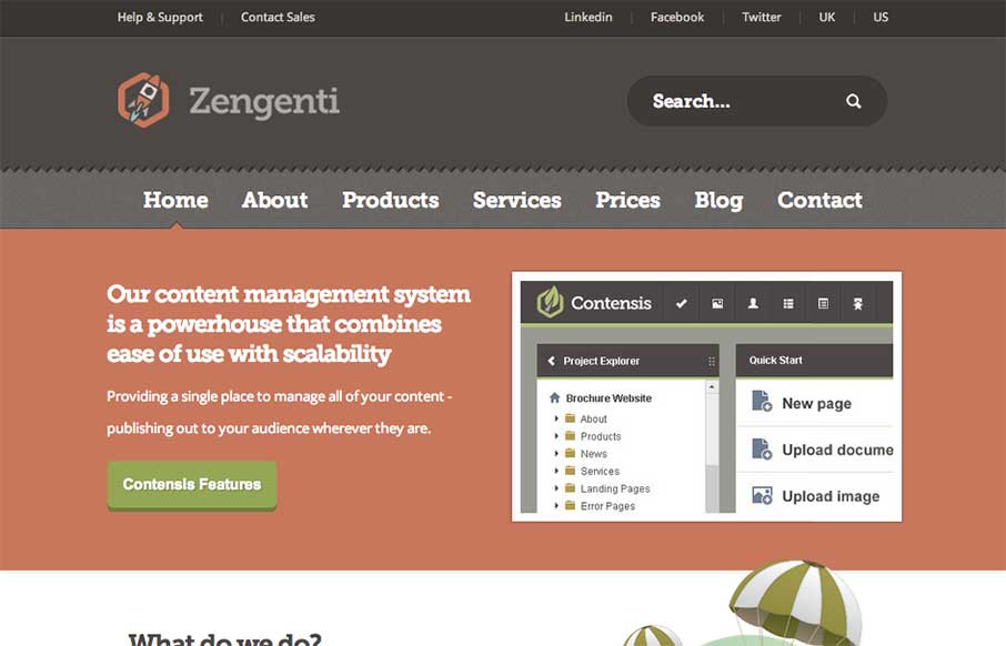
Nice web app site design. I like how it’s a little old school but also new school at the same time. Lovely stuff. Our content management system is a powerhouse that combines ease of use with scalability. Submitted by: Alex Dixon @alexdixondesign Role: Designer...

by Gene Crawford | Jan 14, 2015 | Gallery, Portfolio
Some really hot illustration work closes the deal on the look of this website for me. The underlying layout isn’t all too different in the design patterns the site utilizes but man, those illustrations. I also really like how the main one is responsive....
by Gene Crawford | Jan 13, 2015 | Gallery, Marketing Company
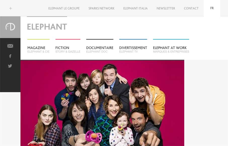
Cool blocky design for the Elephant site. I dig the adaptive looking approach to the layout across various screen widths. The zoom on hover for the main page’s images keeps me engaged somehow as well.
by Gene Crawford | Jan 13, 2015 | Gallery, Shopping
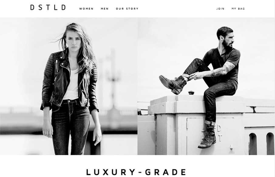
Beautifully simple layout for DSTLD Jeans. I like the left or right approach to making the women to men selection. It keeps the overall same feel no matter what screen width you view the page at. It’s also beautifully black and white which I always love when...
by Gene Crawford | Jan 13, 2015 | Gallery
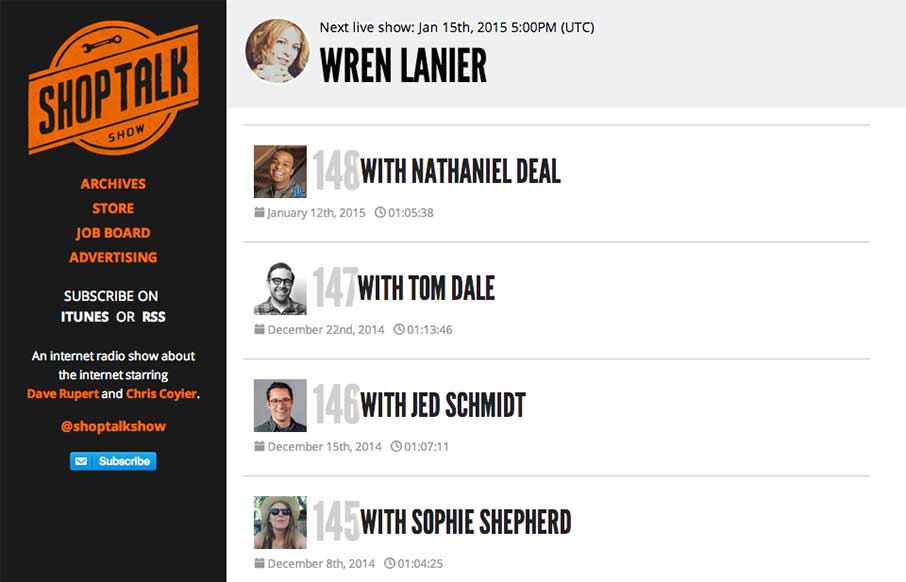
The new Shop Talk Show website is up. Retaining the same branding and colors but very much looks like it just goes straight for mobile users. Likely a very smart move. The content is in the audio and getting people to that fast not in showing off a super slick site...