Boss Gloves

http://bossgloves.com/

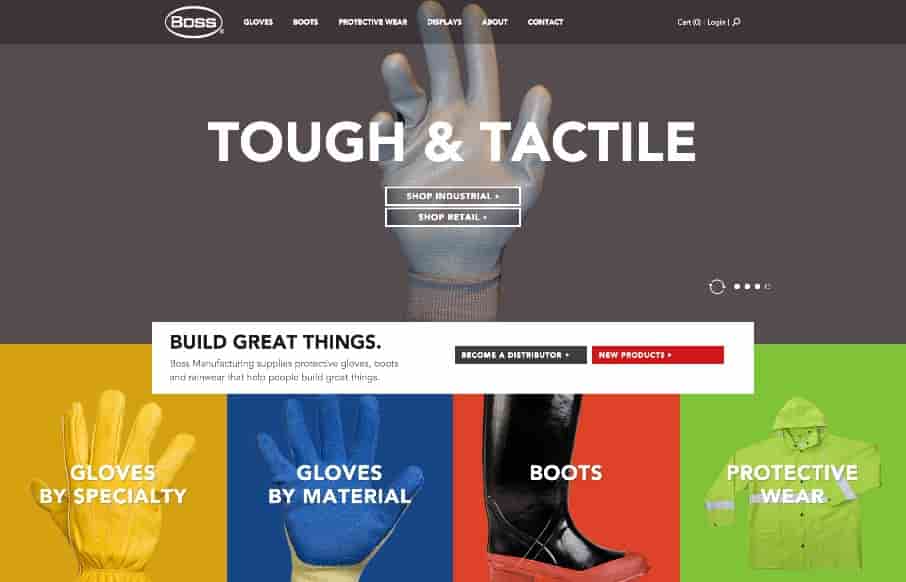
That is some crazy stuff coming from Boss Gloves – making the site exciting for products that aren’t (their words below – not mine). Like the interaction on the slider – and like the points they make below – pretty spot on.

From the Designer:
After taking boss gloves through our Branding Program, we focused on the design. Workwear isn’t always the most exciting, so we kept things big, bright, straightforward and unlike anything else in the category. Short, action-oriented headlines are a little “bossy,” but they’re balanced by friendly, vivid colors and bold images. Oversized product photography wordlessly emphasizes the quality of the products, showing off every stitch.

Submitted by: Ken Earley
Twitter: @atomicdust
Role: Designer & Developer
Country: USA

0 Comments

Submit a Comment

Your email address will not be published. Required fields are marked *

News & Articles

Sign-Up: Enhancing Conversions through good UX

Sign-Up: Enhancing Conversions through good UX

Optimize your website’s sign-up process by focusing on clarity, ease, and user mindset. Clearly explain the purpose, benefits, and steps, and use social proof to build trust and drive conversions.

The Essential Guide to Getting Started on Freelance Writing

The Essential Guide to Getting Started on Freelance Writing

Explore the lucrative and fulfilling world of freelance writing with our essential guide. Learn about specialties like blogging, social media, article, and technical writing. Build a portfolio, find work, set up your business, and discover the potential earnings. Embrace the freedom of working from home and follow tips for success in your dream career.