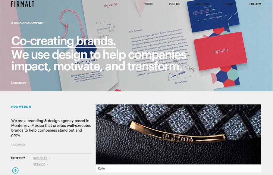
by Gene Crawford | Nov 24, 2015 | Design Firm, Gallery
Nice grid based layout for Firmalt. I like the Masonry like treatment of the main image blocks as you scroll down the page and shift screen sizes. Nice solid simple layout always wins!
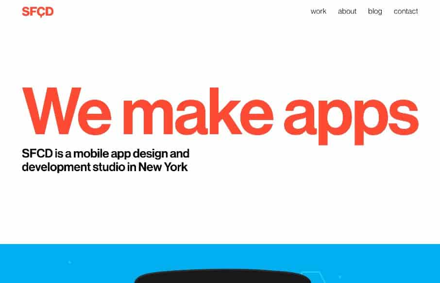
by Gene Crawford | Aug 17, 2015 | Gallery
Simple and bold, that’s often what I like! I love this site design tremendously. Just the layout alone makes you keep scrolling down the page, the way it keeps showing work in non-centered or standard ways. Smart, simple and in the end elegant. Submitted by:...
by Gene Crawford | Aug 11, 2015 | Gallery
I like how they homepage is like a big splash page, but instead of being just a hero image and some useless “welcome” copy, they’ve incorporated direct links and images to their case studies. What I don’t like is how that’s echoed in the...

by Gene Crawford | Jul 28, 2015 | Gallery
A fairly clean experience for a big credit card website. The Chase site is responsive and has some nice open space throughout that really helps with the large amount of “stuff” they’ve put on the screen. I like the navigation design, using the...

by Aaron Griswold | Jul 28, 2015 | Gallery, Product, Shopping
That is some crazy stuff coming from Boss Gloves – making the site exciting for products that aren’t (their words below – not mine). Like the interaction on the slider – and like the points they make below – pretty spot on. From the...