
What happens when Bauhaus rationalism meets IKEA’s flat-pack pragmatism? You get Monochrome Minimalism, a design movement where functional modernism meets mass accessibility, wrapped in calm whites, grays, and geometry.
Today’s web and product designs owe more to this collision than we might admit. The clean lines, modular grids, and lack of ornamentation that define our digital aesthetic trace a direct line from Weimar classrooms to Scandinavian living rooms.
Bauhaus: Blueprint for Modern Minimalism
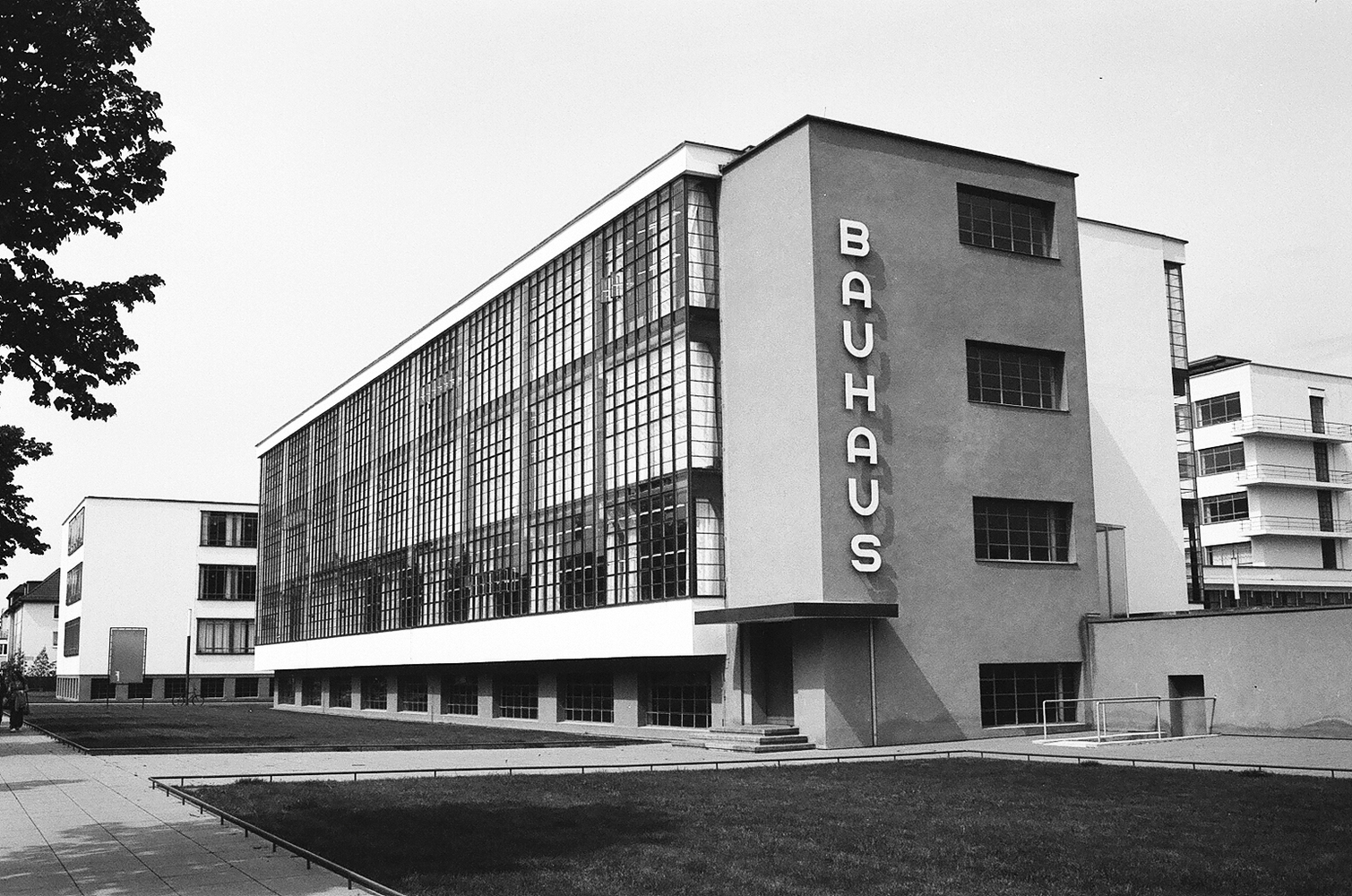
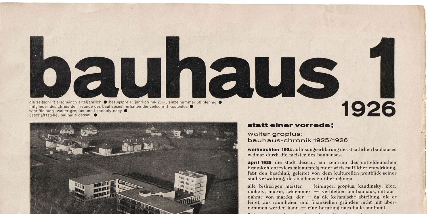
The Bauhaus school, founded in 1919 by Walter Gropius, sought to unify art, craft, and technology. Its central principle, form follows function, rejected excess decoration in favor of honest construction and clarity.
Rectangles replaced curves, sans-serif replaced flourish, and utility became beauty.
Fast forward a century, and you’ll find those same ideas structuring the web’s grids, typographic systems, and modular components.
Bauhaus was never about style—it was about structure.
IKEA: Bauhaus Goes to Market
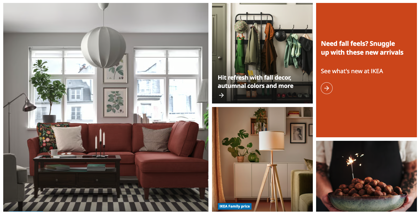
If Bauhaus was theory, IKEA made it practice.
IKEA democratized modernism, translating high design into flat packs and hex keys.
Its products echo Bauhaus ideals:
- Function over flourish
- Simplicity of assembly
- Affordability through mass production
Yet there’s a twist: IKEA sells lifestyle minimalism, not philosophical minimalism. It’s a softer, friendlier kind of modernism—design for everyone, not just purists.
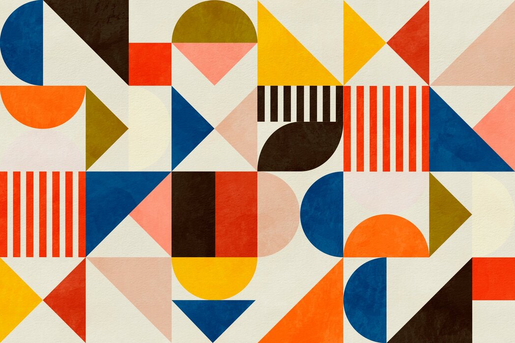
Digital Monochrome Minimalism
The web absorbed these aesthetics wholesale. Most modern interfaces could double as IKEA catalog spreads:
- Neutral palettes: off-whites, grays, muted tones
- Geometric grids and modular layouts
- Large sans-serif typography
- Functional restraint over ornament
Apple, Aesop, Muji, and countless startup landing pages all embrace the same visual calm, a kind of digital Scandinavian serenity.
Monochrome design does more than please the eye, it calms the brain. By reducing contrast and visual noise, it lets users focus on content and intent.
Find Some Inspiration
- Muji: The purest modern descendant of Bauhaus philosophy, every item is a masterclass in purposeful restraint.
- Apple.com: Bauhaus’s spiritual successor. It merges form, function, and emotion through simplicity.
- IKEA: Monochrome meets lifestyle; product photos read like still-life compositions.
- Aesop: Typography and tone define the brand; their black-and-white layouts convey both luxury and humility.
- Norm Architects: Danish minimalism that’s tactile, spacious, and deeply human.

Hidden Irony
Modern minimalism often markets itself as calm, but it’s also curated contro. The more perfect the grid, the more invisible the labor.
Bauhaus wanted to free design from excess. IKEA made it fit in a box. And we, as digital designers, now use those same ideals to design interfaces that promise calm in exchange for conformity.
Monochrome minimalism endures because it brings clarity to complexity.
It’s the pause in the scroll, the whitespace in the noise.
Like the Bauhaus masters before us, we’re all chasing the same goal: design that disappears, leaving only experience behind.
Challenge: Try removing one more layer from your next design, see what remains. The truth might be more beautiful than the polish.
Show Us Your Minimalism
Share your best black-and-white or grid-based designs, we’ll feature standout examples in our next showcase.


0 Comments