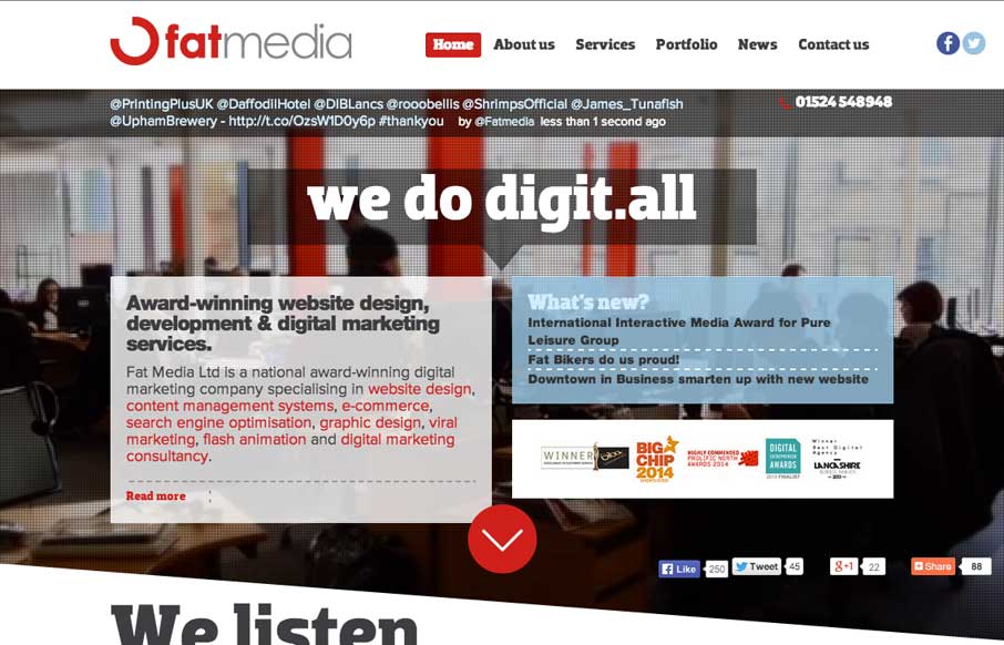
by Aaron Griswold | Jul 29, 2014 | Design Firm, Gallery
Definitely like how Fat Media is doing the foreground / background imaging with a different slant (figuratively and literally). The scrolling animation seems pretty seamless on the home page – and like the hover state of the staff on the home page too. Submitted...
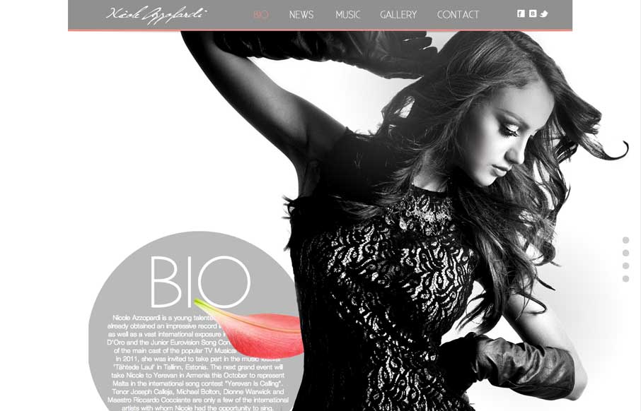
by Aaron Griswold | Jul 29, 2014 | Entertainment, Gallery
Great use of parallax with flying flower petals, bios, and a singer. Also like the use of texture in one of the sections, and then subtler parallax in another section to give some differentiation. Submitted by: Justin Sammut Role: Designer
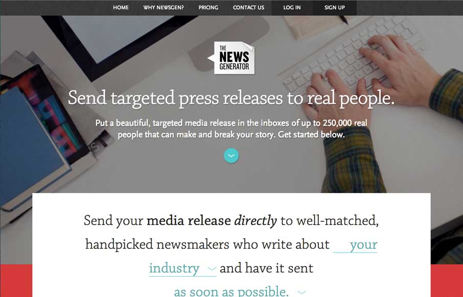
by Gene Crawford | Jul 25, 2014 | Gallery
Nice layout, it uses a lot of tried and true layout but it just feels a little different to me. I really dig the way the main signup form is right in the center of the home page but not in your face at the same time. Some clever form field design to go along with it...
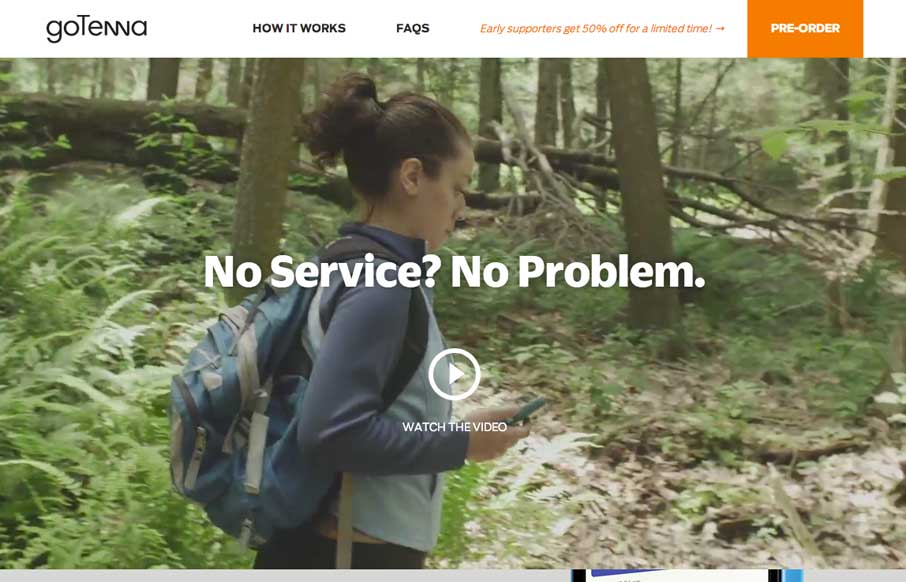
by Aaron Griswold | Jul 23, 2014 | Gallery
We have a saying around here for when we like some new tech gizmo – “Me likey – me want one” – no really… we actually say that… I know… but me likey goTenna – me want one. But that’s not important now....
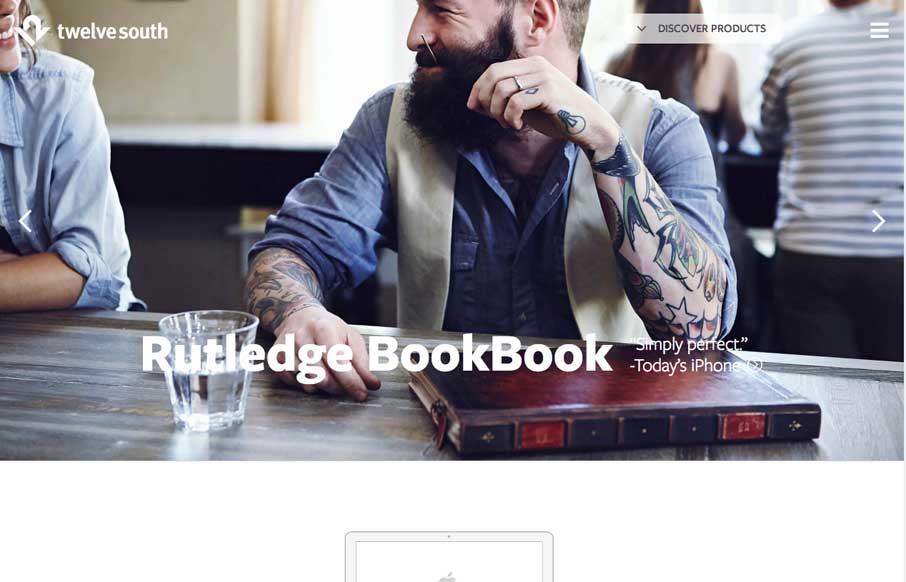
by Aaron Griswold | Jul 21, 2014 | Gallery
This was a fully responsive redesign of the Twelve South eCommerce website. Twelve South creates beautifully designed accessories exclusively for Apple computers. We love their BookBook for iPhones and iPads – and the site reflects the beautiful design of their...