by Aaron Griswold | Dec 4, 2014 | Gallery, Software
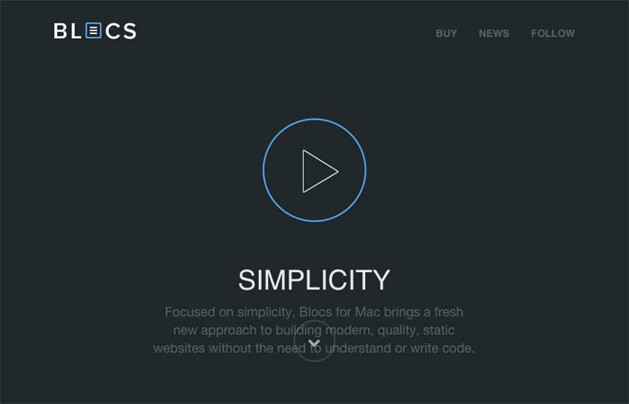
If you’ve read any of my reviews – then you’ll probably notice that the word “simple” comes up about every other review. Simple is a term of endearment in my world, because for me, it means cutting to the core / heart / bones – and...
by Gene Crawford | Dec 1, 2014 | Gallery
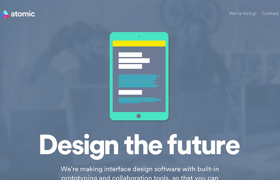
Over the years, we’ve used what seems to be all manner of tools to collaborate between designers, developers, and the pesky client. Atomic.io (from the video) looks to have some firm solutions, and some features that you just go – yep, need em –...
by Aaron Griswold | Nov 26, 2014 | Gallery, Product
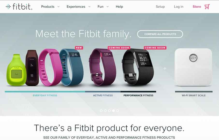
So… the home page for fitbit really doesn’t do the rest of the site justice. I actually held off on this review because of my first glance at the home page. Head to the big drop-down menu, or click on these links: www.fitbit.com/surge, www.fitbit.com/flex,...
by Aaron Griswold | Nov 25, 2014 | Design Firm, Entertainment, Gallery
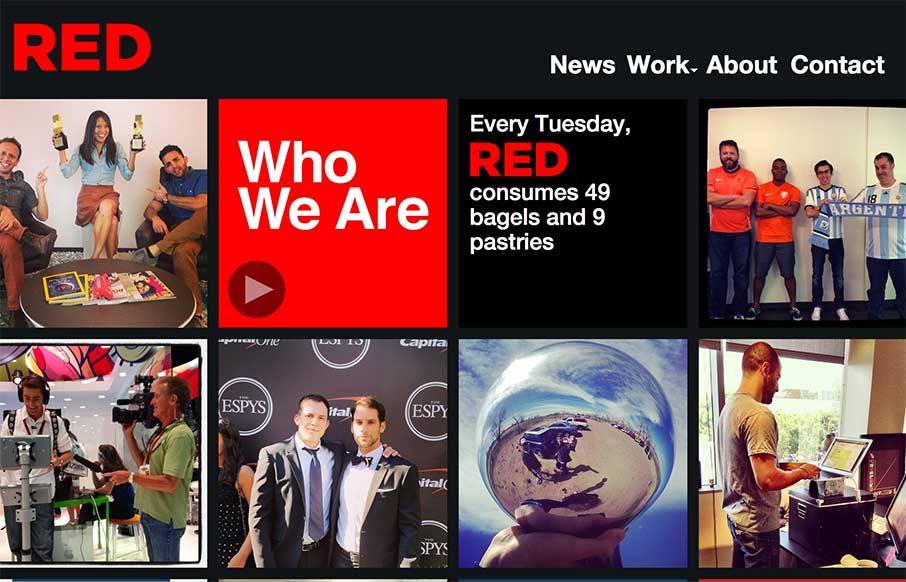
The way the site is built out of squares that adapt to the width of the browser screen (see what I did there?) is really neat. It’s simplicity but not overtly done. The nav reflects the simple approach to the layout too which is nice and clear.
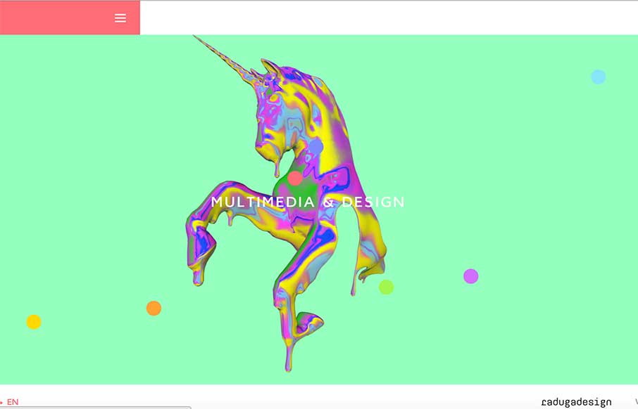
by Gene Crawford | Nov 21, 2014 | Gallery
Some crazy imagery and even crazier interactions. Really just go play around with it and see what you think. What do you think? Submitted by: Ivan Nefedkin @radugadesign Role: Designer & Developer
