
by Gene Crawford | Oct 15, 2014 | Gallery
The page just keeps going and going, but it’s all good stuff. That’s rare for website’s I come across.
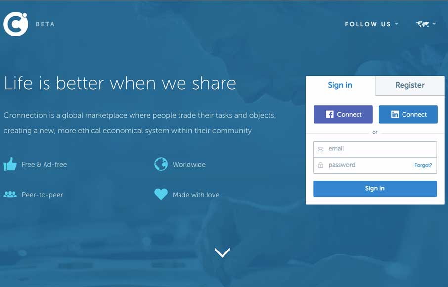
by Gene Crawford | Oct 15, 2014 | Gallery
I love a lot of the detail work in the different visual sections of this site. The way things are stacked and lined up is pretty tight and while very similar to other website’s feels a little different somehow. Submitted by: Álvaro Castaño @cronnection Role:...
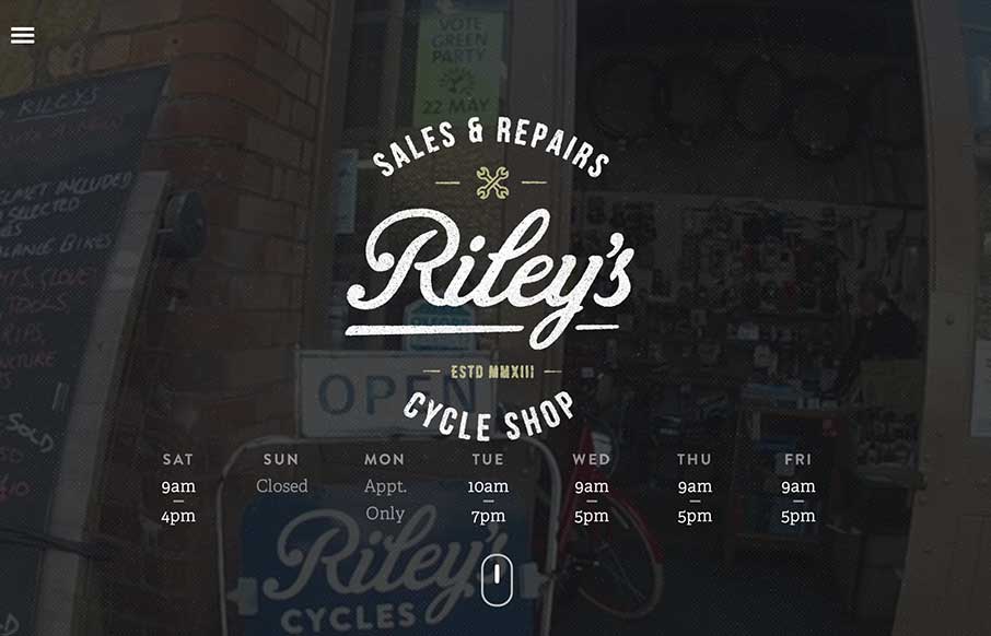
by Gene Crawford | Oct 9, 2014 | Gallery, Sports/Recreation
Beautiful site design. I love the video image in the background of the main hero area. The little scroll graphic using the mouse and the length of the scroll wheel is smart too.
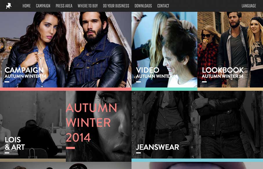
by Gene Crawford | Oct 3, 2014 | Entertainment, Gallery
Pretty cool to see a page for a campaign, something that’s part of something larger and possibly offline to boot. Good stuff. This site is wild and has all sorts of stuff going on but at the same time it’s easy enough to get into. Submitted by: Raul Ortiz...
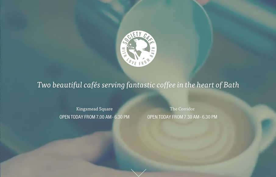
by Gene Crawford | Oct 1, 2014 | Food and Beverage, Gallery
What a beautiful and soft feeling site design for Society Cafe. I love the soft colors and thin line work used across the page. The video in the background is a good touch to keep a kinetic vibe going as you scroll down the page too.