by Aaron Griswold | Mar 5, 2015 | Food and Beverage, Gallery
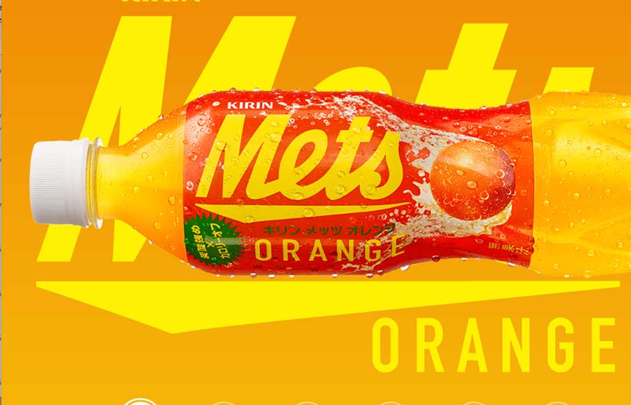
“We Want Mets – We’re the funky, spunky, younger generation…” is now in my brain for the rest of the day – well played Kirin – well played. I’ve been a fan of Kirin, out of Japan, since before I can legally say. They...

by Aaron Griswold | Feb 27, 2015 | Gallery, In-Depth Review, Marketing Company
With the new Bloomberg Business website that launched a couple of weeks ago (which we made some observations here), well it looks like the media giant also has a separate site for the media / advertising / marketing sales division – Bloomberg Media (BBM). We...

by Aaron Griswold | Feb 26, 2015 | Gallery
Dog Studio out of Belgium is pretty darn cool. Their site is a little unconventional – but it seems in-line with their immersive website work. The Projects pages are really rich – especially check out the Waterloo page. Good… stuff! (yes, a play on...

by Aaron Griswold | Feb 26, 2015 | Gallery
I will tell you that your Macbook will be running hard when you clickthrough to La Haute Societe’s site – but it will be worth it. This is one of the best use cases of video background – because it’s pervasive throughout the entire site. It has...
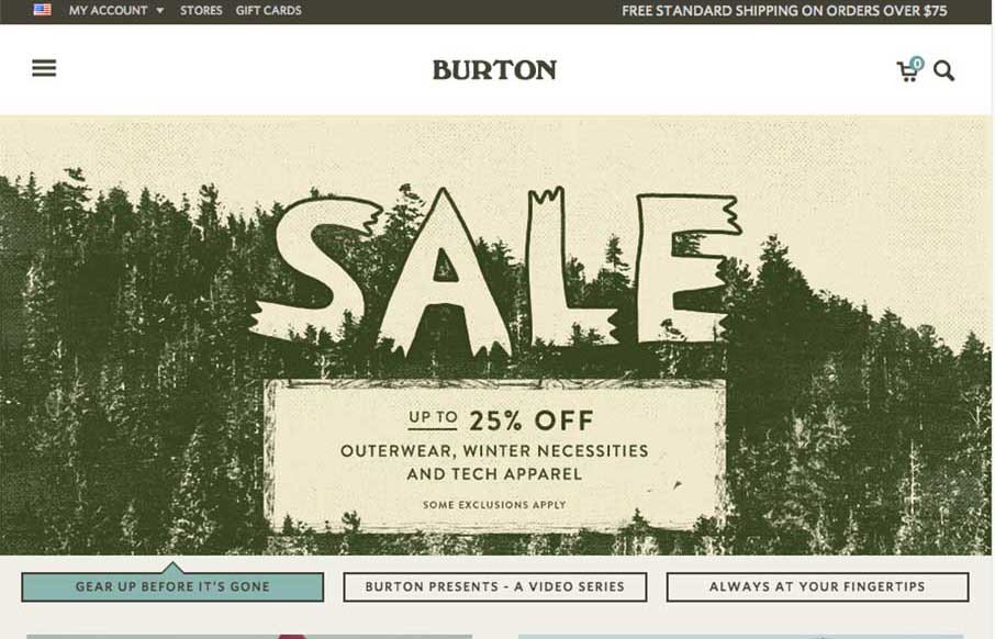
by Aaron Griswold | Feb 20, 2015 | Gallery, Shopping, Sports/Recreation
I took my son snowboarding for the first time at Beech Mountain (@BeechMtnResort North Carolina) last Friday (and ok, it was only my second time) – so we took lessons (because last time, 10 years ago, I only lasted 4 hours, and watched my buddies for the rest of...