
by Aaron Griswold | Oct 14, 2015 | Design Firm, Gallery
Cool looking red, blue and white agency site out of Montreal from Ellpi. It’s very simple and clean, with good white (red) space. I like how the video backgrounds on the site are not featured, they are more like footers on interior pages. From the Designer:...
by Aaron Griswold | Oct 12, 2015 | Gallery, Real Estate
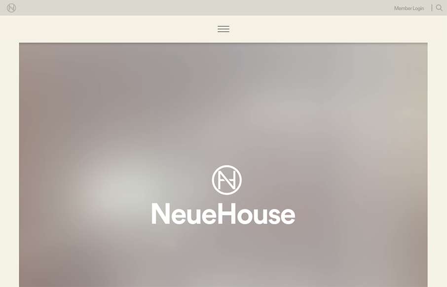
I think I’ve spent about longer looking at this site for NeueHouse then I normally do for reviews. The site is extremely well put together – love the secondary nav at the top and bottom, as well as the movement overall on the site. The work on the...

by Aaron Griswold | Oct 5, 2015 | Entertainment, Gallery
“Design. Changes. Everything.” – Amen. Great website and video work here from InVision, about a topic that’s pretty near and dear to our hearts (and probably your’s too). It’s a promo site for a documentary on how design is...
by Gene Crawford | Sep 24, 2015 | Gallery
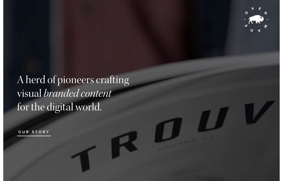
Cool, image heavy site. I really like the hero image style video and then how the navigation comes up under that as you scroll and then sticks as the header. The remainder of the page is nicely organized and continues with the great imagery. From the Designer: Oxen is...

by Gene Crawford | Sep 22, 2015 | Community / Social Networking, Gallery
Really nice and clean layout for the Atlanta Tech Village website. I like the way they are showing you people in the space, with photos and video background, etc… the home page keeps you streamlined and puts what people would want to know most up front. This...