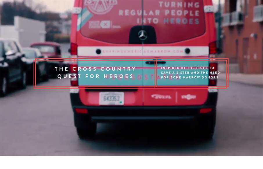
by Gene Crawford | Nov 9, 2015 | Gallery, Nonprofit
The team here at strADegy would go to the worlds end for these three brave and adventurous women. We were honored to help give Sam, Alex, and Taylor the extra help they needed to travel the country and look great doing so. The website was the final piece to the...
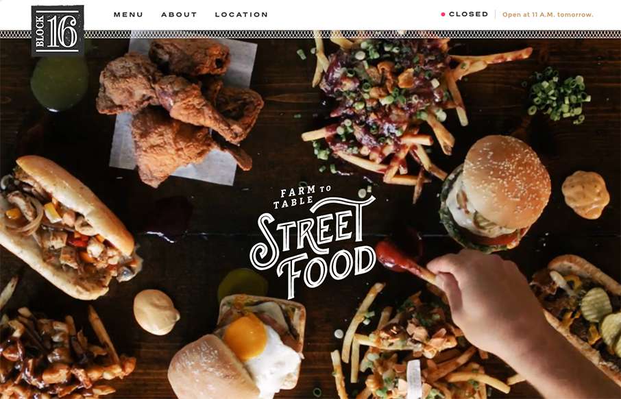
by Aaron Griswold | Nov 4, 2015 | Food and Beverage, Gallery
One more example of how restaurant sites are finally getting facelifts – love this one that Grain & Mortar did for Block 16 out of Omaha, Nebraska. As an aside – restaurant websites have always been horrible (here’s my 2nd site I ever made for a...
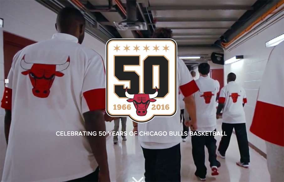
by Aaron Griswold | Nov 2, 2015 | Gallery, Sports/Recreation
Tight and fast sub-site from the Chicago Bulls – great visuals on the video and image backgrounds – and surprisingly no scroll-jacking. Looks like they are still adding some content to the site (Teams / Players) – but really like where it’s...
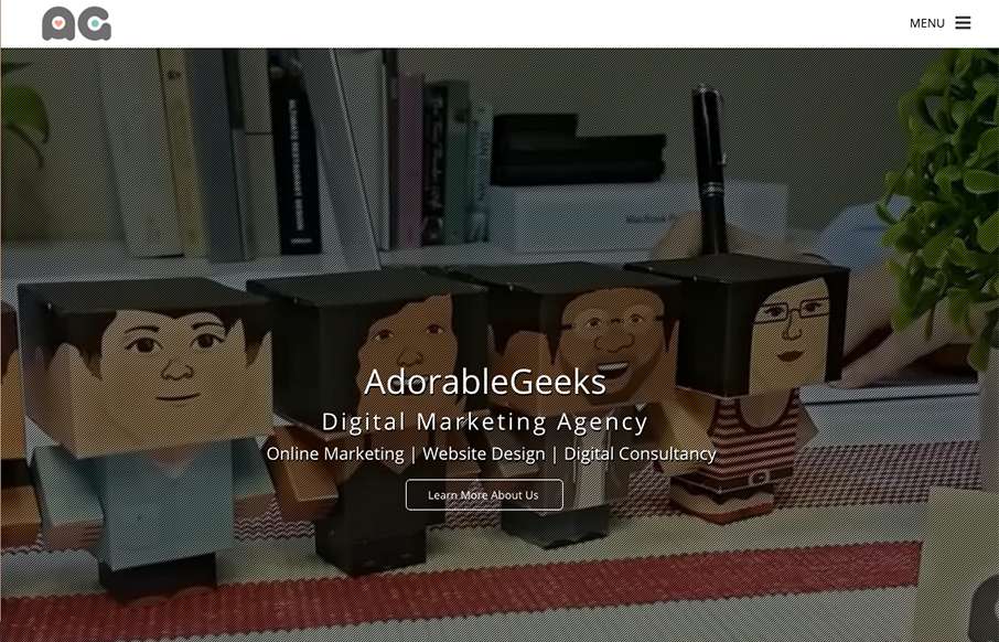
by Aaron Griswold | Oct 28, 2015 | Gallery
Really like the full screen/page video background as an intro the the AdorableGeeks site (out of Singapore). Also like how they carry that concept to their work detail pages under Showcase – it may be another click downstream, but the full screen/page image that...
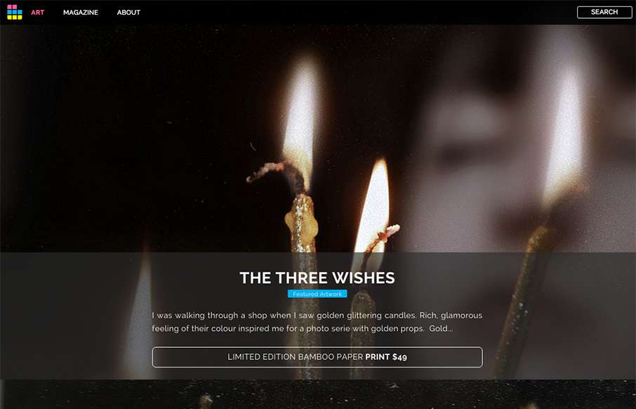
by Aaron Griswold | Oct 15, 2015 | Gallery, Photography
Looks like ArtSocket has changed it up a little since we reviewed them in January. They’ve continued to focus on the Art side, but making the experience a little more immersive with the full-width art scroll on the home page, and more detail on interior pages...