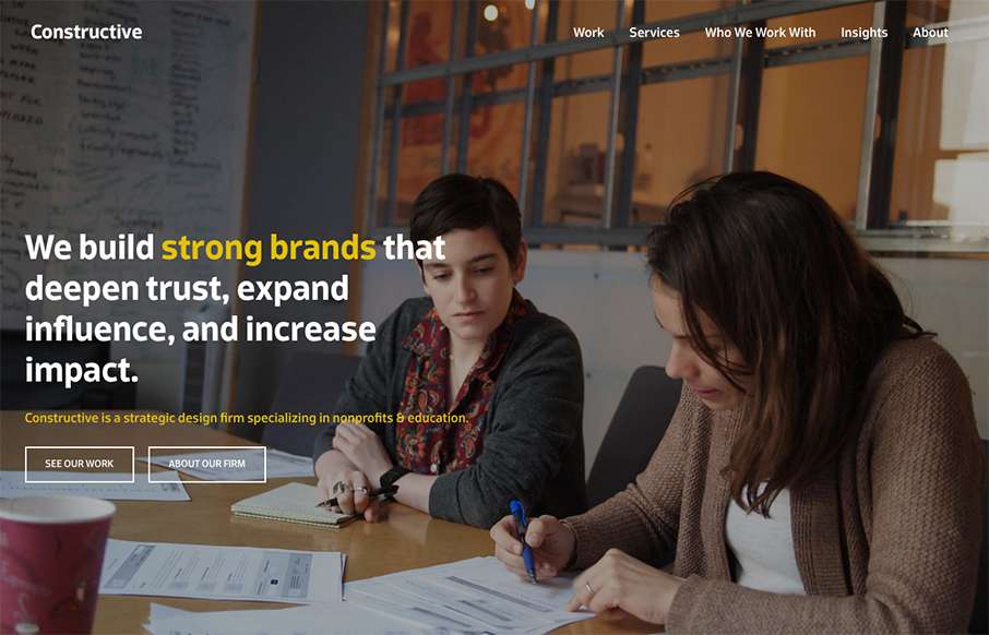
by Gene Crawford | Nov 4, 2015 | Gallery
It’s a fairly standard approach to a layout but I dig it. I like the way the large splash image blends on top of the modular boxes below it. It feels fluid this way. Add in some decent responsive design and it makes for a great site.
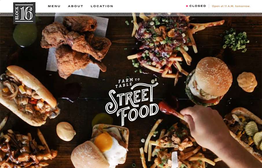
by Aaron Griswold | Nov 4, 2015 | Food and Beverage, Gallery
One more example of how restaurant sites are finally getting facelifts – love this one that Grain & Mortar did for Block 16 out of Omaha, Nebraska. As an aside – restaurant websites have always been horrible (here’s my 2nd site I ever made for a...

by Aaron Griswold | Nov 3, 2015 | Gallery, Product
We’re reviewing this page for this page only. It’s a good example of great, clean product (product feature) page – good funnel – good illustrations. (keep in mind that parts of the JotForm site need a good bit of work design-wise – so my...

by Aaron Griswold | Nov 2, 2015 | Gallery, Sports/Recreation
Tight and fast sub-site from the Chicago Bulls – great visuals on the video and image backgrounds – and surprisingly no scroll-jacking. Looks like they are still adding some content to the site (Teams / Players) – but really like where it’s...

by Aaron Griswold | Oct 28, 2015 | Gallery, Portfolio
Solid and simple portfolio from Emma Lawler out of San Francisco. I like the movement when you click a work sample – also like that there are only three work examples (as not to clutter the page), but that each example has a nice quick narrative, so you get a...