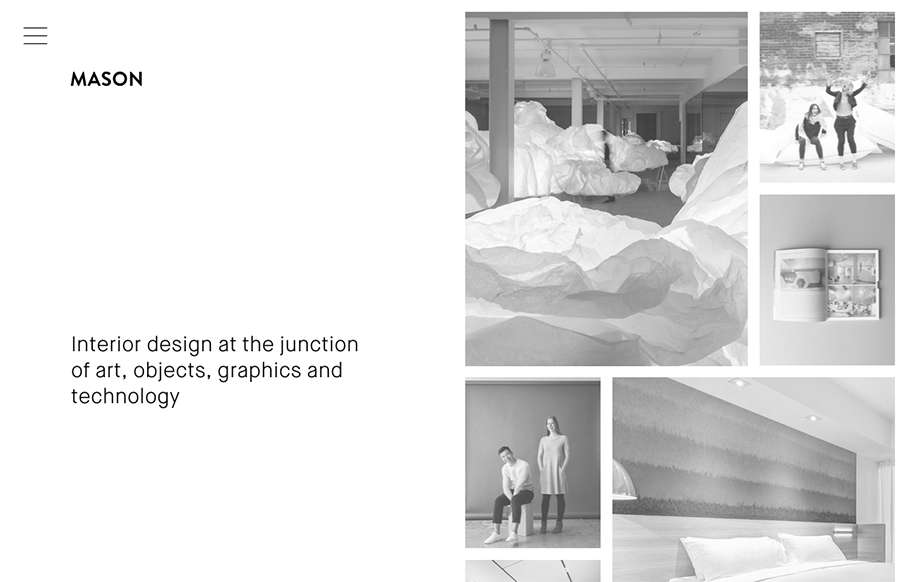
by Gene Crawford | Sep 30, 2015 | Gallery
Really cool minimal approach to the interior design studio Mason’s website. I dig that you basically only check out some images then there’s the hamburger menu, because they take you to some good sample pages of the company’s work. Simple flow of...
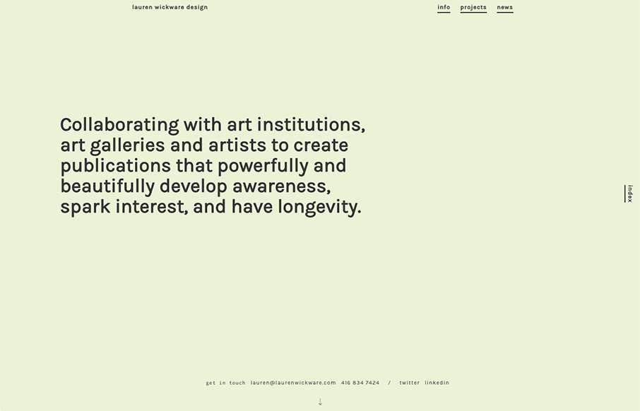
by Gene Crawford | Sep 8, 2015 | Gallery
I love, love, love the way the scrolling works on this website. It’s smooth and very unique to experience. Very memorable experience here.
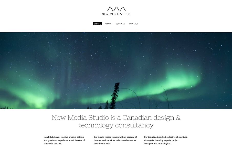
by Aaron Griswold | Apr 22, 2015 | Gallery
Love the stark white that is the canvas for New Media Studio out of Toronto – mainly because of the Northern Lights video background – cool intro. Like the filtered search on the Work page, and like that it’s not jQuery Masonry. And I think...
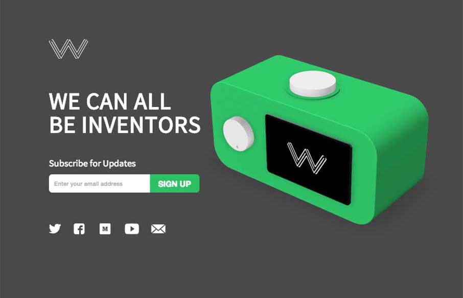
by Aaron Griswold | Feb 17, 2015 | Gallery
Good site and great idea from Wattage.io out of Toronto. Like the integration of the video demos to give you a feel for how the app really works – this is a case where showing your app on your one pager is actually a good thing. Simple, clean, and useful –...
by Gene Crawford | Feb 16, 2015 | Gallery
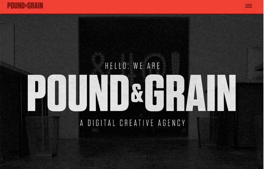
I really like the movement of the Pound & Grain site, out of Toronto. The subtle use of parallax with background shapes and colors, coupled with the images and copy make for a great experience. Also like the little vibrance of the animated gifs hero images, that...