by Gene Crawford | Sep 22, 2015 | Gallery
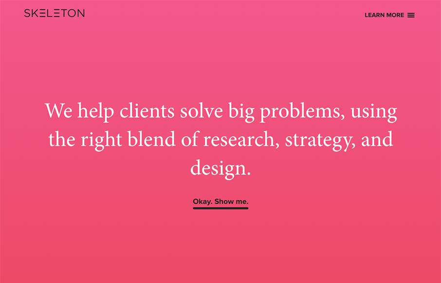
Clear layout and hip colors and type make the Skeleton website stand out. I like the focus on the case studies first – after all it’s what you want people to check out. I dig that you get a bevy of info after you make your way past those 3 project...

by John David Hunt | Jun 23, 2015 | Gallery
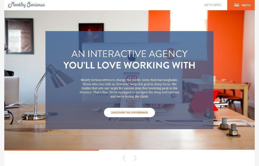
Many agency sites use large photos to bring out the human nature of their company and give us a glimpse to their habits and personalities. Others showcase their skills heavily and give no hint of who or how their work is done and practiced and whether there are humans...

by Gene Crawford | Dec 15, 2014 | Gallery
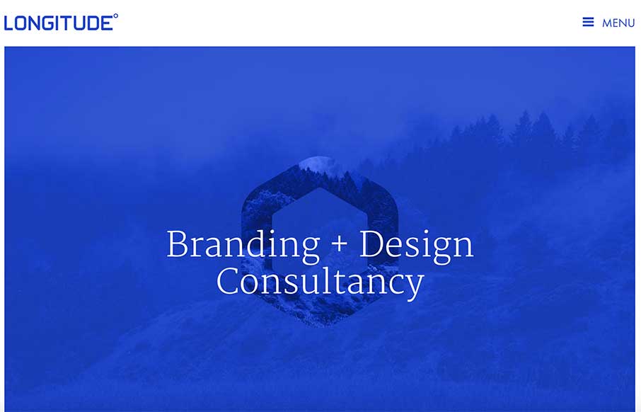
Pretty straight forward layout, but fitted with some nice tight detail work. I really dig the subtle impression you gain by viewing this site. Submitted by: Dustin Myers @dmyers09 Role: Designer

by Gene Crawford | Oct 21, 2014 | Design Firm, Gallery
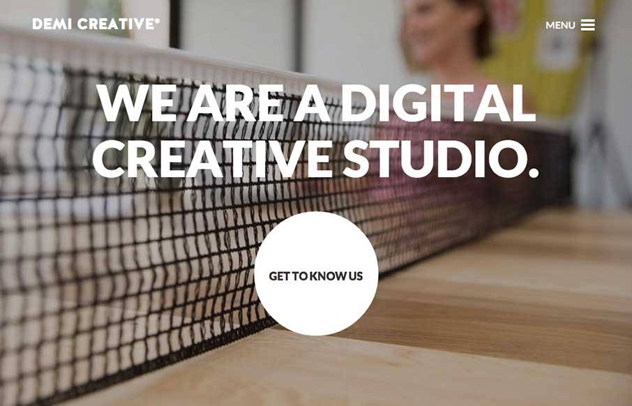
Big bold visual style for Demi Creative. I dig it. I like the simplicity implied into the site design, the main link is the “get to know us” call to action and it draws you in. The nav under the hamburger icon feels slightly lost but once you dig into the...
