by Gene Crawford | Aug 18, 2015 | Gallery
The strict “blocky” grid in this design is pretty cool. It’s been done before and fairly straightforward but when used in this context it feels fresh and unique almost. I dig the fixed left nav too. Check the different screen width design changes out...

by Gene Crawford | Jul 7, 2015 | Gallery
I’m not always a huge fan of super dark websites like these, but in this case there are some pretty great parts. I like the gold mixed in with the dark vibe. I like the second section, under the hero/video area a great deal. I really like how it loads in....
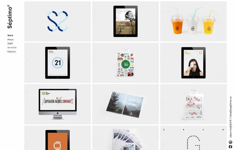
by Gene Crawford | Jul 3, 2015 | Gallery
There is some really fun interaction going on here. The logo and the mouseover animation is brilliant, I love the top left treatment too. Down to the interactions over the work samples as you scroll down the home page which are nicely done as well. These guys really...

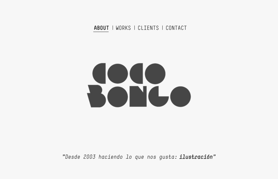
by Aaron Griswold | Feb 17, 2015 | Gallery, Portfolio
Good one-pager portfolio site from Martin Gonzalez out of Barcelona. Like the play of the headline copy over the slideshow and the on-scroll fly-ins. It might scroll a little too fast, but it’s well thought and laid out. Submitted by: Martin Gonzalez Twitter:...

by Aaron Griswold | Nov 13, 2014 | Gallery, Portfolio
Oscar Barber has a good clean portfolio site. Sometimes that’s just perfect – forget the bells and whistles and just make something good – Oscar did. Submitted by: Oscar Barber Twitter: @oscarbarber Role: Designer / Developer “Hi, this is my...