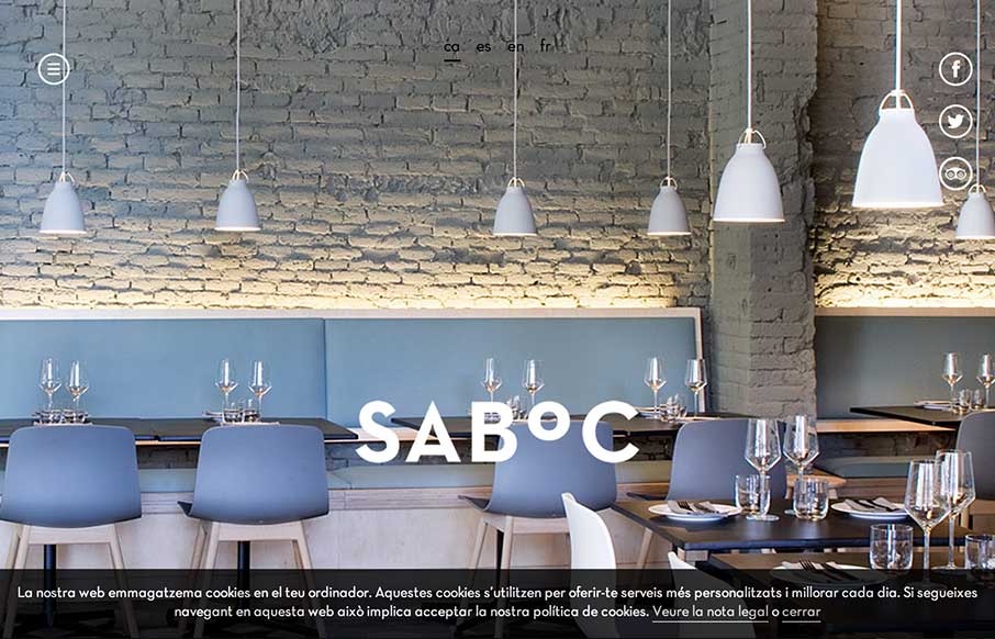
by Gene Crawford | Oct 10, 2014 | Food and Beverage, Gallery
Cool site design. I like the vibe of this single pager. The hamburger icon is in play here, but it’s really just for anchors along the page. Nice use of that in this instance IMHO.
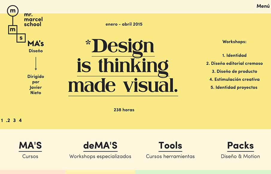
by Gene Crawford | Oct 8, 2014 | Education, Gallery
What a fun looking visual brand. Nice to see it spill out onto the overall layout and design of the website too. Lovely stuff.
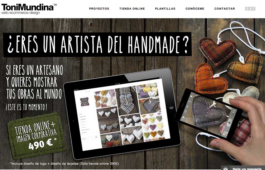
by Gene Crawford | Sep 26, 2014 | Gallery, Portfolio
It’s a standard clean style layout that has good responsive adaptations applied to the design. What I like most is the work put into the imagery, it takes time to get stuff like that to show off in a way that’s compelling. Submitted by: Toni Mundina Role:...