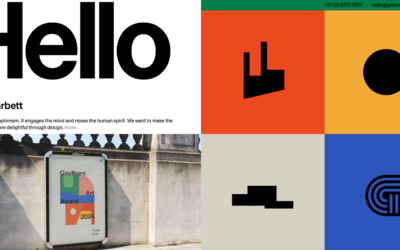
Solid typography and grid work. I love the grayscale/mono coloring and the boldness of it. Another subscription design based shop too. Interesting IMHO.
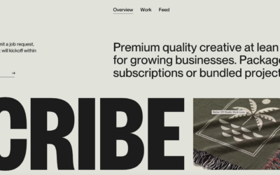
Solid typography and grid work. I love the grayscale/mono coloring and the boldness of it. Another subscription design based shop too. Interesting IMHO.
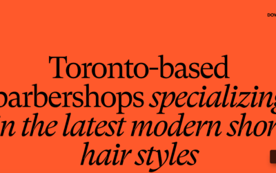
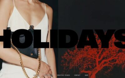
I really like this design, especially considering it's not a web design firm website. It's for a barber/stylist!
Fun interactions and layout. I don't normally love the cursor take-over but in this case it's fun and works. Clean interactions make this website really work.
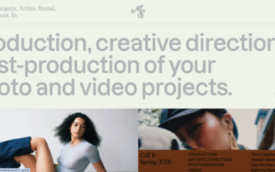
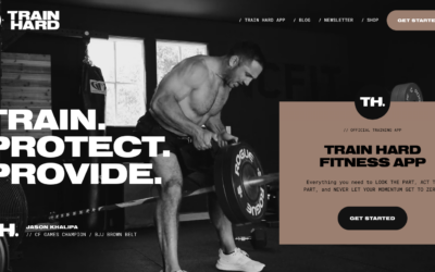
Bold typography and photos. I like a lot of the details here like the overlay meta info on the images. Solid work.
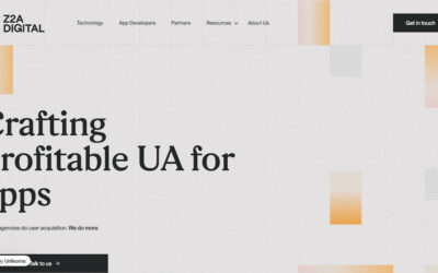
Nice bold typography and sticky grid. I like the dark background utilized here too.
Branding, design & creative agency in Sydney. Specialising in brand identity, packaging design, print & digital communications, websites, advertising campaigns.
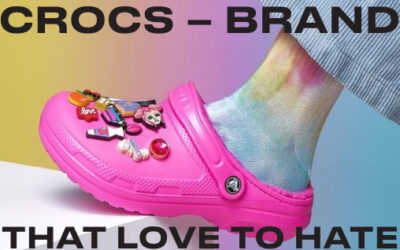
Website on the history of Crocs: from a startup in 2002 to a global leader in comfortable footwear, thanks to innovative designs and materials. Discover key milestones and the brand’s worldwide popularity.
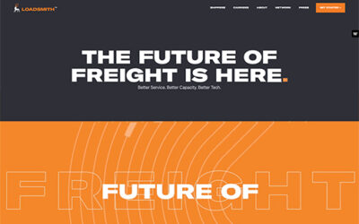
Navigating the complexities of the autonomous trucking world, La Visual redefined and reinforced Loadsmith’s position as a “Driver First” leader. Drawing upon our previous branding success and using comprehensive digital strategies, we further established Loadsmith as a trailblazer, seamlessly intertwining technology with a deep-rooted respect for the driver’s role in the industry.
Very nice product website. It's got some of what you'd expect with the layout but also has some nice minimal interaction as you scroll. Good clean work here.
I love the simplicity in the layout but the layered complexity from the interaction of this website.
Dentistry tool website that comes off like an agency website. I dig it, it brings some fun to an otherwise stuffy feeling industry.
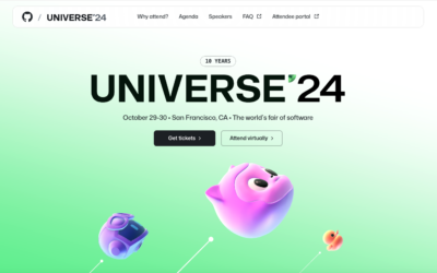
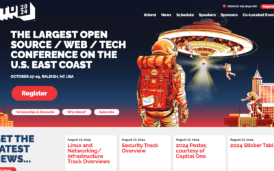
Nice conference website for GitHub Universe. I like a lot about this, what do you think?
Cool targeted scrolling points on this design. I love the oversized typography too. Interested in your take on the business concept. What do you say?
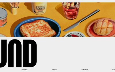
I really love the illustration work and the textures. There are a lot nice little nuggets of animation and interaction as you scroll the home page. Bravo!
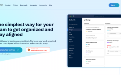
Really nice grid usage for this website. I really dig the simplicity in the layout and then all the little surprises as you start to interact with it. Subtle and straightforward.
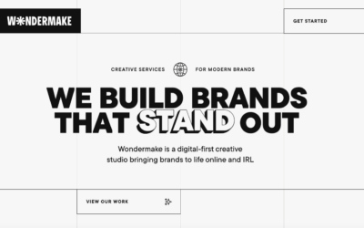
Another pretty great minimal design. This is a wonderful example of a design approach working for something other than a designer or design firm's website. Love it.
Super cool minimal approach to the design for this website. I really like the way it 'uncovers' itself for you as you scroll. Smartly done.
Website for branding and animation agency.
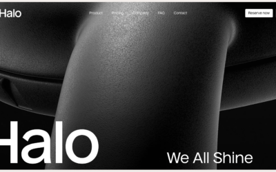
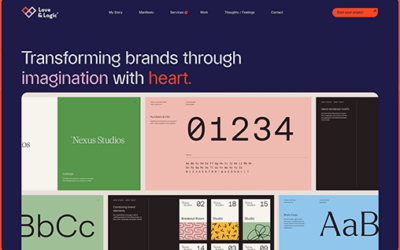
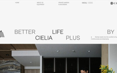
Superbly done grid and overall layout. I love the monochromatic approach the colors too. Very classy and 'high-end' vibe.
I really dig the super clean grid. Juxtaposing the text/copy and the images in such a clean way makes the vibe very professional. Museum level almost.
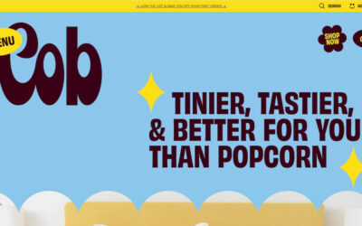
Really visually fun design. Much like the subject matter, popcorn, the designers could really go for it. I love the branding here, even the pop-up keeps with it.
Nice clean grid based design with minimalist color palette. There are some nifty visual surprises as you scroll the page(s). Well done.
I like the background, it 'feels' fuzzy and clean at the same time. I really dig the grid as well, feels swiss in it's approach.
Pretty radical looking design for something pretty straight forward as pastries. I kinda love it.
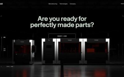
I like the stark black and white approach to this website design. It keeps it classy and focused. The strong typography matches well with the subject matter.
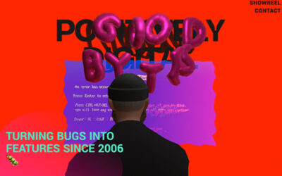
Explore this maximalist site at with interactive shaders, poppable balloons, GSAP animations, a 3D character, and a showreel of Three.js class demos and student projects.
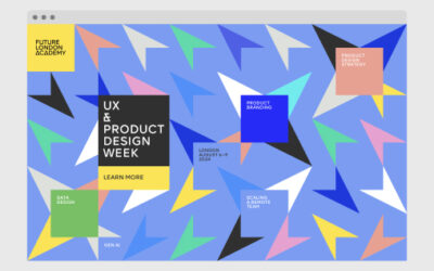
To celebrate the upcoming UX & Product Design Week Future London Academy’s design team created a fun and engaging landing page.
