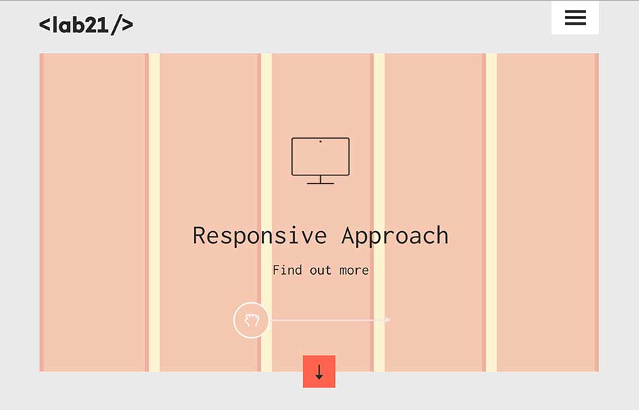
by Gene Crawford | Oct 7, 2014 | Gallery
There is really a lot going on with this site to love. I really dig how it’s educational as well as neat looking. With the ‘responsive approach’ thing up in the hero area they are using it to describe to potential clients exactly what they’re...
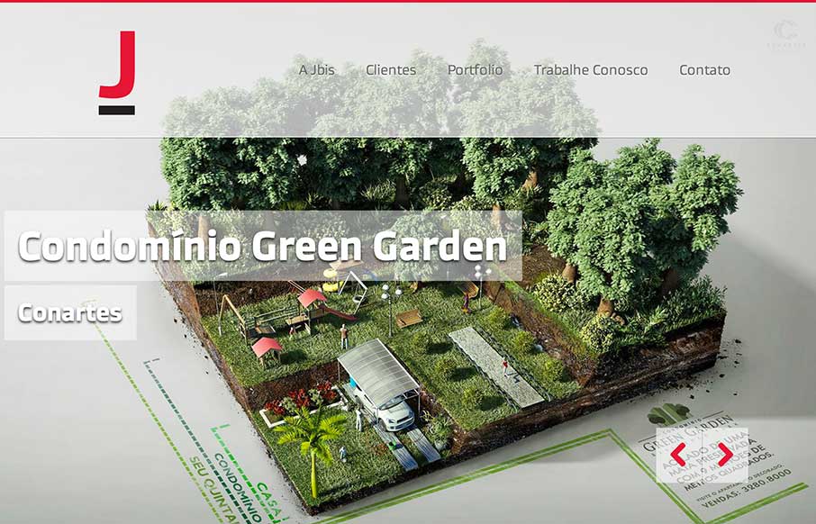
by Aaron Griswold | Oct 7, 2014 | Design Firm, Gallery, Marketing Company
The vibrant images in the slider really help to sell the rest of the one page site. The interaction of the form fields are pretty cool too. Submitted by: ORO Digital Role: Designer & Developer
by Aaron Griswold | Oct 3, 2014 | Design Firm, Gallery
This is a case of the ubiquity of the internet. Maybe it’s because I live in a place that has a lot of “first-world” problems, but I was pleasantly surprised when I saw that Fiasam is based out of Pakistan. Besides the fact that this is a simple,...

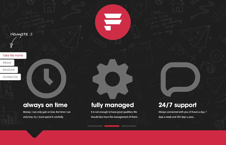
by Gene Crawford | Oct 2, 2014 | Gallery
I like a lot about this website. It’s simple, single page, minimal color palette. But it communicates what they do and has some bells and whistles to show off to potential clients. Submitted by: Pedro Thomaz @PTthe13 Role: Designer Clean and modern single page...
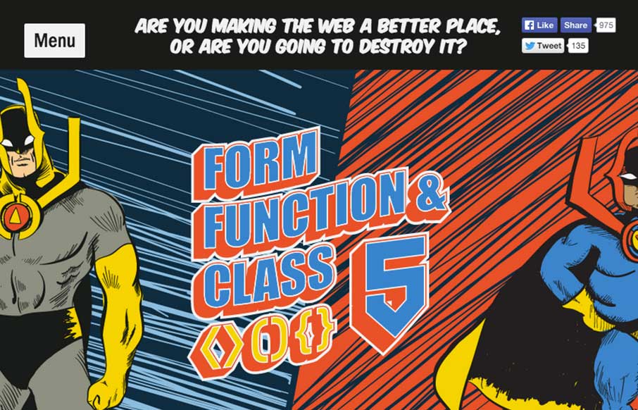
by Gene Crawford | Sep 29, 2014 | Gallery
Very neat design. I like the hero/comic book vibe and bold approach. I also really dig the ken burns effect on the main hero image area. Fun and inviting. This is our* conference site for the year, designed by Aceler Chua of The Missing Bulb and Angello Alarcon. We...