
by Gene Crawford | Oct 20, 2014 | Gallery
Really cool usage of transparency across sections of the layout here. I really dig how that header’s background fades into white then back out as you scroll back up. Smart details make this site really stand out to me. Submitted by: Marc Hinse @MadeMyDay Role:...
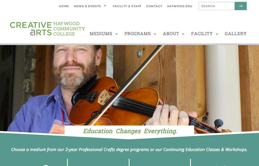
by Gene Crawford | Oct 17, 2014 | Education, Gallery
Sweet responsive site for Haywood College. I like the downward angle used to anchor the page visually, that’s a nice touch. Marisa Falcigno @helloODDS Role: Designer & Developer The website project was integral in highlighting the new identity while...
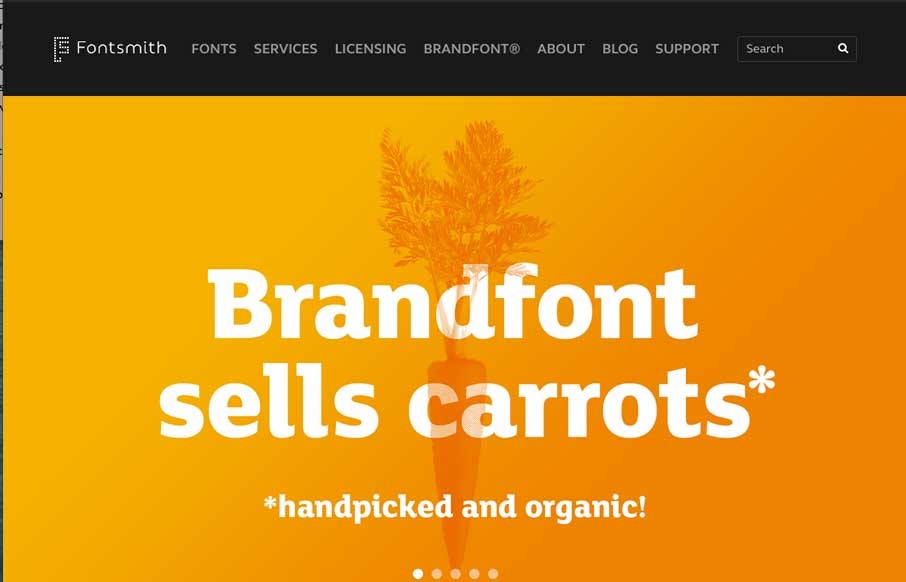
by Gene Crawford | Oct 15, 2014 | Gallery
Very clean and simple design but very effective. Especially for font websites brevity is clarity. Luuurrve this.
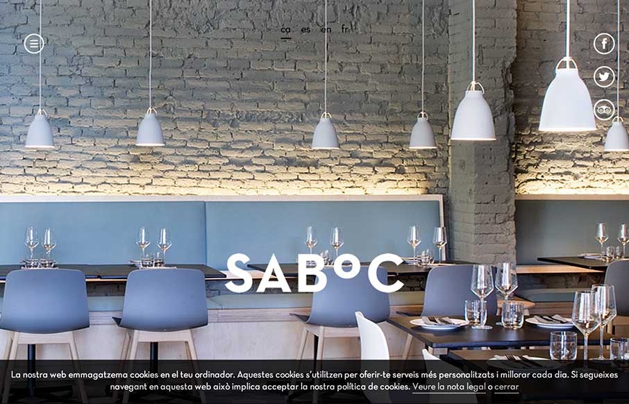
by Gene Crawford | Oct 10, 2014 | Food and Beverage, Gallery
Cool site design. I like the vibe of this single pager. The hamburger icon is in play here, but it’s really just for anchors along the page. Nice use of that in this instance IMHO.
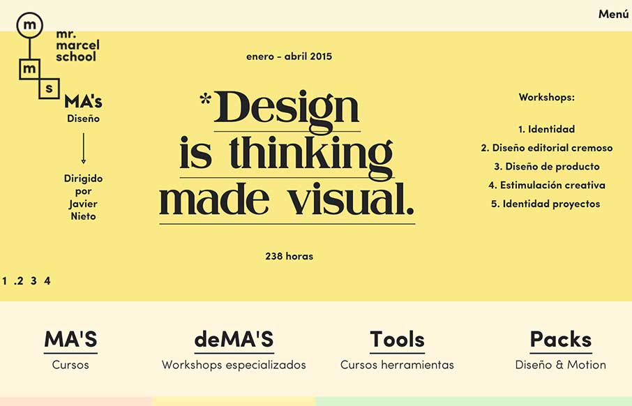
by Gene Crawford | Oct 8, 2014 | Education, Gallery
What a fun looking visual brand. Nice to see it spill out onto the overall layout and design of the website too. Lovely stuff.