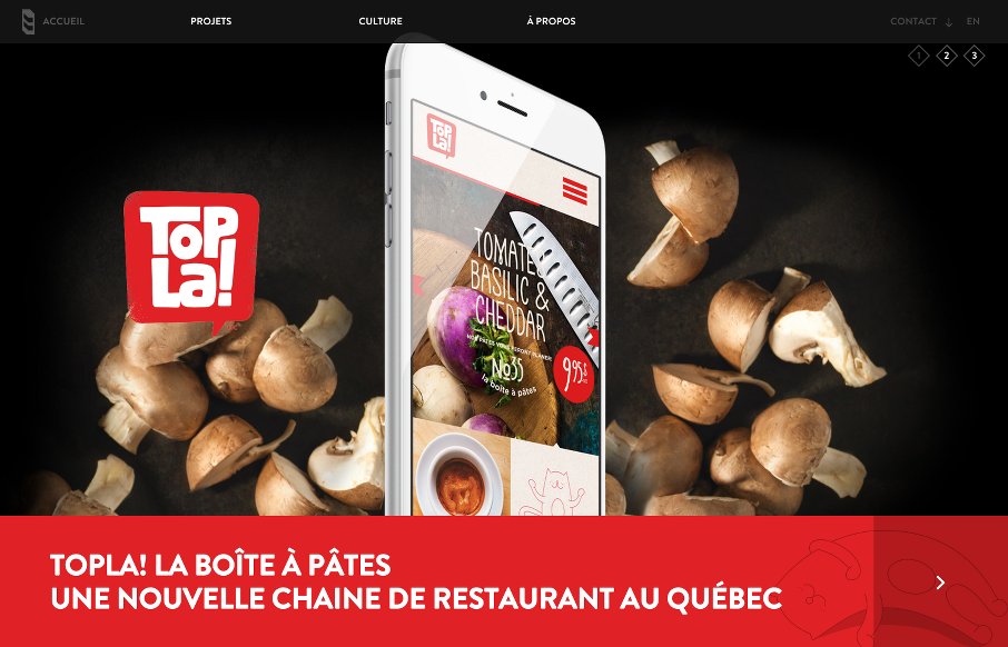
by Aaron Griswold | Apr 14, 2015 | Gallery
Dig the full-width, parallax slideshow on the home page of the 8 Bis Branding site out of Montreal. Found it interesting that they went for filtered search on two pages – Projects and Culture – but the categories on each make sense. There’s also some...
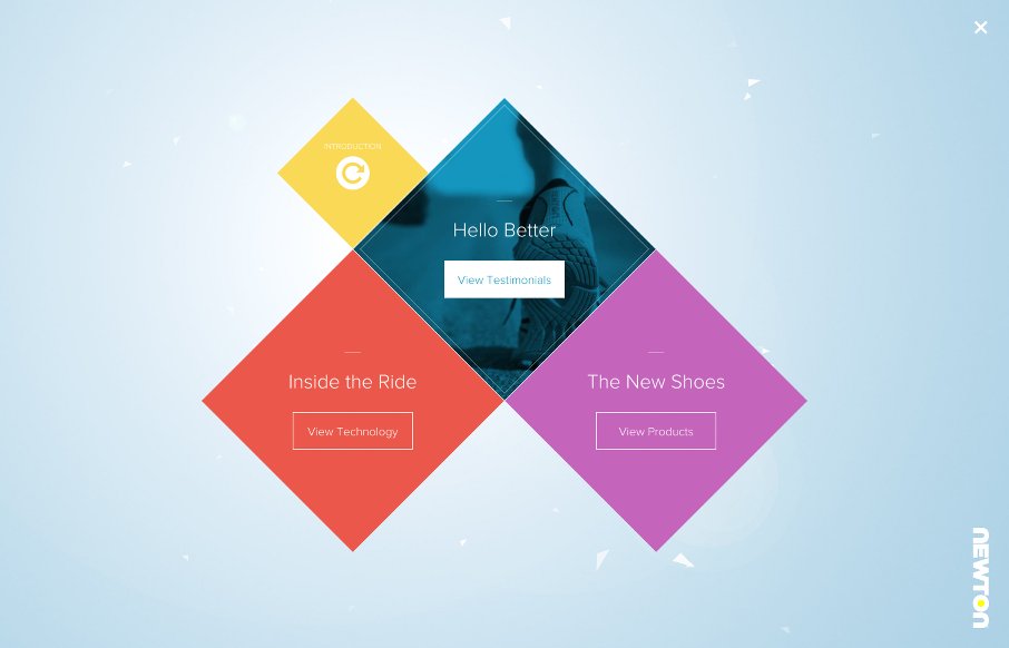
by Aaron Griswold | Apr 13, 2015 | Gallery, Sports/Recreation
This site has been out for a while, but while looking at shoes for races coming up, we found the Newton Running site – wow. From the cool navigation and transitions on the “home page” after the intro, to the interactive parts when viewing the shoes...
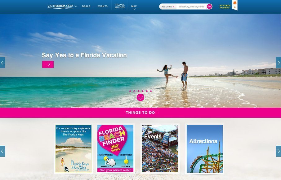
by John David Hunt | Apr 13, 2015 | Gallery, Travel
John has been helping us work on posts for UMS, and left me some comments that I figured were more relevant for the Visit Florida site than what I would have written – so here’s his first post: Heavy on the card design and utilizing images works well for...
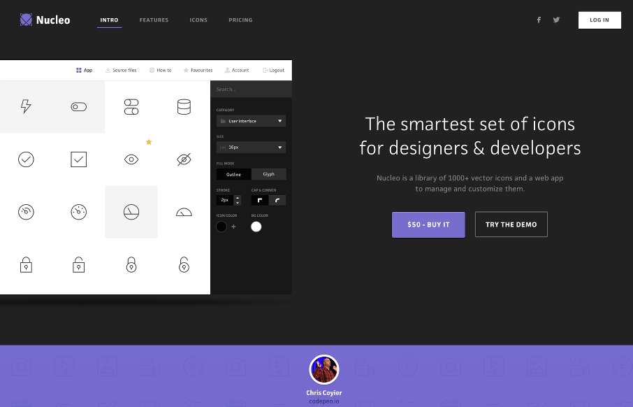
by Aaron Griswold | Apr 9, 2015 | Gallery
We hadn’t reviewed an app product site for a while, and at first I wasn’t sure to just keep this one as a resource for Radar, but I liked the basic clean look of Nucleo’s site. With suped-up intros and pre-loaders becoming a new trend, I like the...
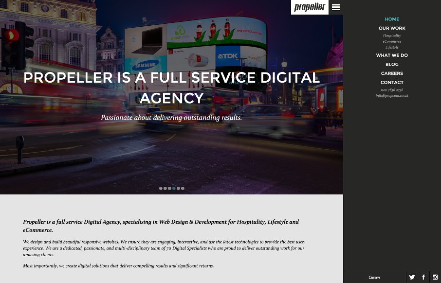
by Aaron Griswold | Apr 8, 2015 | Gallery
Like how Propeller Communications out of London uses the off-screen nav hamburger – but with a caveat – they start the site with with the hamburger open in vertical nav, that you can decide to close to gain screen real estate. From the Designer: Propeller...