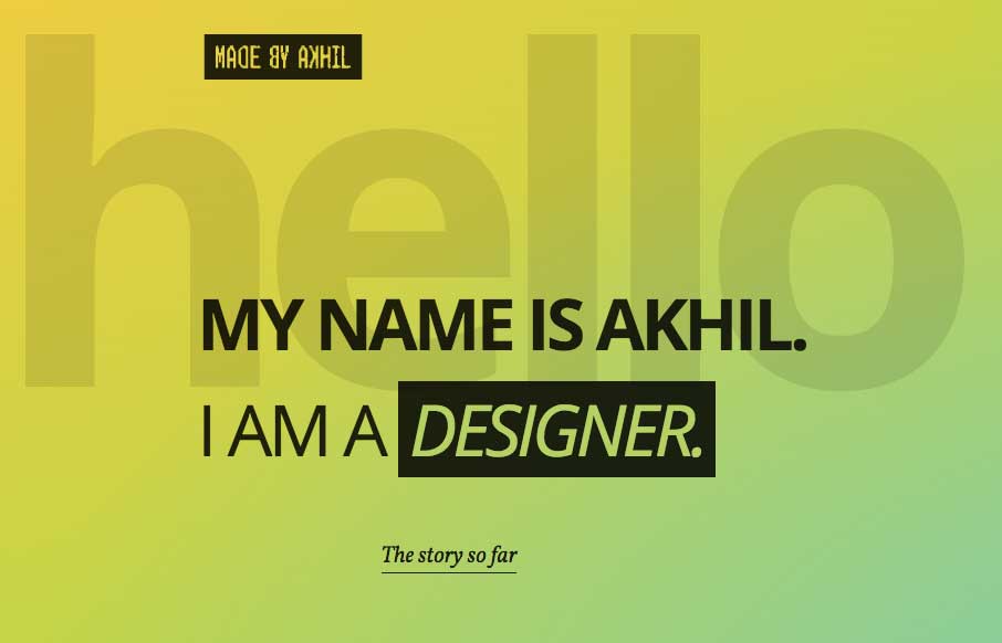
by Gene Crawford | Jun 14, 2016 | Gallery
Pretty cool starting section that leads to a more standard feeling layout. I dig this, this transition and the sub-sections too. They’re very intuitive with the arrows and work smooth as you scroll. The footer section is also solid information design wise too....
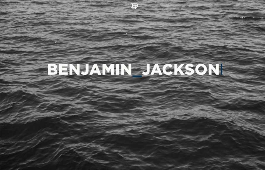
by Gene Crawford | Jun 10, 2016 | Gallery, Portfolio
Large blocks of layout and some nice style touches make me really like the Benjamin Jackson portfolio website design. My favorite part is the way the logo stays in place as you scroll down, solid idea. I also love the strong grid and minimal footprint the site has...
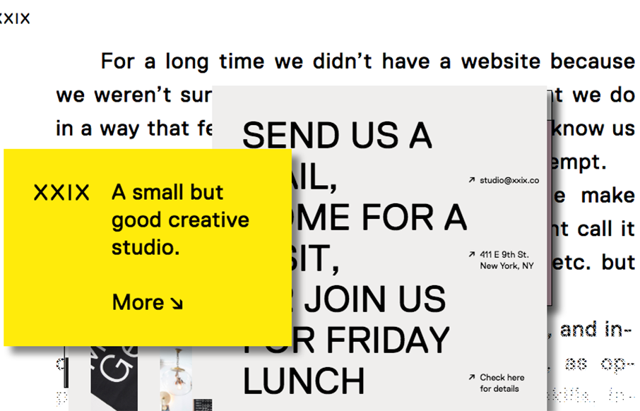
by Gene Crawford | Jun 9, 2016 | Gallery
A good way to show you’re a “new” type of interactive firm is to show it off in your work. Twenty Nine NYC doest that well here with their website. It’s not the most highly functioning site in terms of pure usability but it’s not that bad...

by Gene Crawford | May 18, 2016 | Food and Beverage, Gallery
Some really crazy parallax and interactions on the Rumchata website to get you going.

by Gene Crawford | May 16, 2016 | Design Firm, Gallery
Woah. That’s what I said when I first loaded this site up. It’s plenty full of visuals and good looking teaser imagery. It’s pretty solid in execution too. I love that first moment when you start to scroll this site down the most. It’s a nice...