by Gene Crawford | Sep 18, 2012 | Gallery
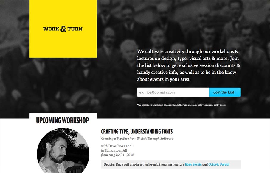
Nice asymmetrical yet super balanced feeling design. From the colors, the yellow and black with that blue is striking – can you make colors feel asymmetrical too? Super clean look and feel with some superb type handling pitched in for good measure.
by Maria | Sep 13, 2012 | Food and Beverage, Gallery
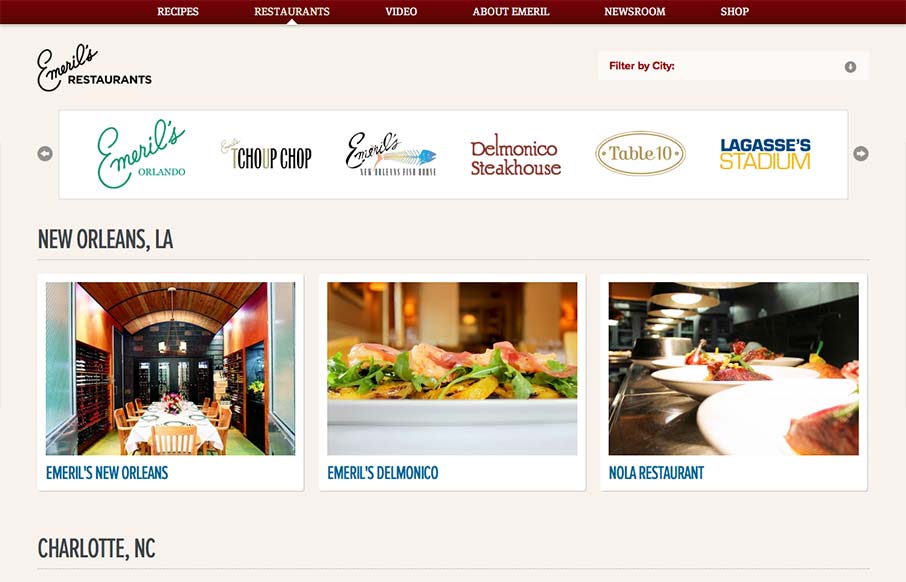
Aside from the oddity of having different sites/URLs in the main nav, the restaurant “site” is really nice. It has a clean design with gorgeous imagery (cuz let’s face it, Emeril’s food is a dream) and a great layout of information. It’s...
by Gene Crawford | Sep 12, 2012 | Gallery
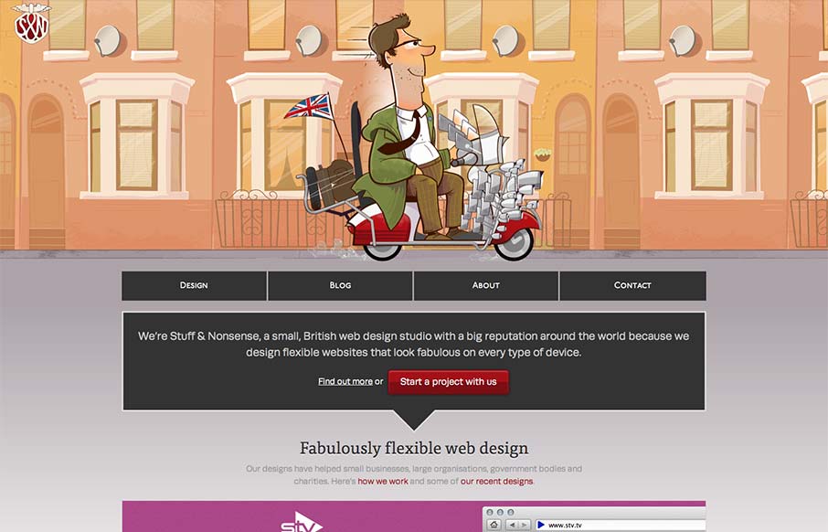
Super fun reboot from Andy Clarke’s stuffandnonsense.co.uk website. Outside of the technical stuff, which yes you should go view source and pour over it. The header is so fun, the illustrations of the dude on the bike with the animated background makes it so...
by Giovanni DiFeterici | Sep 11, 2012 | Design Firm, Gallery
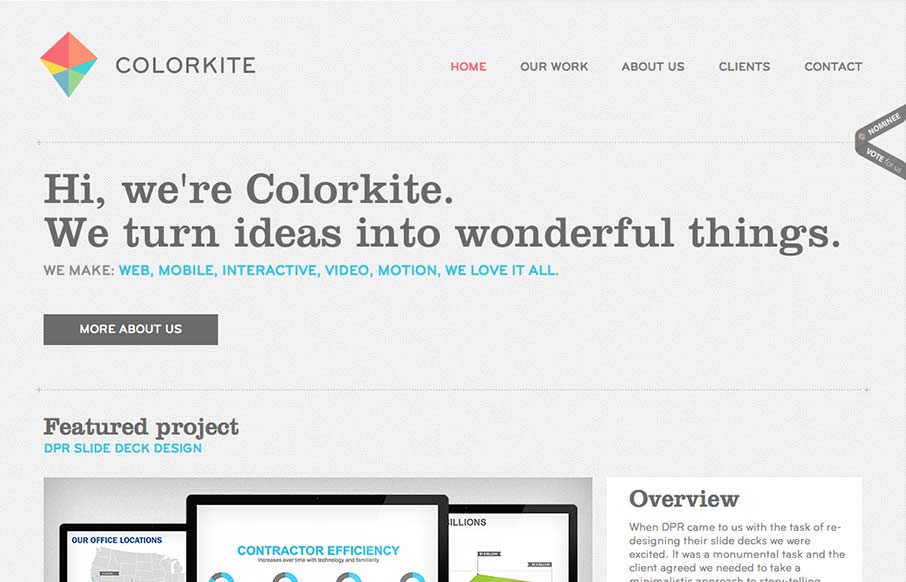
Colorkite is a clean, minimal design that does a great job at getting out of the way of the content. The typography is pretty solid and the color palette is subtle and sophisticated. The site is responsive, though it looks a little disjoint at some screen sizes. The...
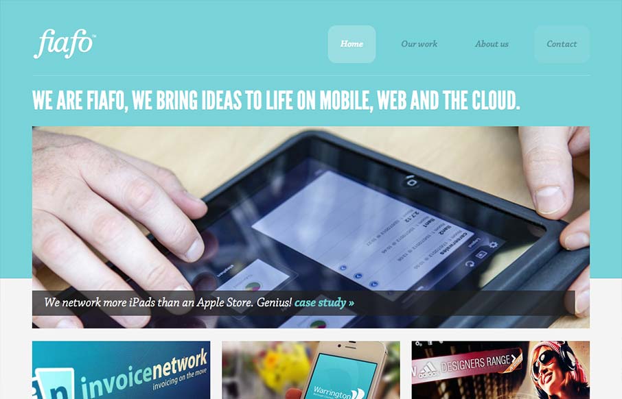
by Maria | Sep 10, 2012 | Gallery
There’s a pretty structured grid feel going on here. The use of League Gothic emphasizes the grid weight, but Chaparral Pro is a welcomed contrast. I think both typefaces are executed well enough to marry the crisp imagery with the fun illustrations. I like the...
