
by Gene Crawford | Sep 25, 2012 | Gallery
I like the contrast between the dark background in the top half and the white in the bottom half. It’s a nice responsive layout too, check out how those main 4 icon/sections change when targeting different screen widths yo. I also really dig how there is...
by Gene Crawford | Sep 24, 2012 | Entertainment, Gallery
Cool vibe to this scroller website. I really dig how there’s a slight parallax thing going on with the show sections/images, it really helps give it some depth interaction wise. The flip over effect on the lightbox windows for the show details is unexpected yet...

by Gene Crawford | Sep 21, 2012 | Gallery
I gave Modernizr․com a small facelift: faster, less finicky, clearer intro text. Enjoy! modernizr.com— Faruk Ateş (@KuraFire) July 20, 2012 Been meaning to put the Modernizr site in the gallery for a while now. Faruk does a great job keeping the site alive...
by Gene Crawford | Sep 20, 2012 | Food and Beverage, Gallery
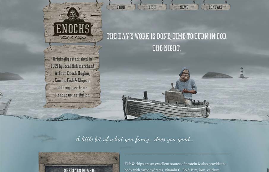
An unexpected responsive design here. It’s one of a few sites i’ve seen recently that takes a lot of the same RWD patterns and adds a layer of decoration on top of it (with the ship captain/fisherman theme) and pulls it off really well. I love the hook...

by Gene Crawford | Sep 18, 2012 | Gallery
There’s a lot to like about this design. The animation of the rows of houses spinning in a big circle like that is used perfectly in conjunction with the rest of the otherwise static feeling design. The design doesn’t beat you over the head with the...
