by Gene Crawford | Jan 8, 2013 | Gallery
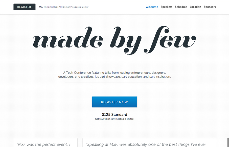
The Made By Few site employs a nice fairly minimal design. I like the blue for the call to action and the other black, white and grey helps to make other details like the speakers images really stand out. I like the progressive loading as you scroll too. Capped off...

by Gene Crawford | Jan 7, 2013 | Education, Gallery
The @happycog-designed responsive redesign of delval.edu is seriously stunning. Love. /via @zeldman— Responsive Design (@RWD) December 19, 2012 I love the visual style of this site. It’s blocky and squared off and generally feels very graphic. I dig the...

by Gene Crawford | Jan 7, 2013 | Gallery, Marketing
Beautiful design from a great company.pro.buysellads.com— allan branch (@allanbranch) December 20, 2012 Like Allan said, this design is beautiful. I like the vertical spacing of the elements, the clean color palette, the clear narrative of what BySellAds Pro is...
by Gene Crawford | Jan 4, 2013 | Gallery, Music
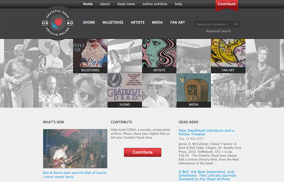
Went to gdao.org & time got away from me. What a wonderfully done site. One of my favorites.— Samantha Warren (@SamanthaToy) January 1, 2013 The thing I most like about this site is it’s information design. There’s a ton of stuff here to slog...

by Gene Crawford | Jan 3, 2013 | Gallery, Software
The crispness of this design just makes me smile. Then the subtle execution of the visual elements from the perfectly chosen color blue for the call to action, to the team display down to the faded map in the footer. There’s so much here visually it’s...
