by Gene Crawford | Jan 3, 2013 | Gallery, Software
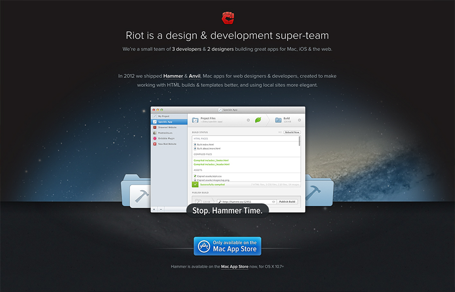
The crispness of this design just makes me smile. Then the subtle execution of the visual elements from the perfectly chosen color blue for the call to action, to the team display down to the faded map in the footer. There’s so much here visually it’s...
by Gene Crawford | Jan 3, 2013 | Gallery
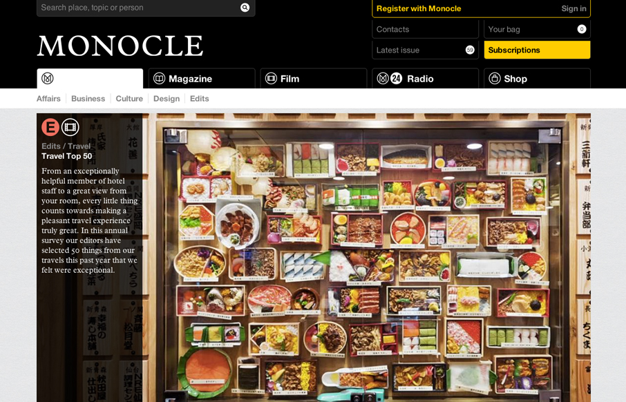
The new Monocle design is smart and sleekly crisp. I really love the header interaction design. It goes from full height to small and sticky very fluidly. Then the asymmetrical feel to the broken up grid of story blocks as you make your way scrolling down the home...
by Gene Crawford | Jan 3, 2013 | Gallery, Shopping
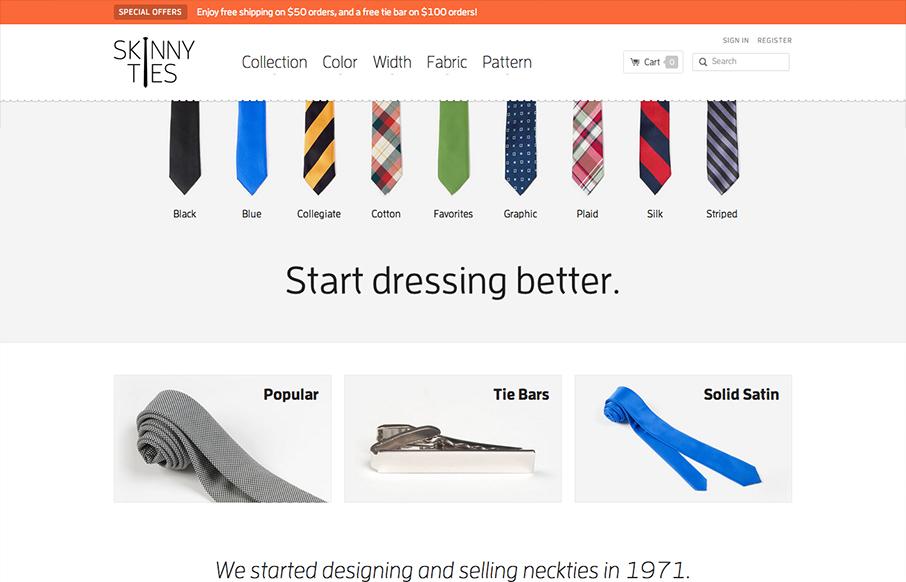
There’s so much to like with this site design! The layout is nice and clean and so well organized. Then the interactions steal the day with the little bobbing the ties do and the drop down design on the main nav. Then, it’s a responsive design to boot!...
by Gene Crawford | Dec 21, 2012 | Gallery
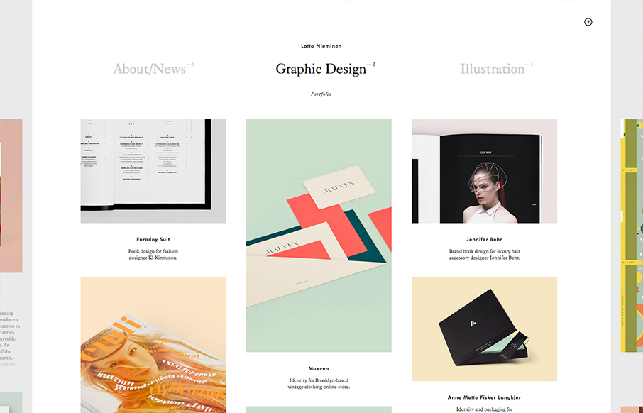
Very nice minimal layout with some nice design interest sprinkled here and there on the periphery. Then, BAM! You find out that stuff is actual navigational pieces to the site. What a great interaction surprise and reward for exploring as well as smart way to make...
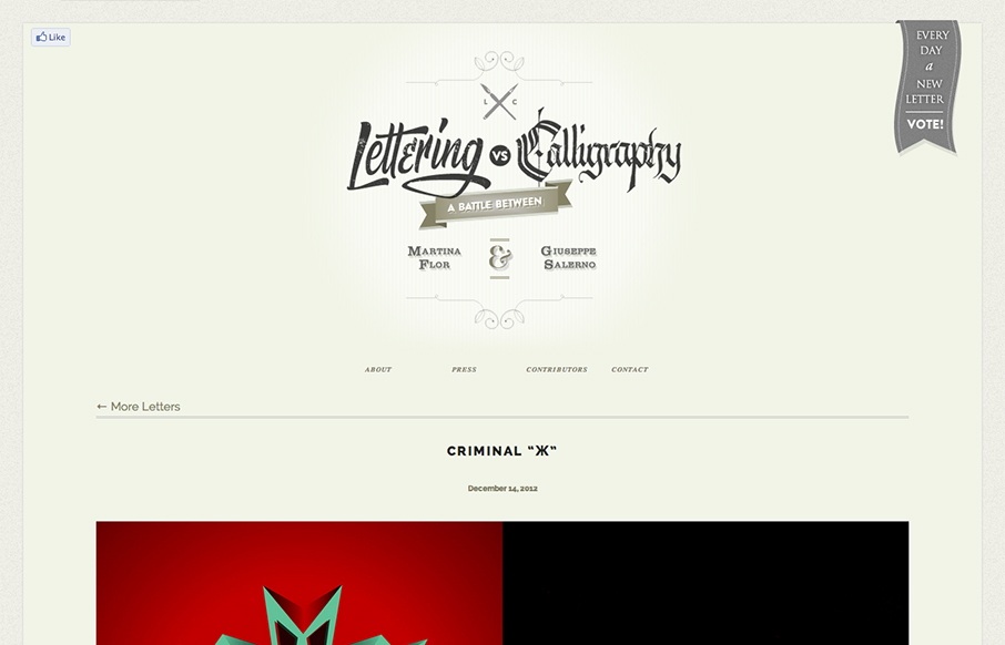
by Gene Crawford | Dec 20, 2012 | Gallery
First I didn’t know whether to make this a radar resource or a gallery entry. Duh! The design is hot so it goes in the gallery. There’s some nice little design flourishes here and there and I just want to keep scrolling and voting. Love this.
