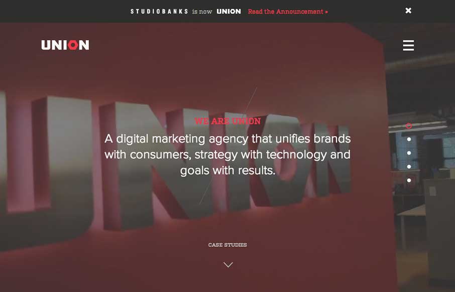
by Gene Crawford | Sep 24, 2014 | Gallery
Here’s a good example of a site pretty much hiding everything except a few links to case studies/work examples under a fly out overlay nav. I gotta assume this is by design. I do like the idea of keeping most people focused on your work like this btw.

by Gene Crawford | Sep 24, 2014 | Gallery, Sports/Recreation
Nice vibe to this design. I love the photography and the responsive work is pretty decent too. Nice seeing a lot of these patterns we see on other designer site’s employed successfully on client end-type websites. Submitted by: Carla Sartori @carlasartori23...
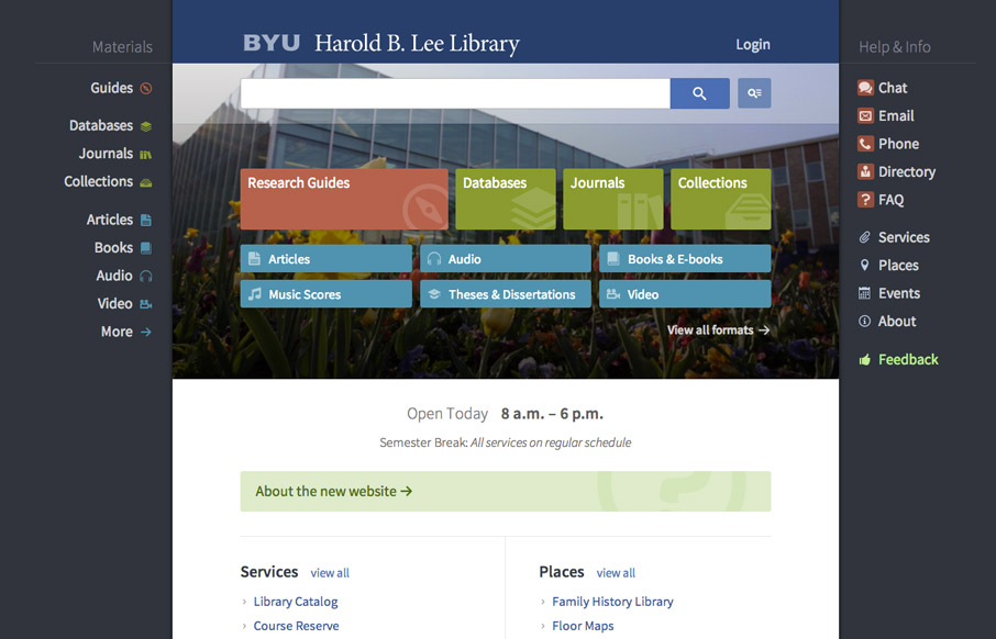
by Gene Crawford | Sep 22, 2014 | Education, Gallery
Very interesting user experience design going on. I really dig the fixed side menus a lot. Very smart interactions. Wow. Just wow. New website for @BYU Libraries: http://t.co/xxO000oA9E Soon to be the envy of all #libweb types. Nice work, @HBLL— Erin White...
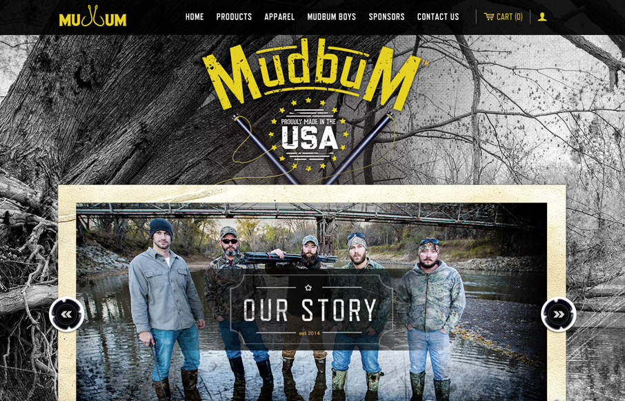
by Gene Crawford | Sep 22, 2014 | Gallery, Sports/Recreation
Interesting content with a good looking strong design to boost it up. I love how it tells their story so well and sets the tone with the visual brand at the same time. Makes me want to get out on the lake and catch some catfish man.
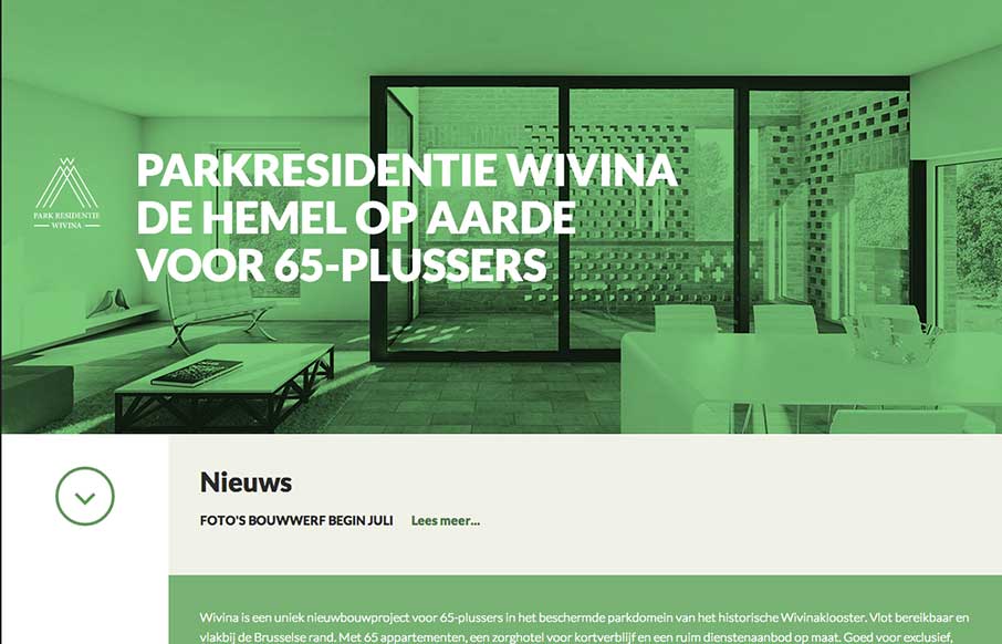
by Gene Crawford | Sep 22, 2014 | Gallery
I like how the website feels like it slides into place over the big header “hero” image area, then looks like a standard style left column nav based design. That’s a cool effect that’s really just about positioning the page elements...