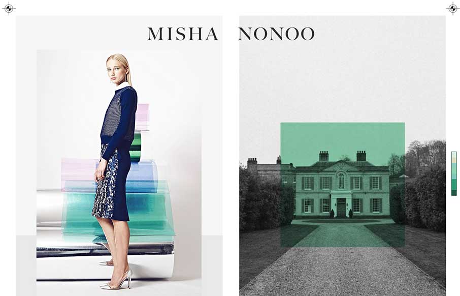
by Aaron Griswold | Sep 19, 2014 | Gallery
This is a smart and beautiful site. It packs in all the elements of a slick magazine, but on one page. I’m not usually a fan of modals, but these work because of the “static” nature of the site.
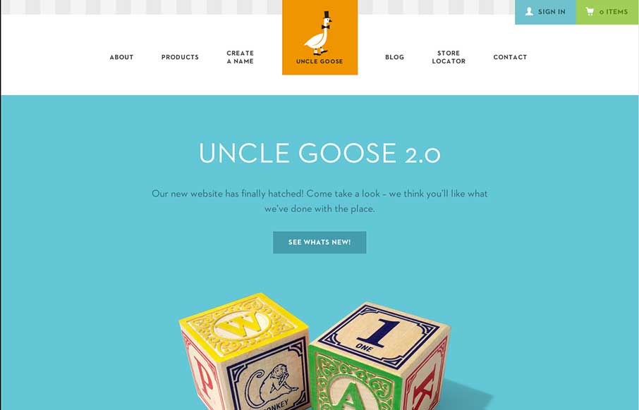
by Aaron Griswold | Sep 19, 2014 | Gallery
Old Mother Hubbard ain’t got nothin’ on Uncle Goose… I wanted to do some Andrew Dice Clay when I saw this site – but finally realized how inappropriate that might be… Now on to the site: What really sticks out is the attention to design...
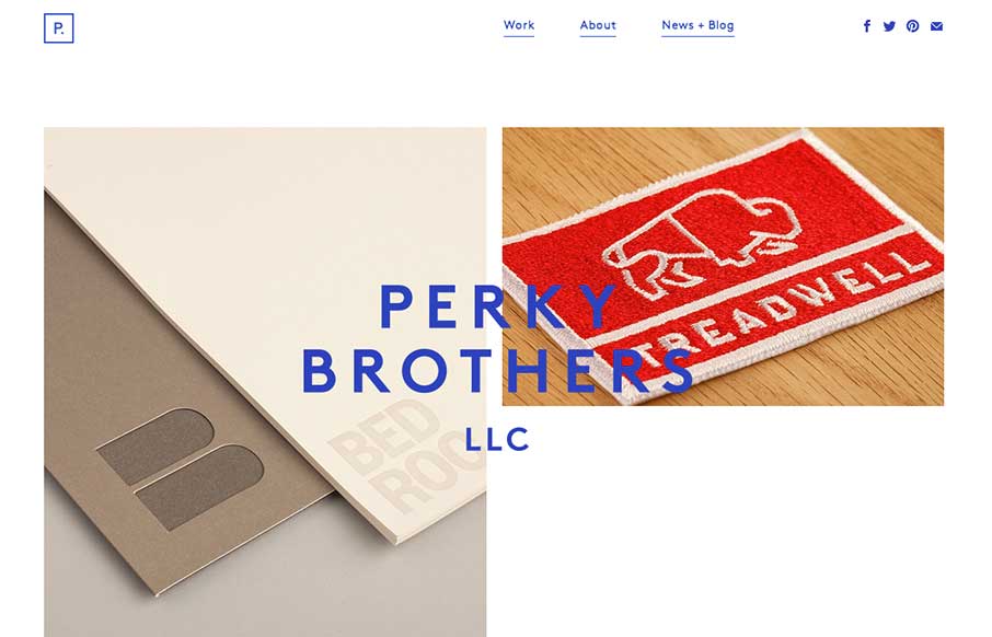
by Gene Crawford | Sep 18, 2014 | Food and Beverage, Gallery
Nice minimal design for Perky Brothers. I love the name. I also really like the overlay of the words that sit on top of the images and stay put as you scroll down the page.
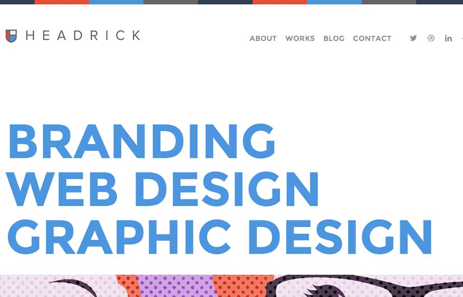
by Gene Crawford | Sep 17, 2014 | Gallery, Portfolio
I like how the type and the line work in this layout are all big and bold yet the page feels soft at the same time. Really unique yet familiar feeling at the same time. Smart work. Submitted by: Tony Headrick @tonyheadrick Role: Designer &...
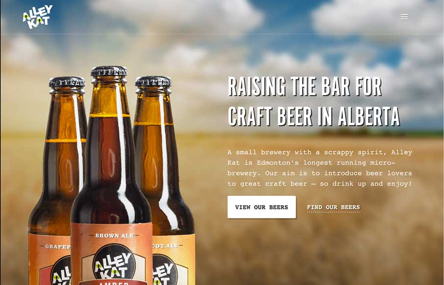
by Gene Crawford | Sep 17, 2014 | Food and Beverage, Gallery
Nice design that feels “crafted” with some hand made looking sections, the type plays into this nicely. The site utilizes a Full Screen Overlay style navigation pattern which seems to fit aesthetically but not functionally too well.