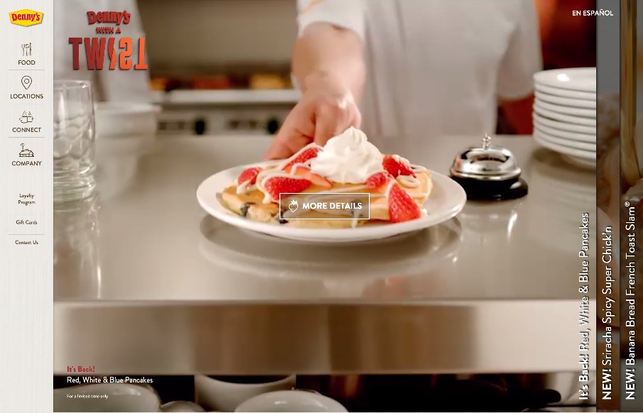
by Aaron Griswold | Jun 9, 2015 | Food and Beverage, Gallery
It’s breakfast time in Nashville, Tennessee where we’re putting BDConf (www.bdconf.com) on this week. we just finished setting up, and I’m watching the dude get the breakfast ready for the attendees… and then I see this site in our inbox...
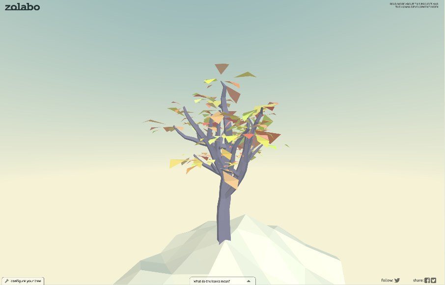
by Gene Crawford | Jun 8, 2015 | Gallery
Pretty rad interactive element here. The tree that you get after completing the form is brilliant. Go take a peek and play around with it.
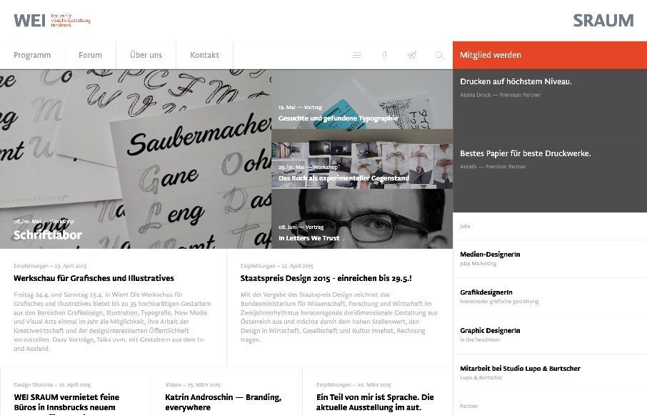
by Gene Crawford | Jun 4, 2015 | Conference, Gallery, Nonprofit
There is a lot going on here to get this website responsive visually. The grid is pretty core to its layout and it flows really well from screen to screen width. I also really dig how the header/nav stays fixed and moves up visually as you scroll down. From the...
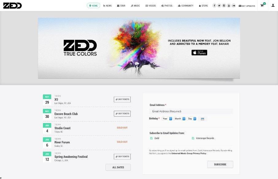
by Gene Crawford | Jun 4, 2015 | Entertainment, Gallery, Music
Pretty decent band website. It get’s straight to the point and doesn’t bog you down with giant photos and crazy background design stuff. Band name, play music samples, buy stuff… that’s all you need really.
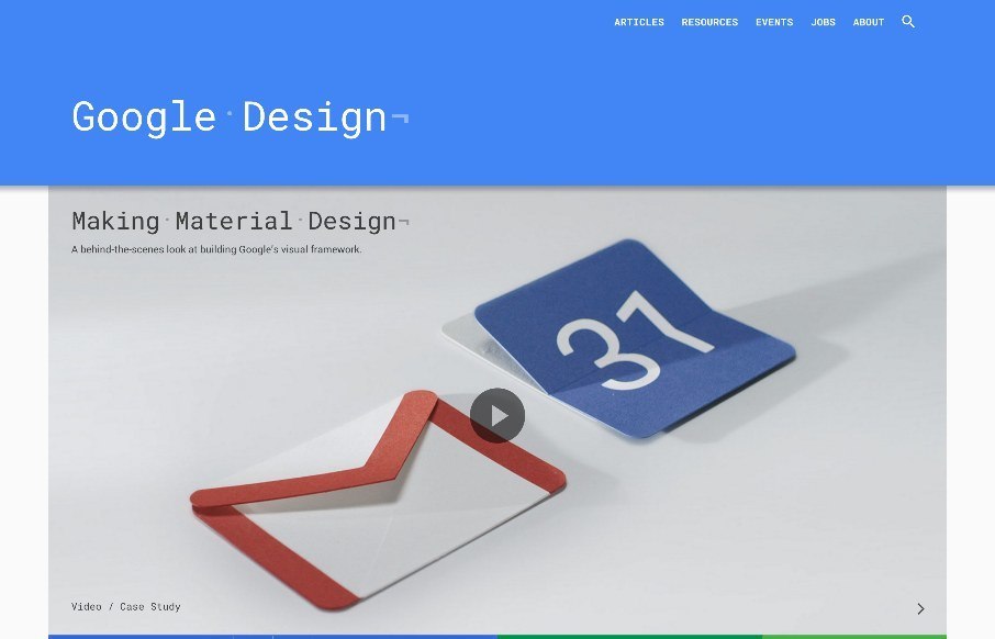
by Gene Crawford | Jun 3, 2015 | Gallery
A simple feeling design that is anything but simple. Clearly, they utilized their Material Design approach to this site. There is also some really nice little interactions, like the “ping” visual thing when you click on main links. I will say that this...