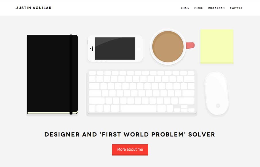
by Aaron Griswold | Aug 5, 2014 | Gallery
Really like Justin’s use of navigation, both in the Work section, and in the header. It’s different, active, animated, and gets away from the proverbial hamburger menu icon – which is always a good thing. The rest of the site is clean and crisp, with...
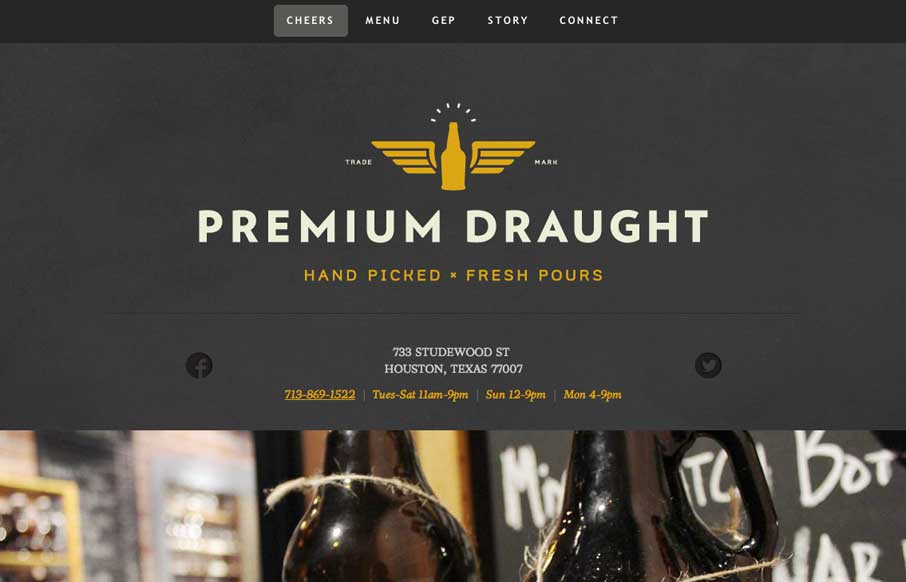
by Aaron Griswold | Aug 4, 2014 | Food and Beverage, Gallery
A good one page site that seems to be an extension of the growler fill station itself (making the site background / tecture look like the chalkboards in the store). In the mobile version, they’ve made the menu more accessible for your phone, without resorting to...
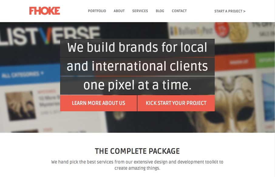
by Aaron Griswold | Aug 4, 2014 | Design Firm, Gallery
We’ve reviewed some of FHoke’s work before (i.e., Judgement Day) so cool that we get a look at their agency site. Really like the interaction of the jQuery masonry on the Portfolio page (we did this for a client recently – not as easy as it looks to...
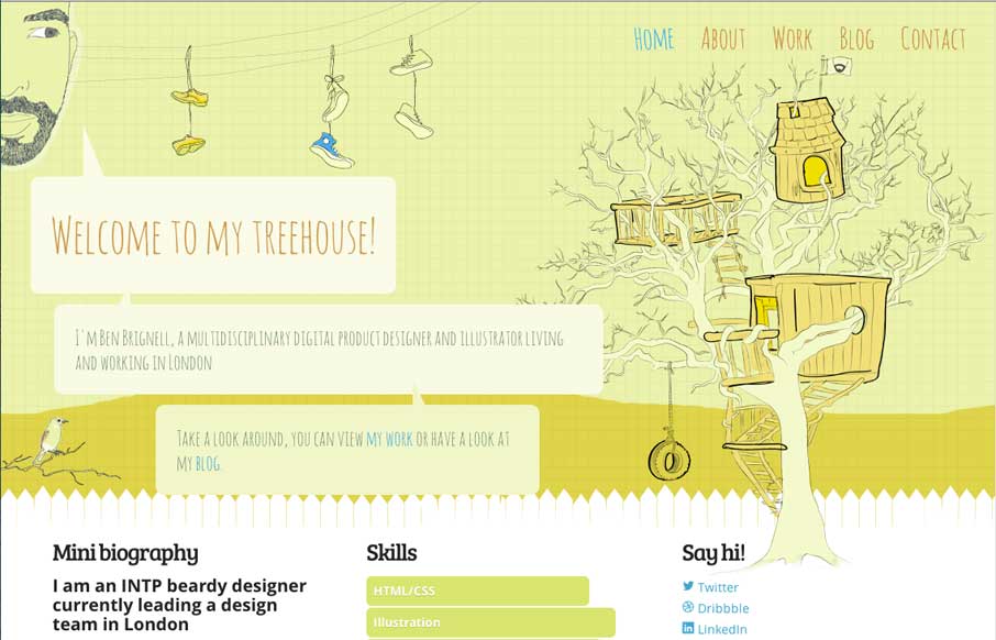
by Aaron Griswold | Jul 30, 2014 | Gallery
Let’s start this morning off with a good one – Ben Brignell does that for us! I really like the entire site – from the animation opening on the home page, to the javascript color changes you can make on the About page, to the project tags in his...
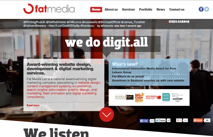
by Aaron Griswold | Jul 29, 2014 | Design Firm, Gallery
Definitely like how Fat Media is doing the foreground / background imaging with a different slant (figuratively and literally). The scrolling animation seems pretty seamless on the home page – and like the hover state of the staff on the home page too. Submitted...