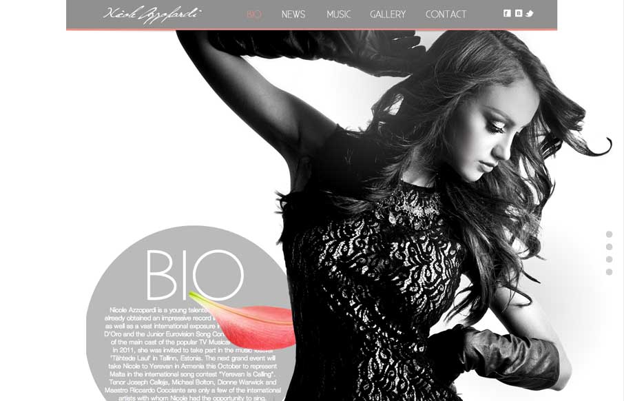
by Aaron Griswold | Jul 29, 2014 | Entertainment, Gallery
Great use of parallax with flying flower petals, bios, and a singer. Also like the use of texture in one of the sections, and then subtler parallax in another section to give some differentiation. Submitted by: Justin Sammut Role: Designer
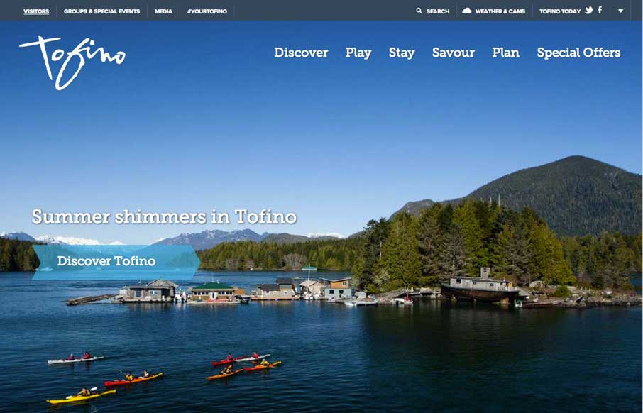
by Aaron Griswold | Jul 28, 2014 | Gallery, Travel
Cool use of different elements and shapes to give clear section delineations on the home / single page design. Also like the only drop-down in the top right corner (arrow) that works as a dashboard for the site. Submitted by: Jim Morris @ventureweb Role:...
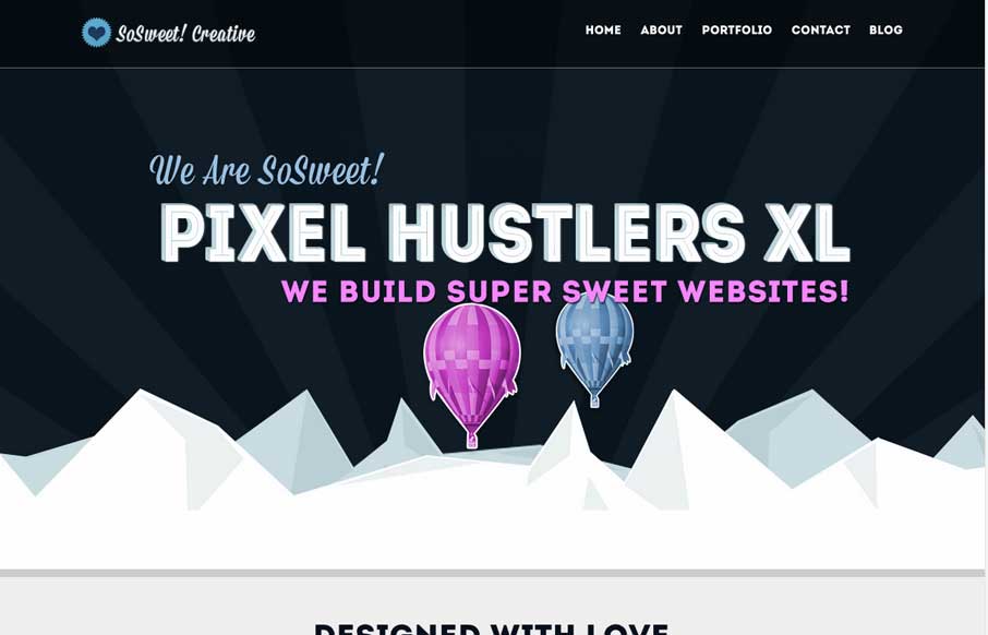
by Gene Crawford | Jul 25, 2014 | Gallery
Nice strong colors and graphic feel to this design. I really like the beating heart when the page loads up. I extra dig the way the contact form loads in too, nice touch. Submitted by: Stephen Scaff @SoSweetCreative Role: Designer & Developer SoSweet! Creative is...
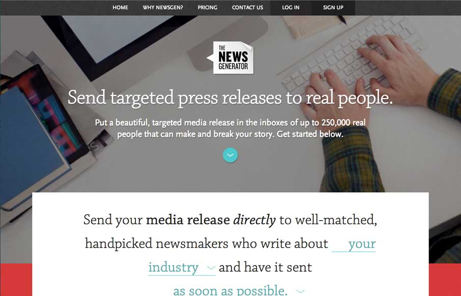
by Gene Crawford | Jul 25, 2014 | Gallery
Nice layout, it uses a lot of tried and true layout but it just feels a little different to me. I really dig the way the main signup form is right in the center of the home page but not in your face at the same time. Some clever form field design to go along with it...
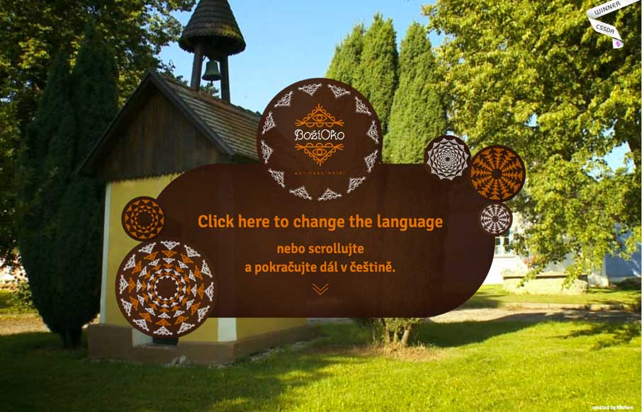
by Aaron Griswold | Jul 24, 2014 | Gallery, Travel
We leave you today with the type of site we see very rarely (for now – see this as a trend in the coming years) – you can scroll through a virtual tour of this resort in the Czech Republic. Looking at the code – each scroll forward or backward is an...