by Gene Crawford | Sep 17, 2015 | Design Firm, Gallery
Nice minimal site design. I like the blocks of content and how they keep you focused as you review the home page. I’m not huge on the way they handle when you scale down for mobile screen widths, but overall it’s smooth and works great across whatever...
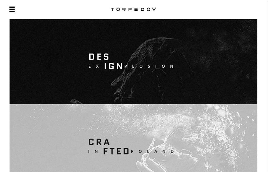
by Gene Crawford | Sep 10, 2015 | Gallery, Portfolio
Pretty solid graphics on the home page, I dig that left or right choice. I also like how he’s used the hamburger menu thing in the logo look as well. It helps tie it together for people. Nice use of slight animations in the case study imagery as well. From the...

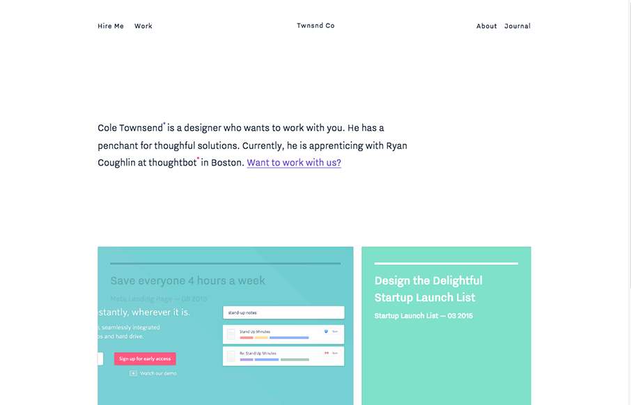
by Gene Crawford | Sep 1, 2015 | Gallery, Portfolio
I love, love, love that header/hero area background. I dig the way the rest of the page loads for you too. It’s just a simple portfolio/resume website and it’s just that, simple. But still powerful feeling.
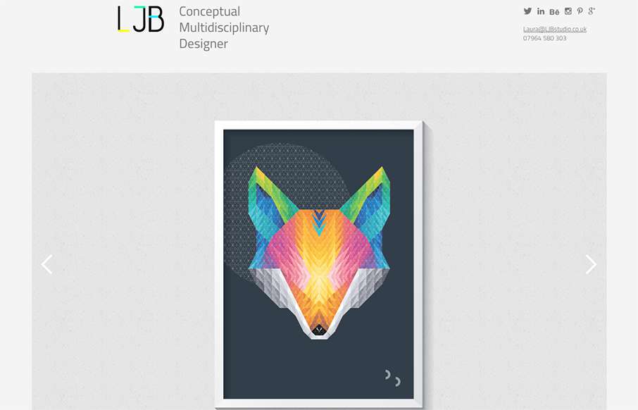
by Aaron Griswold | Aug 31, 2015 | Design Firm, Gallery
Cool portfolio design from Laura Boast of LJB Studio out of Manchester (UK), built by Nine Sixty. One thing I really like is how the home page has no nav in order to draw more attention the work in the slideshow – but nav comes up in the sticky header when you...
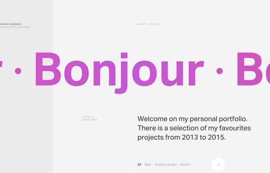
by Gene Crawford | Aug 27, 2015 | Gallery, Portfolio
Super sleek grid based layout. I love that he’s using the grid visually and structurally. I also love the way it plays with the typography and then the interactions feel perfectly placed. The layout of the work samples get kind of tedious as you scroll down the...