
by Gene Crawford | Mar 9, 2016 | Design Firm, Gallery
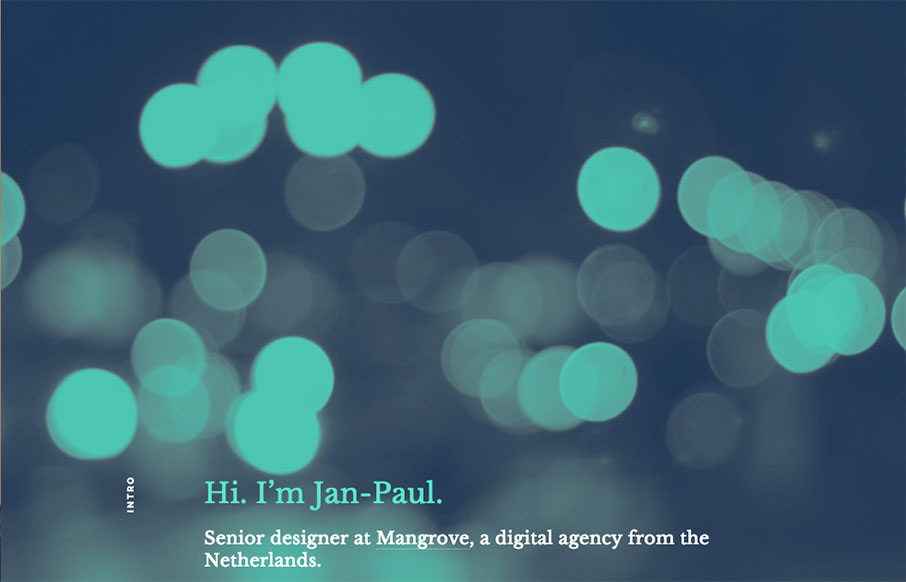
Kind of a parallax type approach, but really just targeted scrolling with some really badass inter-section animations. I love those section transitions. Solid.
by Gene Crawford | Mar 8, 2016 | Gallery, Portfolio
Really simple approach but very effective. I dig the simple links and the way all the sections are tied together with simple colors and then interactions. Straight forward works for me!

by Gene Crawford | Mar 8, 2016 | Food and Beverage, Gallery
I’m in love with the way this website does sectional targeting. You start off with sort of a splash page (we can discuss that later) then get siphoned off into a couple different directions depending on your food choices. Then there’s a solid landing page...
by Gene Crawford | Mar 8, 2016 | Gallery
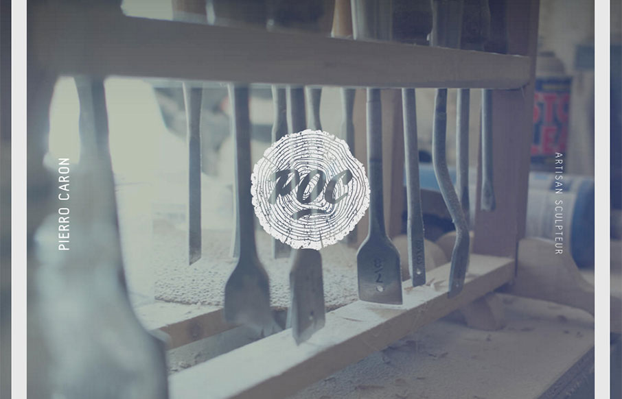
I LOVE the vibe of this site design for POC Sculpture. It feels soft and wispy with strong lines and edges. Kinda like sculpture 🙂 There are some really nice little interaction details here as well, like the slight movement as you scroll and then check the “back...
by Gene Crawford | Mar 7, 2016 | Fashion, Gallery
Pretty cool minimal design for Anekdote. I really dig the gray field where you can see the edges of it like they have it. It’s just simple and works. That’s good design to me, when the actions become almost invisible but say present.