by Gene Crawford | Sep 29, 2015 | Gallery
I love minimal and clean design. This site pushes it to the limit. It’s doing everything right on that side of the house. I do think it falls short a little with the nav items being set in white text, they can get lost based on the background images. However...

by Gene Crawford | Sep 28, 2015 | Gallery
Pretty cool layout. I like the fixed side bar nav and the illustrations that train your eye on each neighborhood section. Which are all designed quite well using a card style design approach. Check out an example of that here.
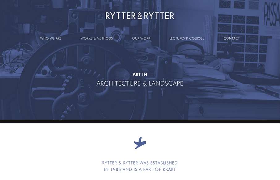
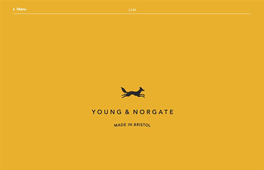
by Gene Crawford | Sep 23, 2015 | Gallery
Pretty clever single page layout for Rytter & Rytter. I like the way the sections are laid out as you scroll down, the flow feels nice. My favorite section is the pictures of their work, the way they’re cataloged and displayed is just clever.

by Gene Crawford | Sep 23, 2015 | Gallery, Marketing
Nice work with this heavy grid layout, lots of sections of content to get on the page. Sometimes, boy do I know, it’s hard to work with all sorts of content that a client might give you and this design just screams this to me. I really like how it’s all...
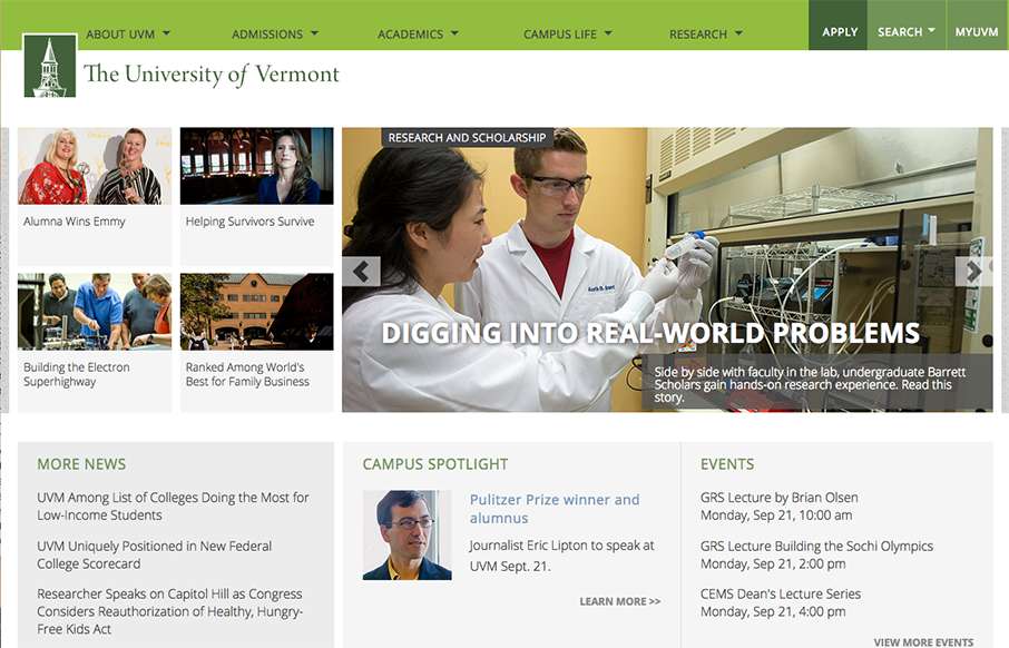
by Gene Crawford | Sep 21, 2015 | Education, Gallery
Great example of a responsive site for a university. Aside from the great responsive work here, I also love the main nav and search area. It’s a mega-dropdown style but the entire page sort of slides down. The search box works the same way but it has everything...