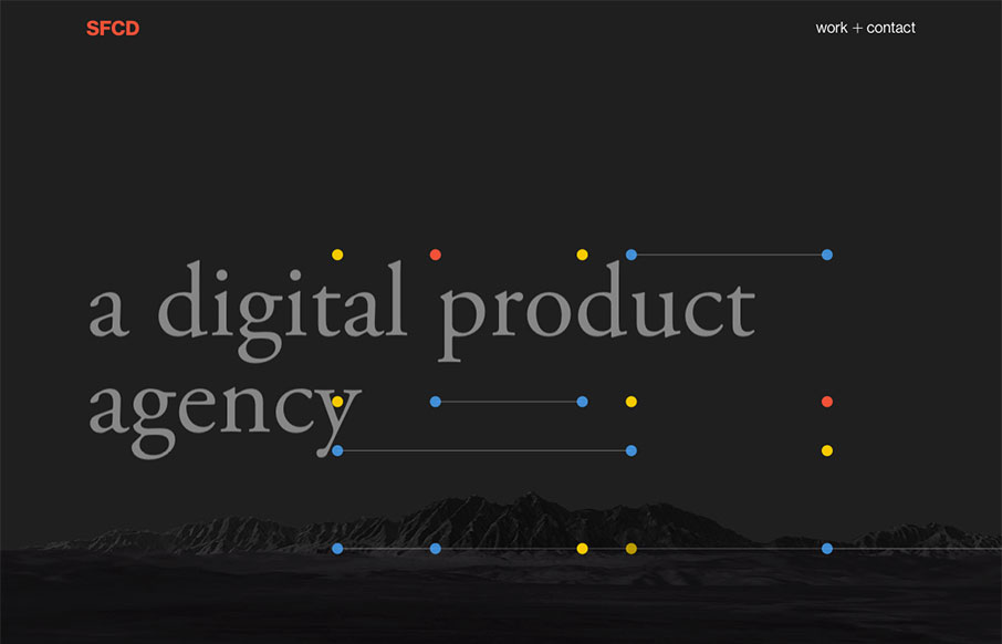
I love it when there's a good dark background website and it just works. Like with Andy Smiff's, I love how it really kicks in that classic way. Simple, straight forward, clean grid and clean type. Good stuff. Submitted by: Andy Smiff Twitter: @Andy_Smiff Role:...
i-Genesys
Pretty nifty scroll triggered interactions and movement. I dig how the elements shift around as you downscale the browser window too. Showing off what they can do. Some clever layout and illustrations really seal the deal on this design. i-Genesys is a creative agency...
YORH EKIN
I like the subtle blend of colors and the slight movement of the graphic behind the main intro text as you scroll. The display of work is straight forward and fun enough to keep you scrolling. Yorh Ekin, a creative director with a sense for design and technology. His...
HAWRAF
Pretty dang crazy website. I kinda dig it though. It's highly confusing form a standard set of expectations, but it ends up working just fine. I actually called someone over to my desk and asked them to figure out how to do something on the site and they did no...
Dan Mall
Beautiful layout and design. I love the load-in animation, it sets up a fairly straight forward layout of visual elements in a really striking way. Crisp typography and color that help build a sense of contrast. Spend some time on this site if you can and learn.
Clearleft
The new(ish) ClearLeft website is live. What a cool yet simple approach. I love it. There's some real beauty here in their approach. I particularly love the team page and the events page. Read Jeremy's Launch Note too.
Huee
Lots of stuff going on with this website for Huee. It's pretty chock full of eye candy and movement, which should get many clients excited. I dig the background video of the lady pointing at the phone, pretty clever joke. The hamburger nav icon that opens up the slide...
Ariel Beninca
Great portfolio website design for Ariel Beninca. I love the simplicity which makes you really notice the way the work is presented as you scroll down the page. There's a very clean aesthetic here but just enough movement and fun to show off some skill. Submitted by:...
Stripe
Good lord I love the Stripe website. Everything about it. It's so visually dense with content and stuff but yet feels so light and airy. Yeah, I just said light and airy. 🙂 Seriously, you've probably spent most of your time with Stripe in the app or on your phone......
Siminki
Putting this in the gallery because I love the illustration work. The line work is cool and it's inviting. The way the've weaved in the illustration with the rest of the page design is stellar work too.
Grant Burke
Neat interaction work here for Grant Burke's website. I like how the header/logo/nav changes around as you scroll. Nifty color choices too. The thing I love most is the multi-column layout for wider screens. You simply don't see that often and when I see it done well...
Tobias Van Schneider
I really dig the bold type and overlay on the photo. Cool use of colors on the black background too. Tobias always has swag!
Colin Simpson Design
Love, love the typography on that logo mark. I also dig the big shots of the work, putting things in context like that, brilliant. From the Designer: The portfolio of Colin Simpson a UX designer from San Diego who helps elevate experiences for big and small brands...
Daru Sim
Simple and effective. You can beat a one - two punch like that. This website embody's that in every way. From the Designer: It's almost the end of 2016 and I thought that its time to revamp my personal website (v3.0) and yay, I've done again and it is now live at...
Brendly Webdesign
Pretty good layout, it keeps you moving your eyes around but on the right stuff. I also like how they've humanized certain areas like the contact us part, with a picture of one their team. Strong thinking here. From the Designer: We are a webdesign agency. The site...
Arsmoon
Love the vibe of this site. I really dig how the side nav icon/thing moves up so you notice it as you scroll down. Like the dark background setup here too. From the Designer: We are digital agency based in Ukraine. Our independent team help you to provide the best...
Amaro da Costa
Pretty sweet layout. I'm in love with the way the projects are displayed as you scroll down the page. Perfect really. Also some overall solid design. Submitted by: Joao Costa Role: Designer & Developer Country: Portugal
Ezra Arthur
I love the simplicity of this ecommerce site. The simple logo and big close up shots of the products are beautiful. Would love to know if this is an off the shelf theme customized or not. Good stuff regardless... Submitted by: Kia Bess Twitter: @kitchensinkinc Role:...
Projekcje
Pretty neat looking layout. I like how it pushes the boundaries of what a typical layout can be. It's pretty traditional under the hood but on the surface it's fresh and new looking. I particularly dig the submission form design. It's rare to see attention to detail...
DELT
Fun imagery help deliver a pretty standard agency message and it works great. The best feature, once you get to it, is the fly-out nav. I love how it's basically a small site map but they've also broken out the major areas of focus for the agency at the same time...
Revolution Messaging
You've got to love commitment to a good theme. The Revolution Messaging website delivers on that in such a solid way. I love almost every detail of this website. The way it loads items as you get down the page and the way there are tiny little interactions baked into...
Brittany Chiang
Really solid portfolio website for Brittany Chiang. I love the timeline layout section and the case studies are well done. All you need do is just scan down this site and you know all you need to know. Great design work all around here! Submitted by: Brittany Chiang...
Hillmann Living
Nice clean layout for the Hillman Living website. I love the way the image fades in with those color chairs on that dark background. Cool effect there. I also like the way the first section of product images are worked onto the page. It's chock full of visual interest...
Goltermann.Design
Wow. That's about all that goes through my mind as I check this page out for the first time. What great CSS animation work on the main photo area. Solid layout and detail work. Hire this man! From the Designer: I am a Berlin based graphic desiÂgner and I create clean...
MAVENTRI
This layout has the vibe of a theme but what's been done with it regardless is nice. I love the color scheme here, it feels really new. I also dig the nice use of the case studies. From the Designer: We are a unique business services firm combining accounting,...
Met Museum
Nice rework of the Met Museum by Fi interactive. I've been following their work since the pre-flash and through the flash era of the internet. I'm glad to see they're still kicking and doing fantastic work. Mobile was a big focus Right “off course it was in this day...
Lily Camera
Pretty rad interaction work here. I love how when you scroll down you are told the story of the Lily camera rig/drone. Some nice illustration work contrasted against good product photos is solid IMHO.
Ester
I like the way the design starts out sort of minimal and get's more and more visually dense as you scroll down the page. The case study marquis are pretty well done and I love the contrast to the rest of the site here. The illustration work is good too.
Jaco Analytics
Nice illustrations and video work. I like the way the signup is simplified with just the email asked for. It's cool as you scroll down as well.
Charter Reserve
I really dig the interactive stuff on this site. The way it shows different details as you scroll is killer. Then the different types of product displayed the way it is is cool. Such a cool site. In partnership with a national agency, 40Digits developed a responsive...