by Gene Crawford | Jun 16, 2016 | Gallery, Portfolio
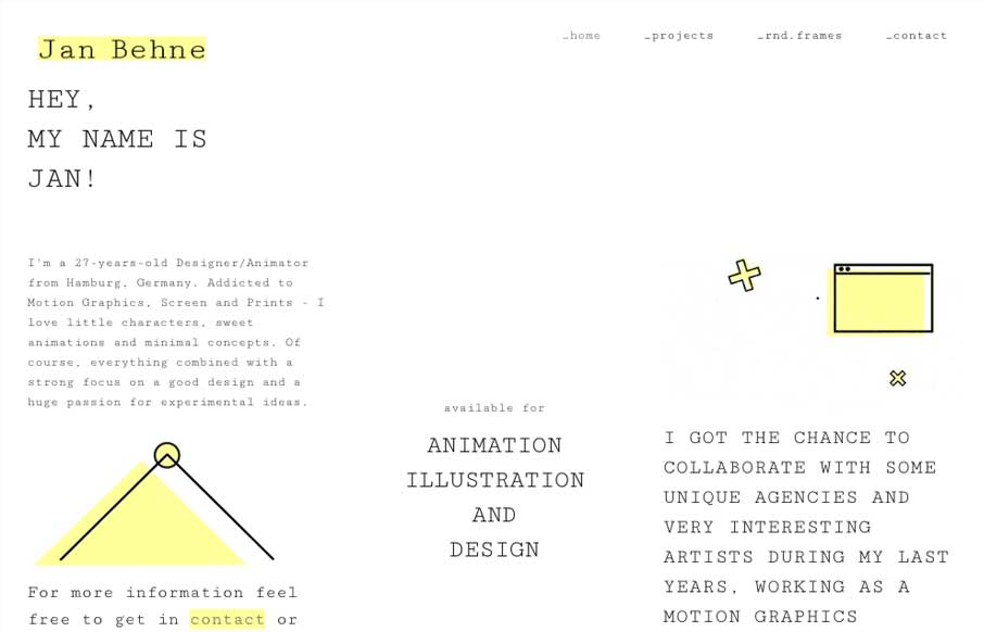
Pretty nifty change of direction for the Jan Behne portfolio site. I dig it, I love the way the three columns are used. Very print design like but totally digital in it’s content and deliver. Smart work. Hey, I’m a Graphic Designer and Animator from...
by Gene Crawford | Jun 15, 2016 | Gallery, Portfolio
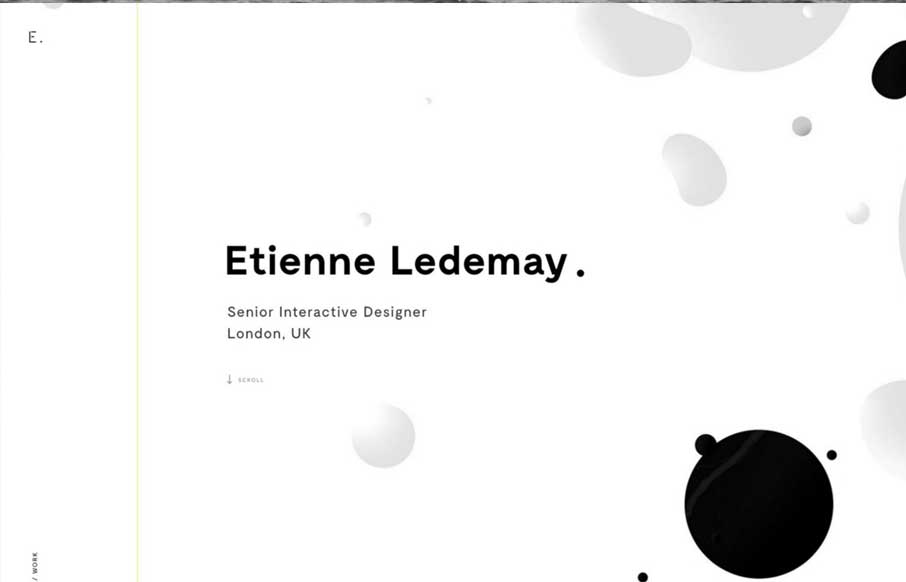
Gotta love great graphic design when you see it. Etienne Ledemay delivers. I love the simplicity that overlays the complexity of the typography and scrolling interactions here. That line also delivers you straight to the bottom of the site. Well done!
by Gene Crawford | Jun 10, 2016 | Gallery, Portfolio
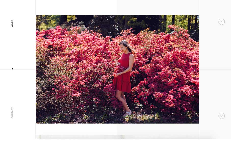
Pretty rad looking portfolio site. It’s simple, just show the work. This site does that well. It’s also unique feeling which is something you’d also look for in a portfolio. Cool. I also really love the small-screen width or “responsive”...
by Gene Crawford | Jun 9, 2016 | Gallery
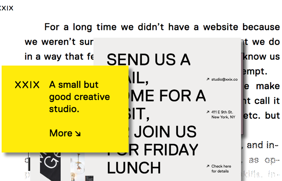
A good way to show you’re a “new” type of interactive firm is to show it off in your work. Twenty Nine NYC doest that well here with their website. It’s not the most highly functioning site in terms of pure usability but it’s not that bad...
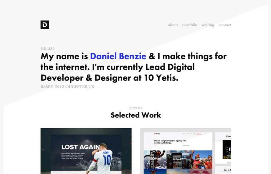
by Gene Crawford | Jun 9, 2016 | Gallery, Portfolio
Simple layout and nice typography. The Daniel Benzie portfolio site is quite nice. The angle in the background image really helps drive your eyes down into and through that main tagline then on to the work.