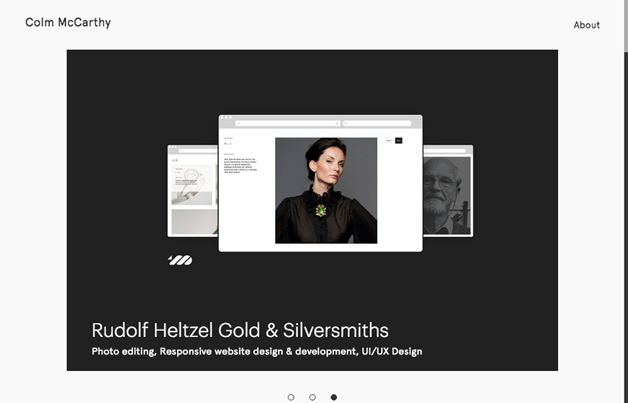
by Aaron Griswold | Jun 20, 2016 | Gallery, Portfolio
Nice, minimal portfolio site from Colm McCarthy out of Ireland. Like the use of the text over the main image on the work detail pages – interesting to see how it lands on different viewports.
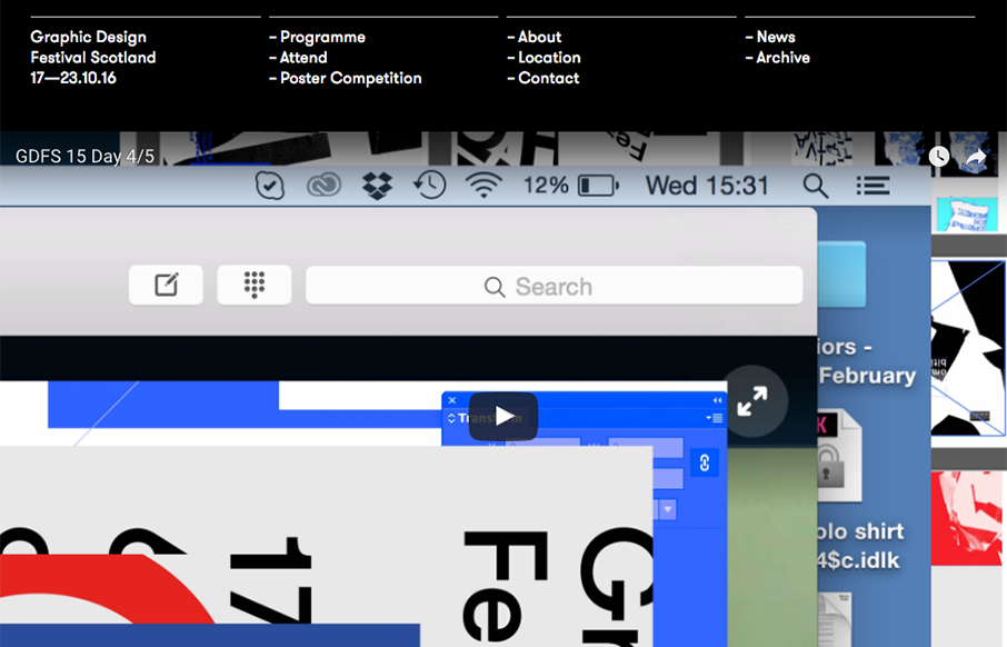
by Aaron Griswold | Jun 20, 2016 | Gallery
Love the smart use of the gridlines for the Graphic Design Festival in Glasgow, Scotland. Simple and clean – good stuff. From the Designer: Graphic Design Festival Scotland is an international organisation promoting creativity, innovation, collaboration and...
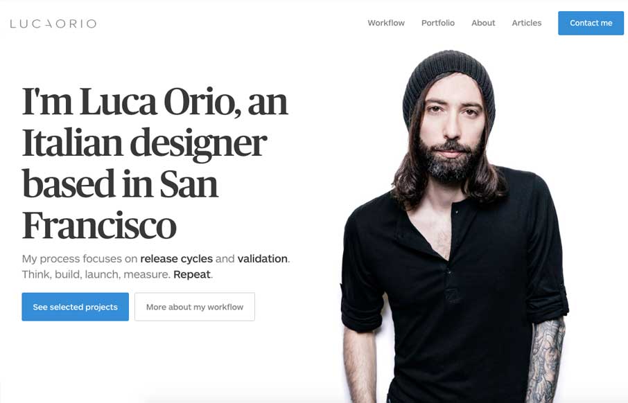
by Gene Crawford | Jun 16, 2016 | Gallery, Portfolio
Pretty slick and straight forward portfolio site for Luca Orio. Style and class go a long way and this designer has those in large amounts. I love this site. From the Designer: Luca Orio is an Italian designer based in San Francisco. His process focuses on release...

by Gene Crawford | Jun 16, 2016 | Gallery
Lots of standard layout stuff for this web app product, but it’s just. I don’t know, nicer. I love the oversized image for the view of the product and the overall vibe is just nice. Clean simple design that focuses on showcasing the product by avoiding any...
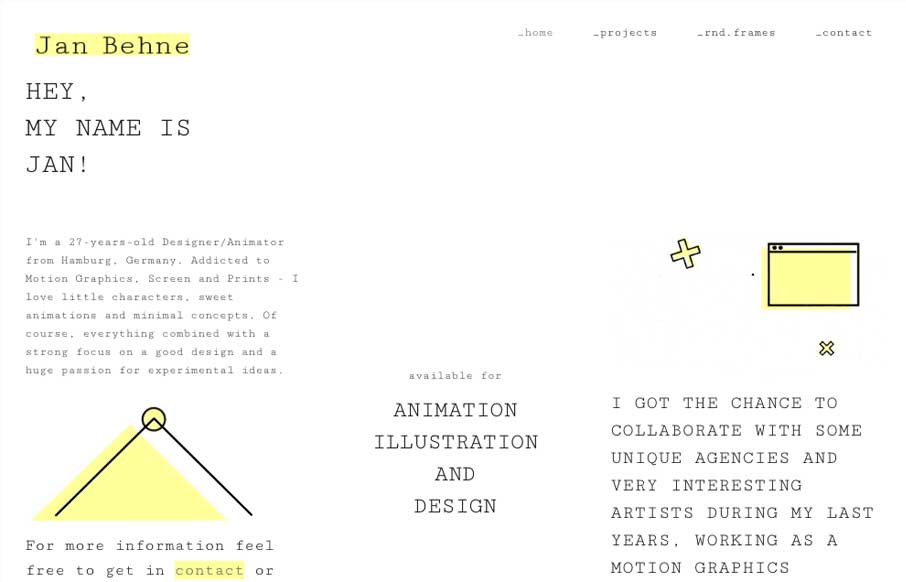
by Gene Crawford | Jun 16, 2016 | Gallery, Portfolio
Pretty nifty change of direction for the Jan Behne portfolio site. I dig it, I love the way the three columns are used. Very print design like but totally digital in it’s content and deliver. Smart work. Hey, I’m a Graphic Designer and Animator from...