
by Gene Crawford | Jun 6, 2016 | Gallery
Nice dynamic looking layout for Bing Digital. I love the soft colors and the imagery that helps sell the idea that they know what’s up. The thing I like most is how they list out all the stuff they do in the footer area. So clever and simple, yet most never do...
by Gene Crawford | Jun 6, 2016 | Gallery
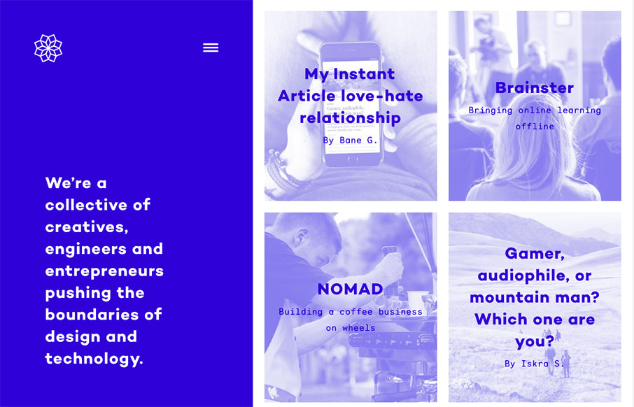
One of my new favorite websites. I love the fixed left side and the block imagery on the right. Also check how the hamburger icon kind of twinkles a little to let you know it’s there. From the Designer: We’re a collective of creatives, engineers and...

by Gene Crawford | Jun 2, 2016 | Gallery, Travel
Super simple and probably as minimal as it can get for a site like this. I love the simple placement of the location images and how you can just keep sliding to the right to see more. The search design is pretty sweet too.

by Gene Crawford | May 31, 2016 | Design Firm, Gallery
In a sea of design firm websites that all start to look the same the Newgroup site stands out. It’s simple and the grid is clean but overall the way the elements are placed and the spacing used give it a unique flow. That helps the sections that are quite...
by Gene Crawford | May 31, 2016 | Design Firm, Gallery
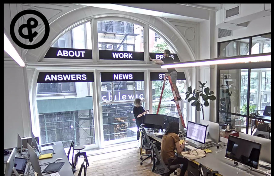
Website for the legendary Sagmeister design studio. Pretty interesting, but the most intriguing part is that the home page is a live feed from their office. So weird, and so cool.