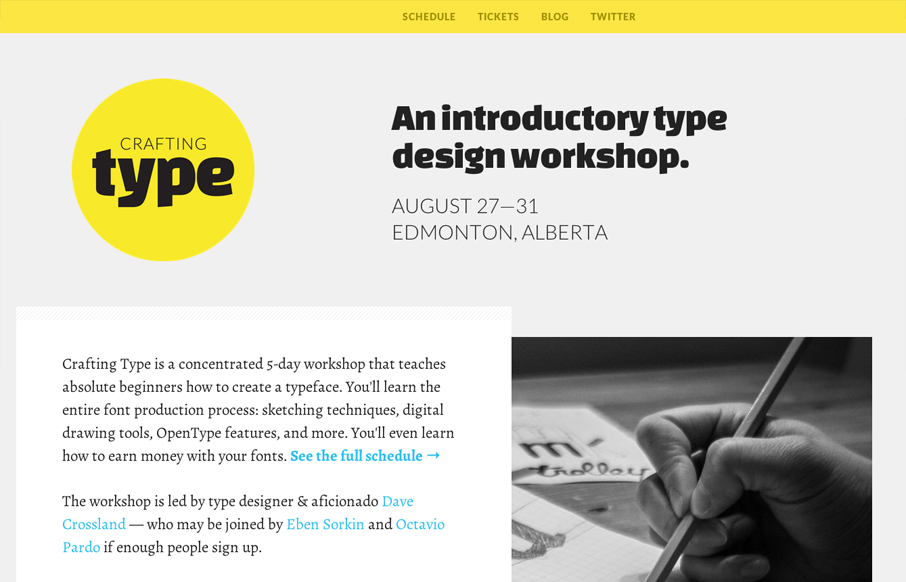
by Gene Crawford | Jul 26, 2012 | Gallery
So what else would you expect from a website about crafting type than a superbly typeset website. Everything about the type and layout of this website is just perfect. From the vertical rhythm to the letter spacing *shudder* I loves it!
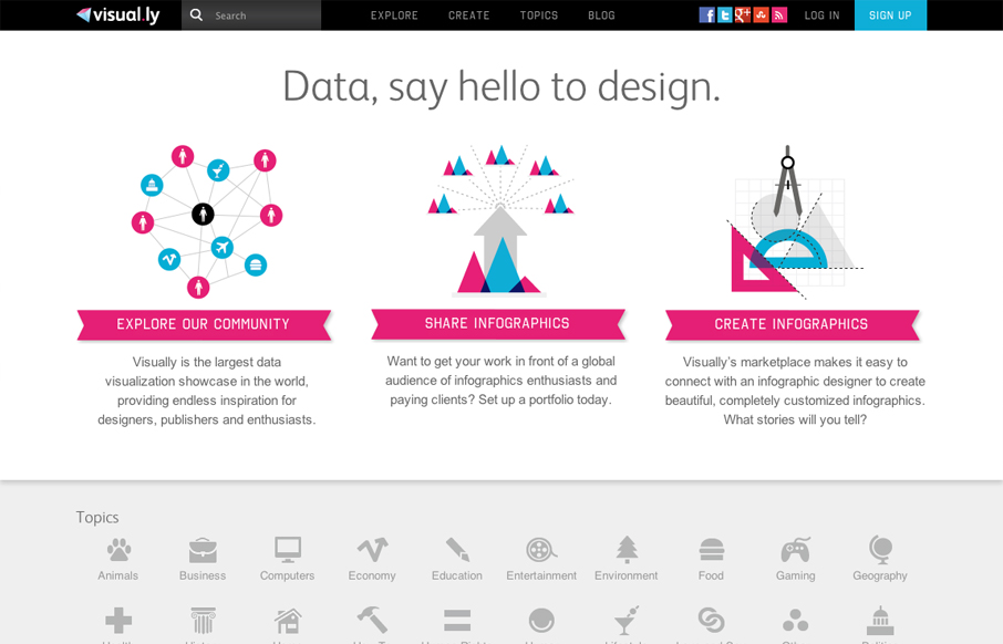
by Gene Crawford | Jul 25, 2012 | Gallery
Nice illustrative explanation of how Visually works. It’s fast and effective and pretty bold with the magenta and cyan like colors. Very wide feeling layout, I like that I have room to breath because the site is very dense with info.
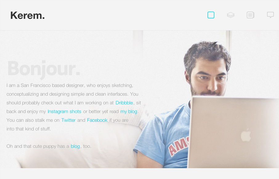
by Gene Crawford | Jul 25, 2012 | Gallery
Nice work on the photo and how the copy plays right up to it, even visually with the copy about the dog right above the dog. I just dig that. Love the fixed header and how it feels really well tailored into the site. Random numbers section in the footer area is...
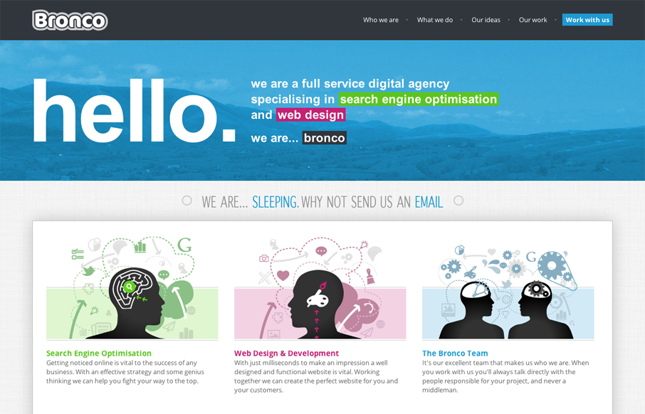
by Gene Crawford | Jul 24, 2012 | Gallery
I really like the full width design employed across the pages of this website. It gives it an overall visual structure that feels fresh and yet classic at the same time. The other thing that sticks out to me is the extensive content, there is a depth here that...
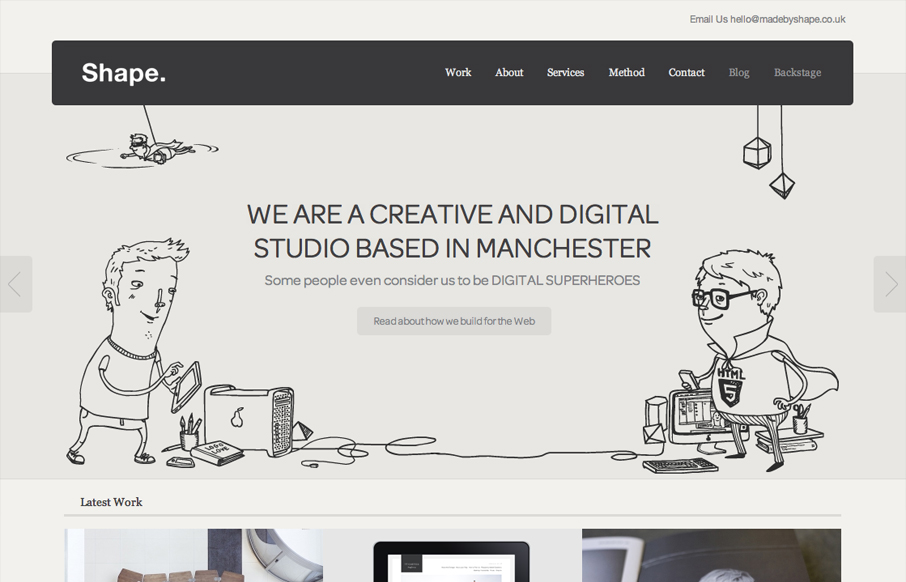
by Gene Crawford | Jul 23, 2012 | Gallery
God I love this website. It’s so full of sweet little details and then awesome features like ‘method’ page. The project planner form is a real piece of work too, I love interactions in the multiple choice section and the price range slider. Spend...
