
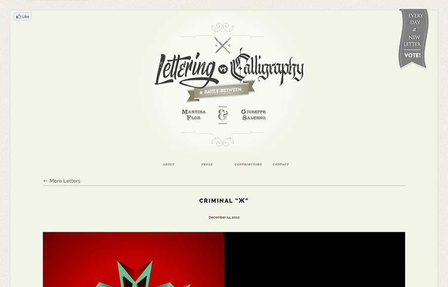
by Gene Crawford | Dec 21, 2012 | Gallery
This design is very crisp and nicely worked out. What I like most is the discreet interactions between scrolling/navigating down the page. The black to red shift in the line & icons keeps you informed and engaged on a visceral level. I just found this design a...
by Gene Crawford | Dec 20, 2012 | Gallery
First I didn’t know whether to make this a radar resource or a gallery entry. Duh! The design is hot so it goes in the gallery. There’s some nice little design flourishes here and there and I just want to keep scrolling and voting. Love this.
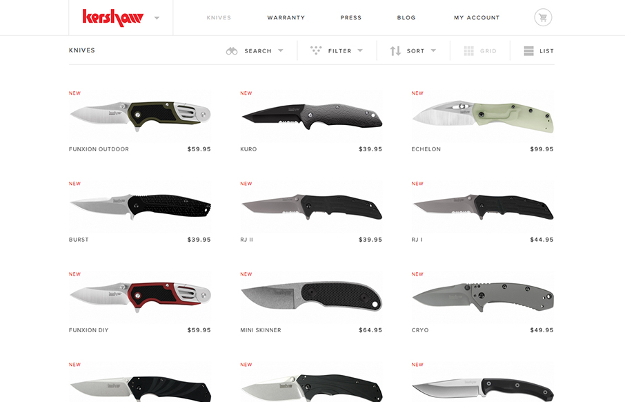
by Maria | Dec 20, 2012 | Gallery, Shopping
Another superb responsive ecommerce website design. Looks like some image swapping going on for the different screen widths too. Smartness.

by Gene Crawford | Dec 20, 2012 | Gallery
The new stitchfix.com looks hot! Bravo to @mrmrs_ !— Samantha Warren (@SamanthaToy) December 15, 2012 Looks good indeed. I particularly like the login box in the header area, the changes it goes through for each screen width design. I like details like that a...
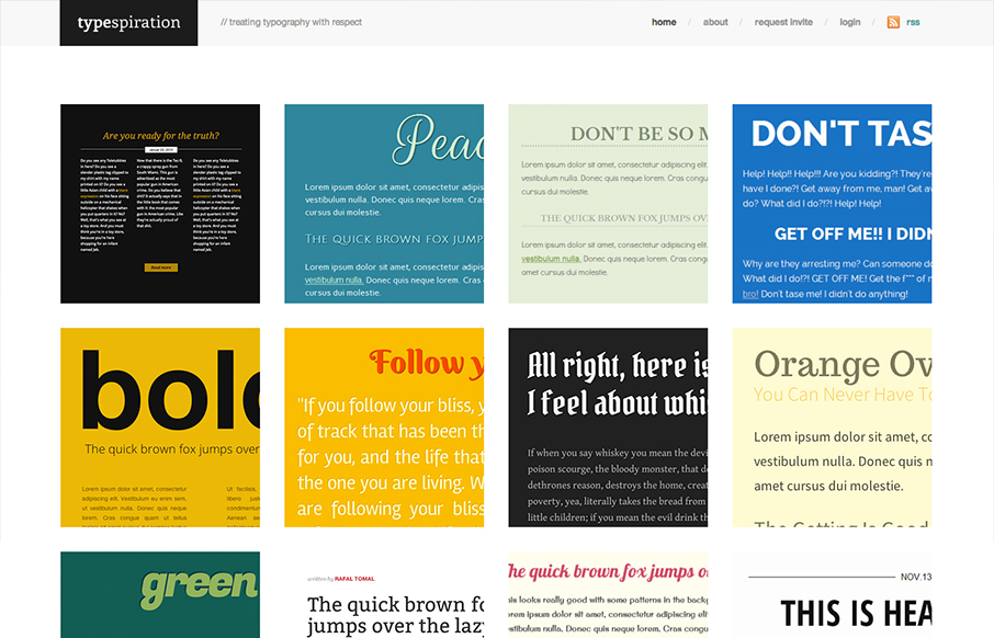
by Gene Crawford | Dec 19, 2012 | Gallery
Love the content and idea of this website a great deal. The execution is also very nicely done. The responsive design and cleanliness of the site make me smile. Rafal Tomal has a great write up on his blog about building and designing Typespiration that you should...