by Maria | Dec 19, 2012 | Gallery, Shopping
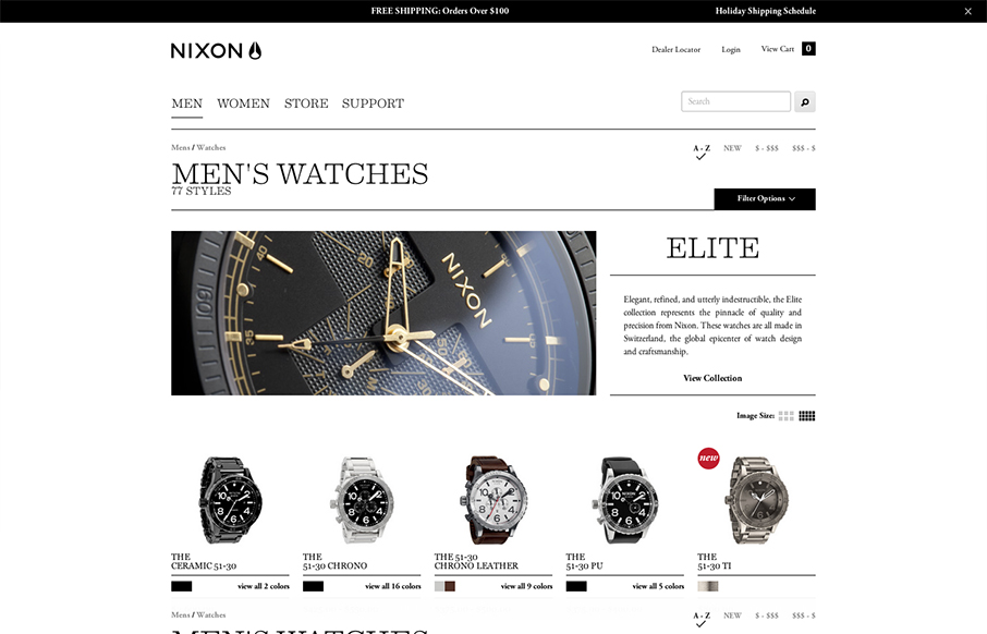
A great example of responsive design used in an ecomerce situation. And the work and product are very high quality so they have to match and the design doesn’t disappoint.

by Gene Crawford | Dec 19, 2012 | Gallery
Beautifully simple website design for Mosaic. It has just the right amount of showing off the product, how it works and how you can gift it with animations timed to go off as you scroll. It has that Apple feel without going over completely. I love this.

by Gene Crawford | Dec 18, 2012 | Gallery
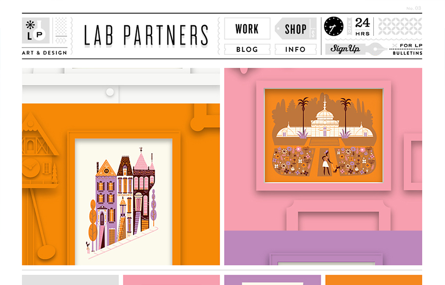
This is just a visual feast. I love the work presented here and I love how it all ties together with the site design. That top header and nav area is pretty dang cool. The slideshow is very interesting too with the pieces coming together dynamically like that....

by Gene Crawford | Dec 17, 2012 | Gallery
First off the design is gorgeous. The colors, typography and overall gestalt of the various elements make the design feel very welcoming and open. What I like most is the basic narrative, of “how does it work”, “how do I use it”, etc… I...

by Gene Crawford | Dec 17, 2012 | Design Firm, Gallery
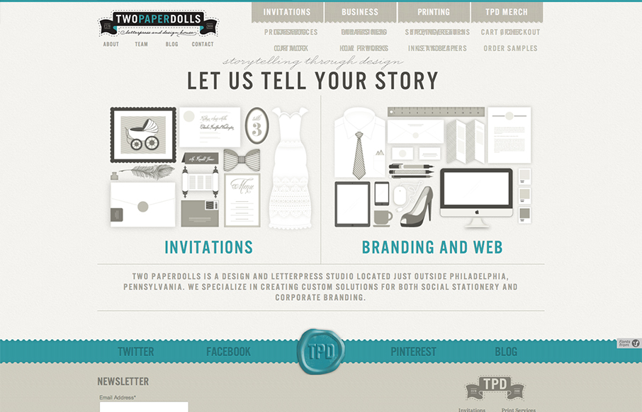
Gawd I love these illustrations, so precise and fun. The second thing is I like how upfront the two directions in service are displayed. “Invitations” and then “Branding & web” you can choose your adventure. That’s smart if the...
