
by Gene Crawford | Jul 9, 2013 | Gallery
I really dig the simple yet clever design of the Bendyworks website. It’s largely made up of text, but it’s well written and clearly defines what Bendyworks does for you and what they’re looking to do. I also really love the hot dog graphic, who...
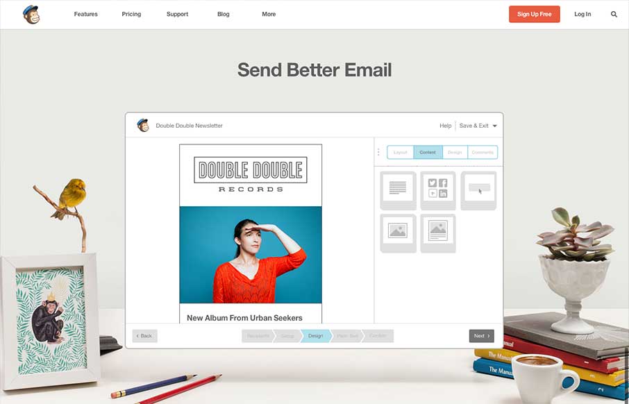
by Gene Crawford | Jul 8, 2013 | Email Newsletter, Gallery
The new Mailchimp site is superb to say the least. The simplified layout on the homepage really sets the tone for the rest of the design. Incorporating the video of how the app works into the homepage like this is smart and works very seamlessly, you almost...

by Gene Crawford | Jul 8, 2013 | Food and Beverage, Gallery
What a great website design. It’s clean and precise and keeps a level of corporate appeal while still having a nice craft vibe. It pulls out all the trends in its detail work for sure and they’re all done very well, from the parallax(ish) section to the...
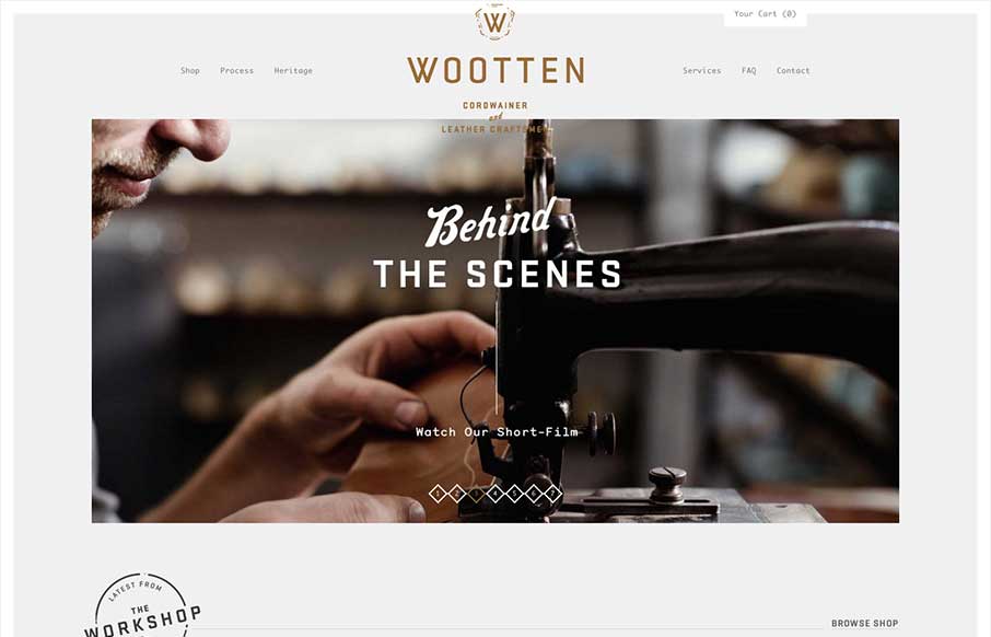
by Giovanni DiFeterici | Jun 19, 2013 | Gallery
Man this is a beautiful site. The photography really sells it. Just check out the heritage page. The mix of fixed imagery and scrolling text is beautiful and the transition between content blocks is perfect. The site has a handcrafted feel that perfectly compliments...
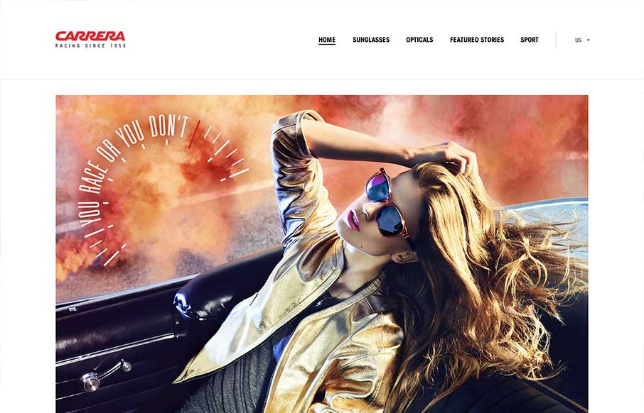
by Giovanni DiFeterici | Jun 18, 2013 | Gallery, Shopping
I really like how carreraworld has broken the grid. The site is well structured, but has loosened the hard lines of the grid it uses to create a more free flowing and energetic design. Nothing feels static. Even thought the design is wildly varies throughout the...