by Gene Crawford | May 20, 2014 | Gallery
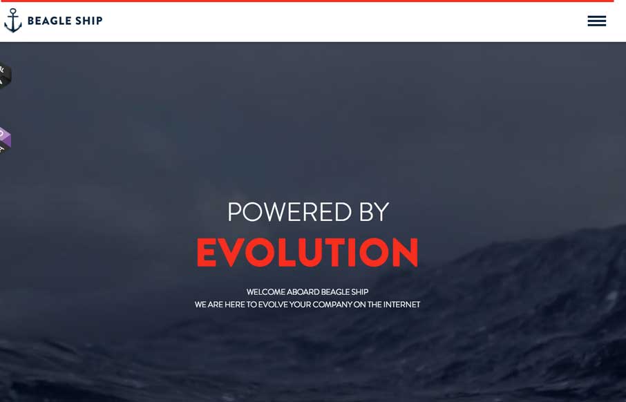
Cool interactions and content blocking. I really dig the first time experience when you hit this site. The way the portfolio navigation on the home page is designed is very cool along with the loading animations of the 3 marquee sections.
by Gene Crawford | May 20, 2014 | Gallery
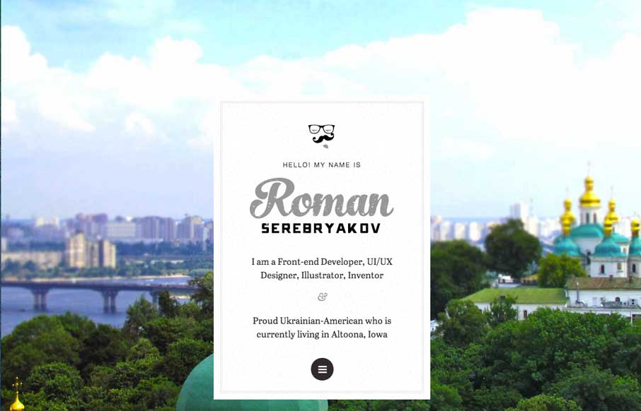
Pretty cool interaction from the home page. I really like the original thought. Otherwise the design is super simple – half of it links elsewhere, which is also smart if you’re truly active in those communities. Really smart design here.
by Gene Crawford | May 19, 2014 | Gallery
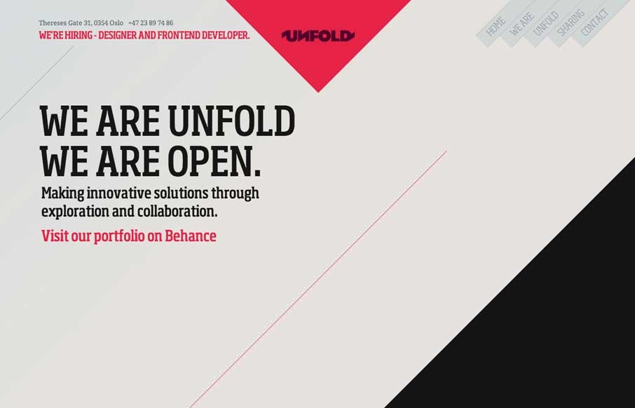
Pretty cool layout, the angles make this website so different. I also dig how they change the navigation colors based on where you are on the page. Very interesting site design here.

by Gene Crawford | May 15, 2014 | Gallery
Pretty nifty site design, it’s party blog like layout and part not. There’s also some interesting interactive pieces like on the “our way” page, that keeps you interested in the content.
by Gene Crawford | May 15, 2014 | Design Firm, Gallery
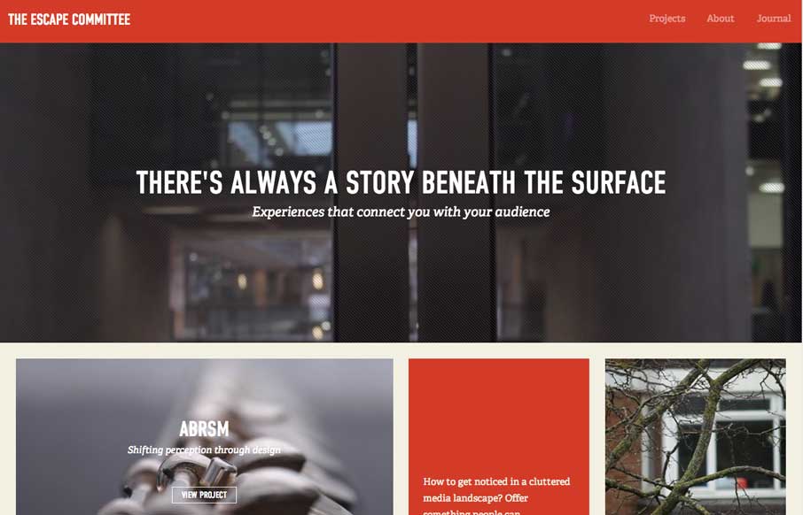
Really cool layout for the Escape Committee website. I really dig the sharp lines and boxes the design is based on. The typography fits exactly how it feels like it should too. Makes me want to read all the articles.
